|
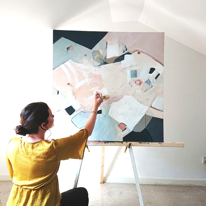
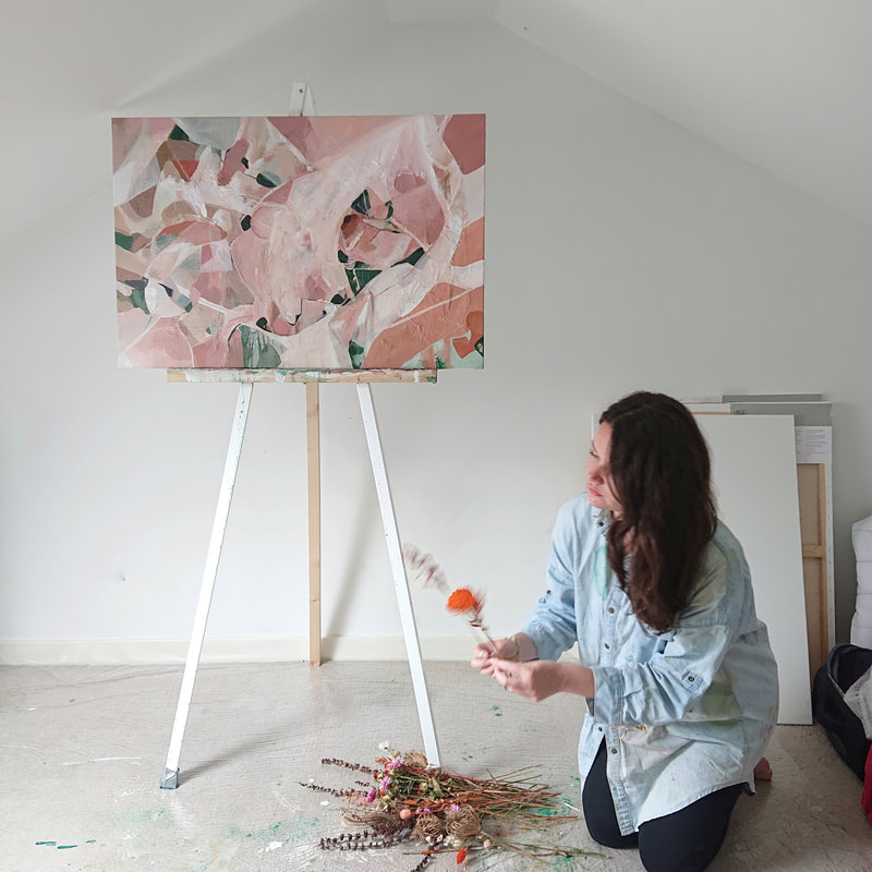
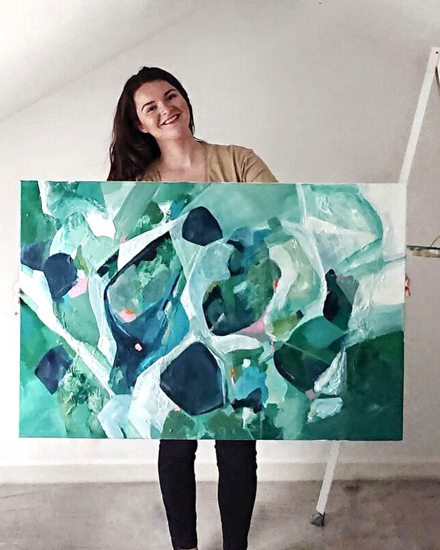
I was made redundant completely out of the blue on a rainy Glasgow Friday afternoon. I can only describe it as feeling like I’d been hit by a bus! I won’t go into the full details of the circumstances at this stage, but I know that anyone who has been made redundant or lost a job will be able to relate to this on some level. Some situations are dealt with better than others… but the feeling of being dropped suddenly and needing to pay a mortgage / bills and having no idea of how you will be able to afford it is more than terrifying. Finding myself redundant after five years of working full time in the interior design profession, I spent the following weeks trying to process the trauma of what had happened, whilst also scrambling to update CV’s. Then lockdown in the UK was enforced. Gyms, restaurants, parks and libraries were all closed. Staying home had become the new reality and my previously vibrant social life had been reduced to the confines of my home. I quickly gathered a few things up and moved in with my boyfriend. Not only was the world going crazy, and a massively scary pandemic was unfolding, but I was searching for a jobs in an economy that had been ‘put on hold’. Along with all of these things came the uncertainty and fear of the unknown. I spent the first 2 weeks of lockdown trying to calm myself mentally. I went for walks, did yoga, meditated, played games, dived into books, called friends and tried to first and foremost take the time to look after myself in the situation I was in. My family, boyfriend Liam and my friends are the biggest support I’ve got and I’m so so lucky to have them around (despite being socially distanced!). However, outwith my own home, where I had left most of my clothes and belongings, there were only so many leisure activities I could do and only so many CV’s I could send out (with the replies of, ‘sorry, we aren’t taking on anyone due to Covid’) before I went mad. (I’m very much a person who needs some form of purpose, or at least a project to get on with and without one I tend to go a bit loopy.) I have been painting for a couple of years as a hobby, it was something I did on the side of my 9 -5 interior design day job and I always found it was super relaxing and therapeutic. One night I was sitting on the couch after a long lockdown day of being unproductive and boredom had well and truly set in. I moaned to Liam that I couldn’t paint, so the next day he made me and easel and I finally had my little art set up in his attic!!!! Rediscovering my Creativity.So, I started to paint again in lockdown, not for anyone else, but for me. Painting has for the past few years, been something that I’ve constantly found therapy in. Its not only given me purpose, but when I paint my worries and spinning thoughts pause for a bit. The focus on one central thing at that moment in time relaxes the body and quietens any physical or mental stress. I’ve heard people relate painting to meditation, and I can completely see the connection there. Even though I was overwhelmed at the world going crazy and my current situation, there is nothing more stress free to me than going up to the attic studio, lighting a candle or incense, putting on some of my favourite playlists and diving straight into a painting. The Benefits of Painting & Creating:So, we are pretty aware that painting can help with physical and mental stress but what else can it help with?
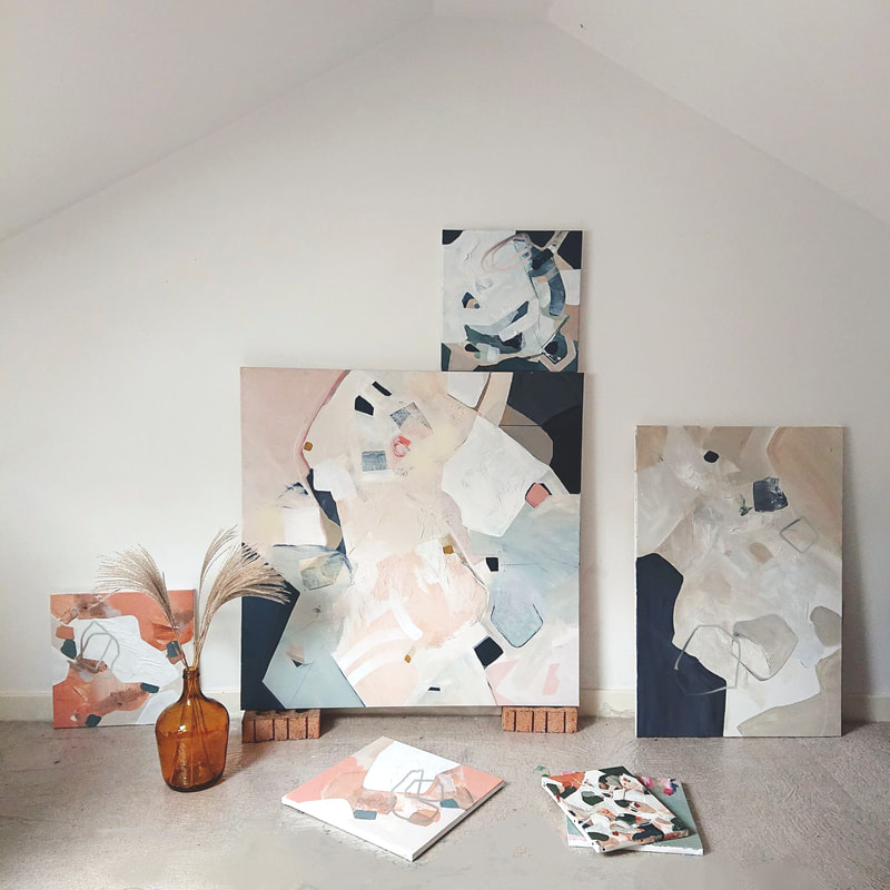
Silver Linings.Lockdown has been the first opportunity I’ve really had to fully explore this side of my creativity freely and I’ve said repeatedly to family and friends its been the silver lining of CO-VID. I have formally set up my own website and business, ChristinaStudio and started posting more paintings online and really trying to market myself and my brand (very much a learning process!). More commissions have started coming in which I am so grateful for. I’ve been lucky enough during lockdown to work with some amazing clients like I.am.Nomad and Louise Bramhill Interiors in Glasgow to name a few. My paintings have been sent to England, Scotland, Wales, Ireland, South Carolina, and the Democratic Republic of the Congo. Just the thought of having them all over the world in different homes fills me with absolute joy. Hopeful.One day recently I was packaging up a few pieces of art in my studio I had just sold. I had a thought about how this time is a scary one for all creatives right now, I know so many who are either redundant or are facing redundancy and are struggling to see what the future holds for them. It is inevitable that some days will be good and you’ll feel positive, and others will be bad and you’ll feel like giving up. While thinking about this and all of the other people affected during this time, I had a thought that no matter what life throws at me nothing will be able to take away my passion and drive to create paintings or interiors. This is something that I’ll always have in me, and in that I’ve found a strange sense of comfort. This applies to anybody who has their own unique way of creating and seeing the world - just because co-vid has happened doesn’t mean you've lost it - embrace what you have to offer and remember you are not alone! I thought if I lost my job that would literally be the END of me (sounds dramatic but seriously) but at this point during lockdown I’ve figured out it might only just be the beginning. Follow my progress here on my blog, and follow me for daily updates via instagram and facebook (links below.)
1 Comment
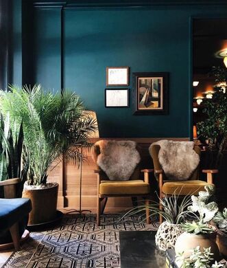
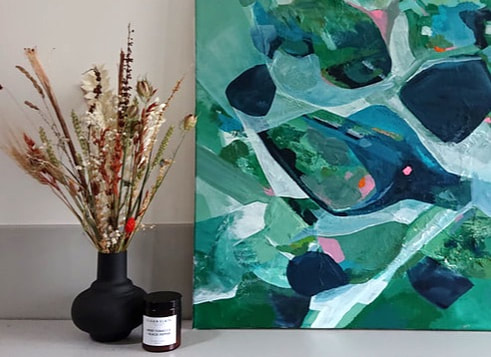
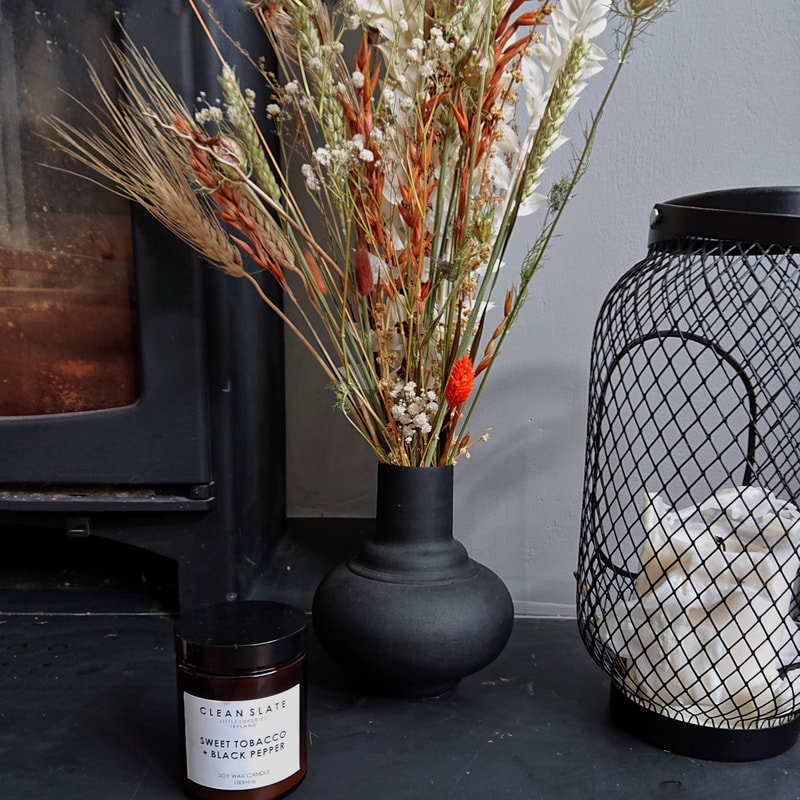
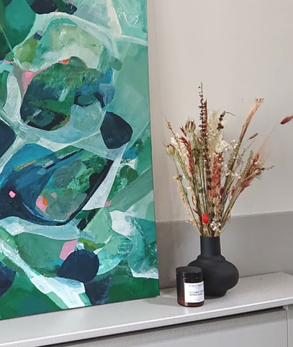
Products from I am Nomads shop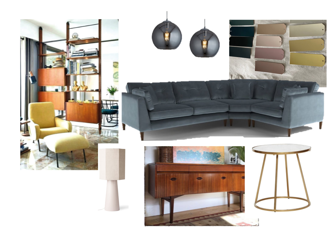 The Mood Board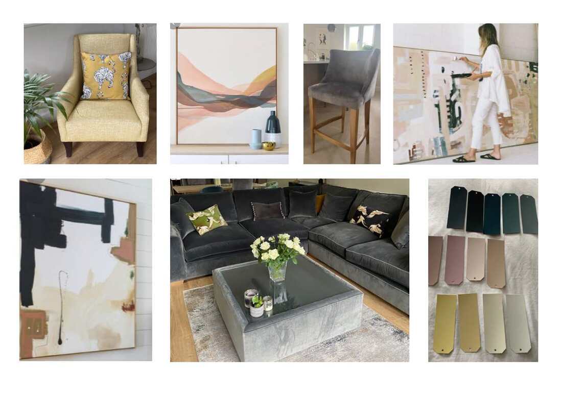
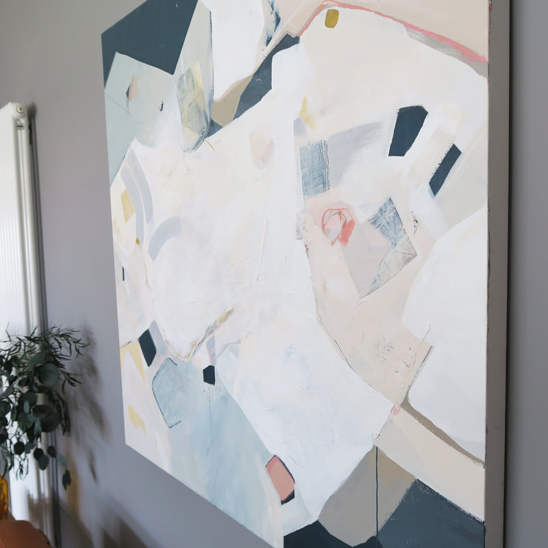
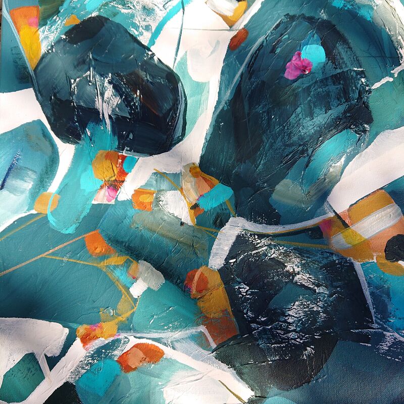
The Finished Piece
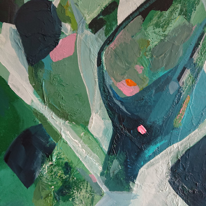
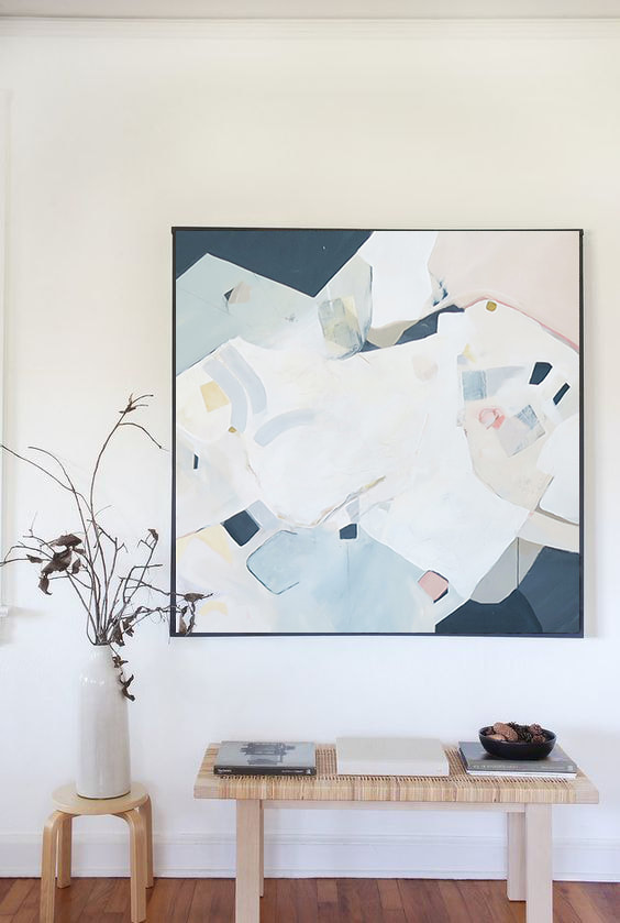
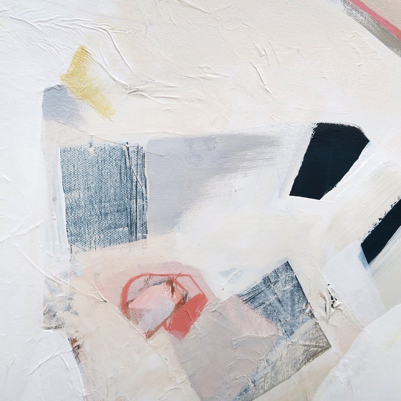
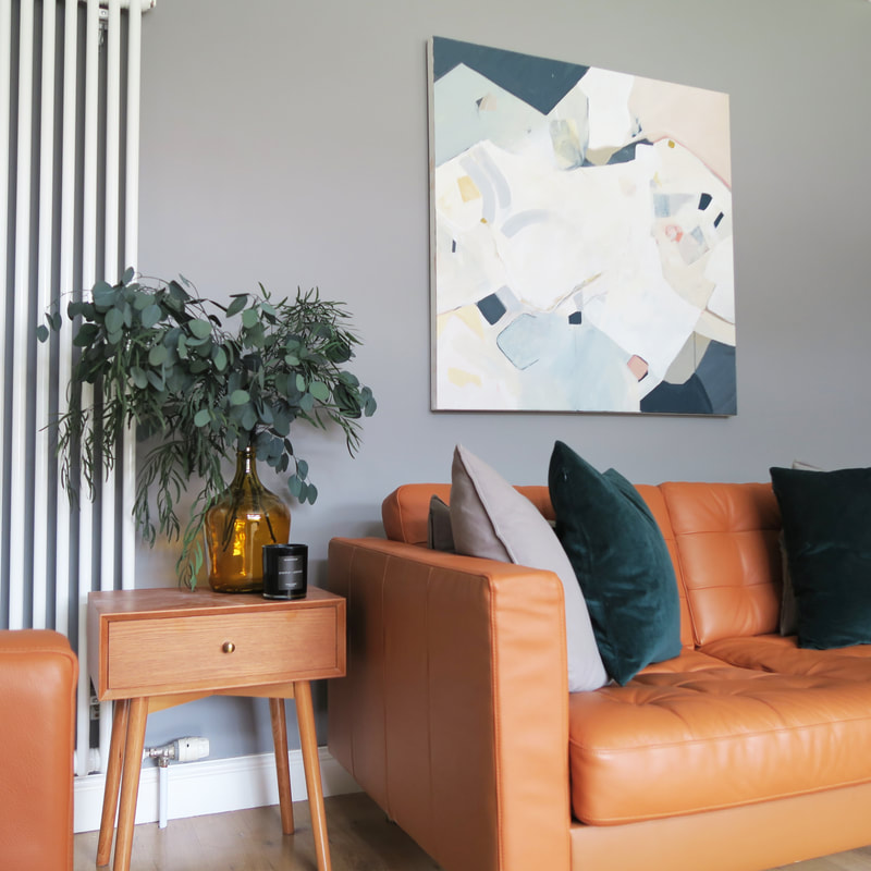
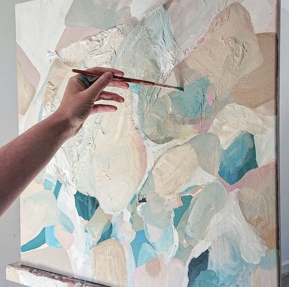
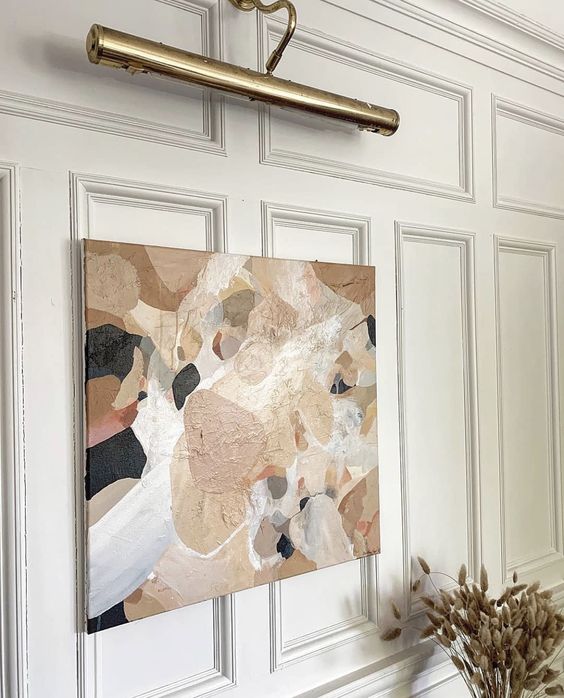
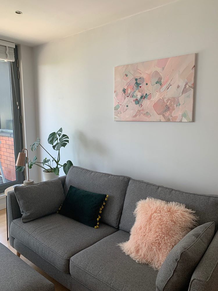
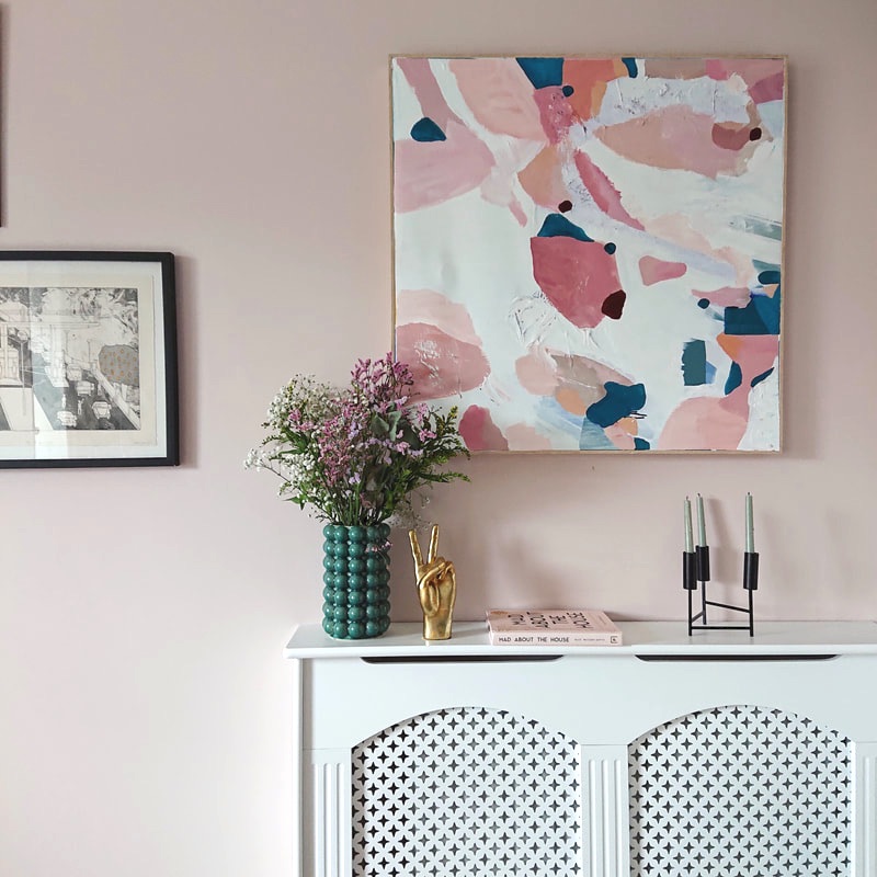
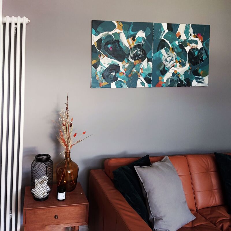
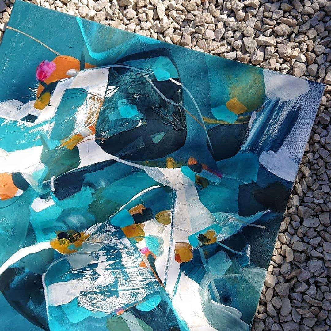
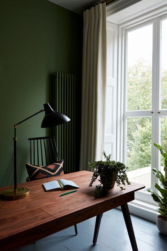
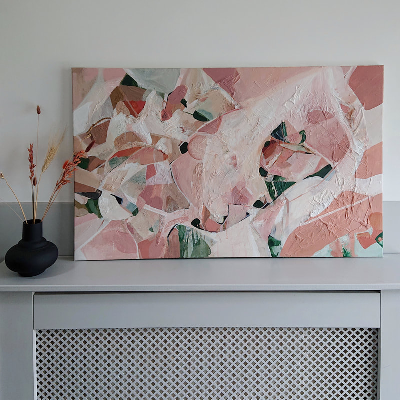
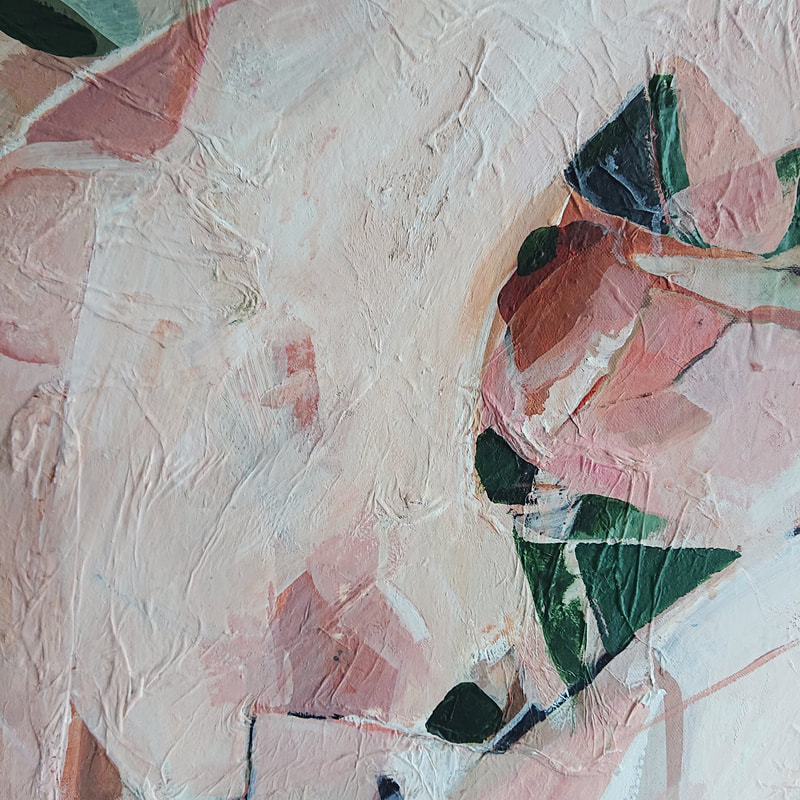
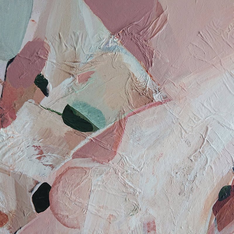
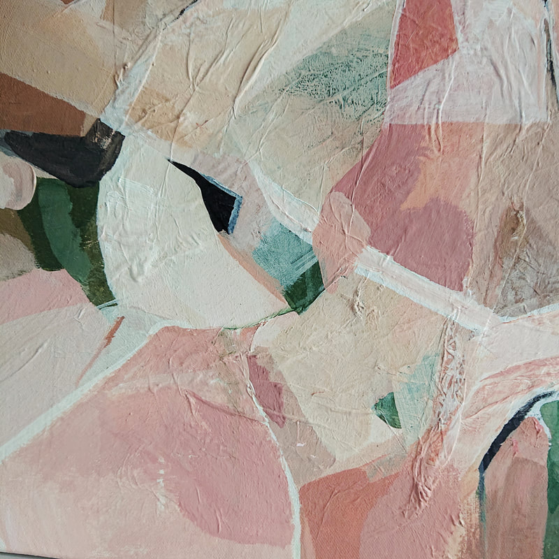
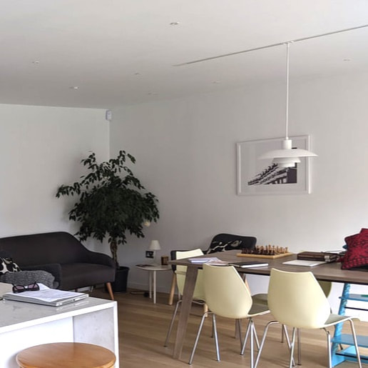
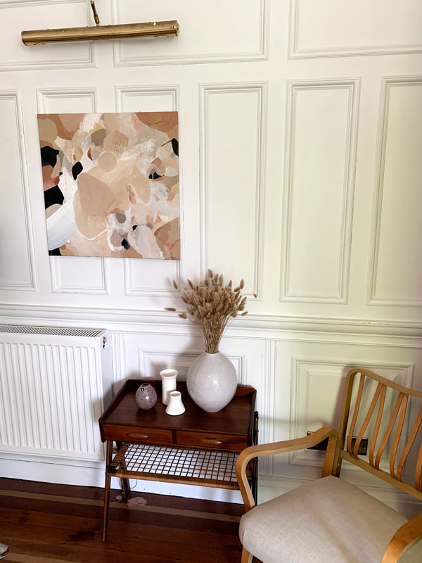
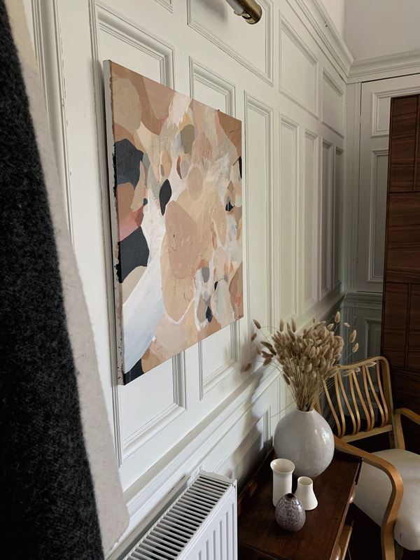
Initial MoodboardsThis month I had the chance to create a super feminine piece of work which was commissioned for a modern new build in Glasgow. The interior itself was very neutral with pink accents and an emerald green velvet chair & cushion. There was also copper in the solid furnishings and lighting which allowed me to introduce subtle hints of warmer colours. The client wanted a rectangular piece to sit above the grey sofa. The Finished Piece.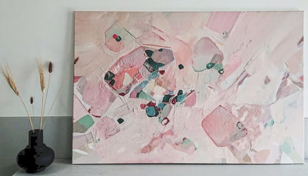
MoodboardThe painting.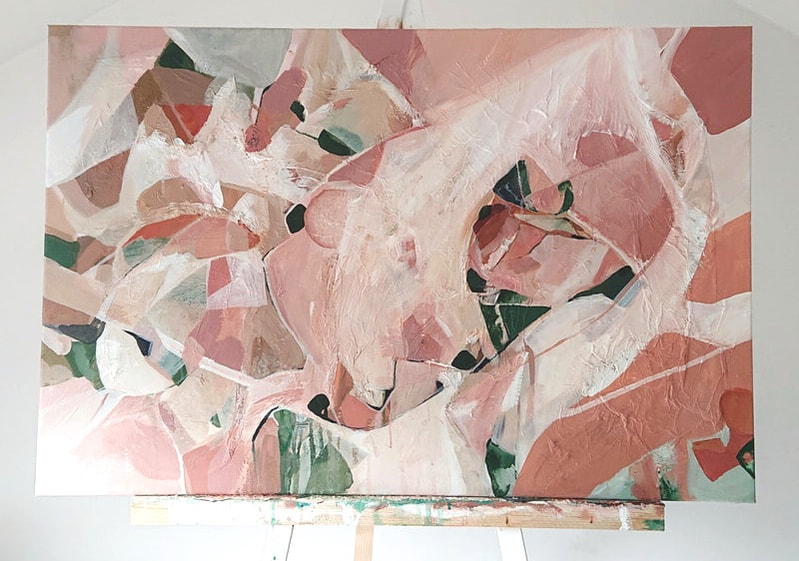 I was really happy with how this piece turned out, although it was a slow process and there was a lot of trial and error with composition - once I got there I think the piece looks super statement yet soft because of the colours chosen, and the client loves it.
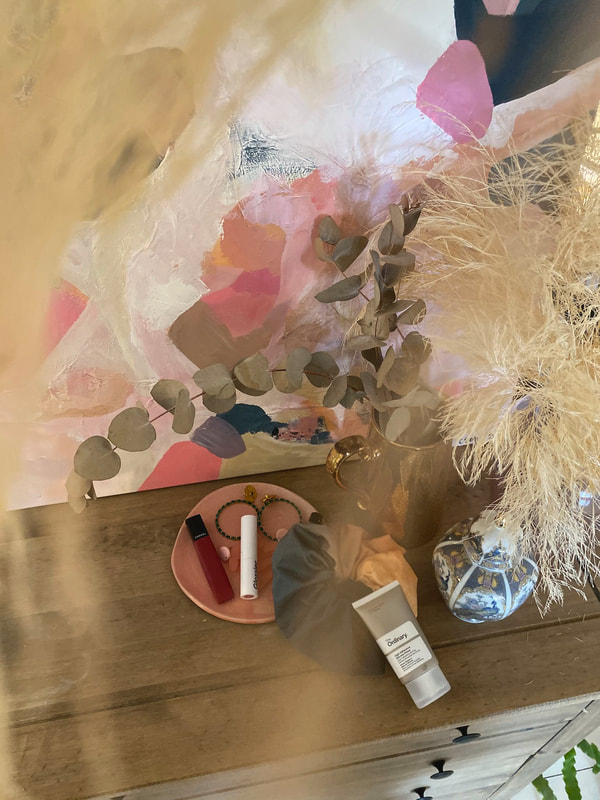
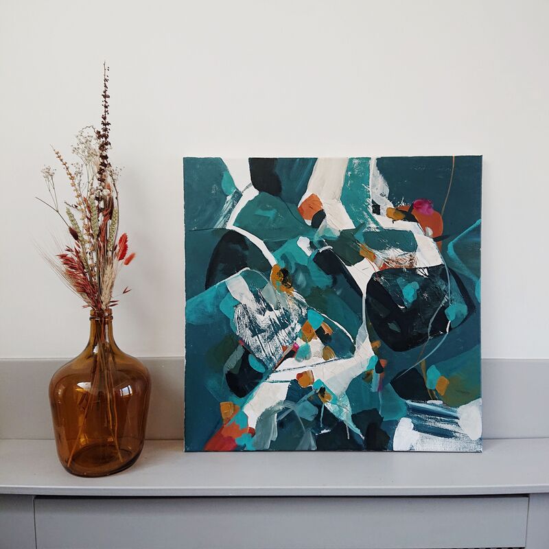
This will be packaged up with a lot of love and care and sent to its new home in Manchester, I'll hopefully get some pictures from the client and do an update with how it looks in its new home. I love seeing how the pieces sit in the interiors they are designed for. Watch this space!
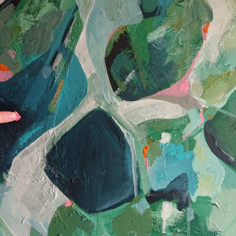
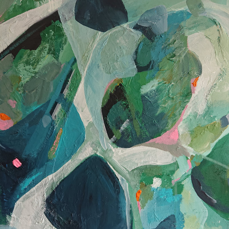
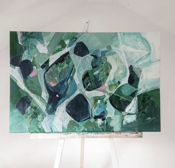
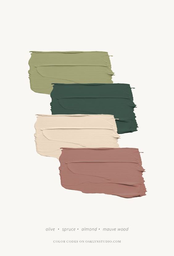
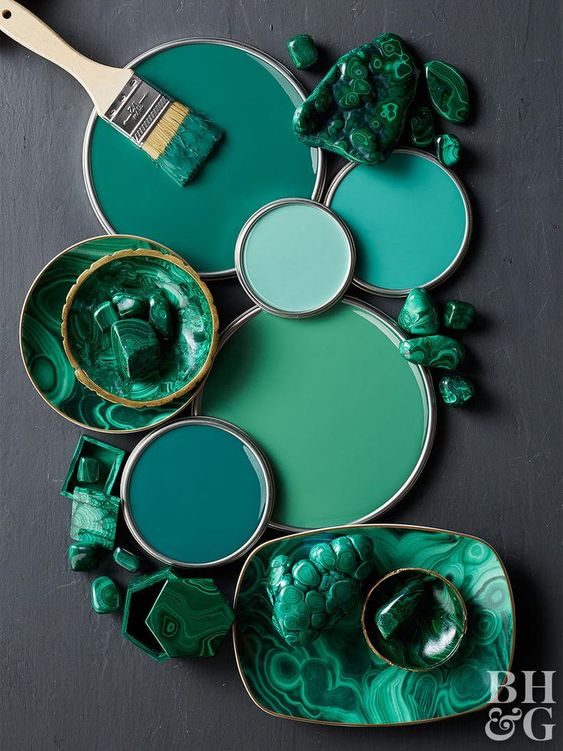
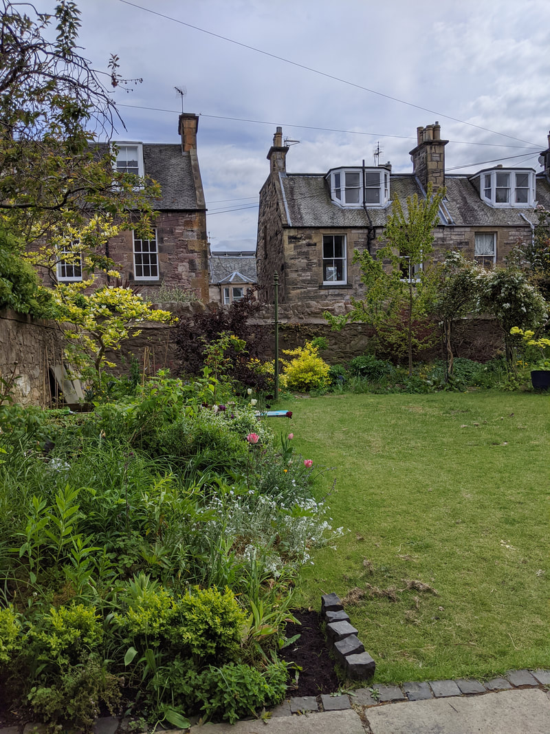
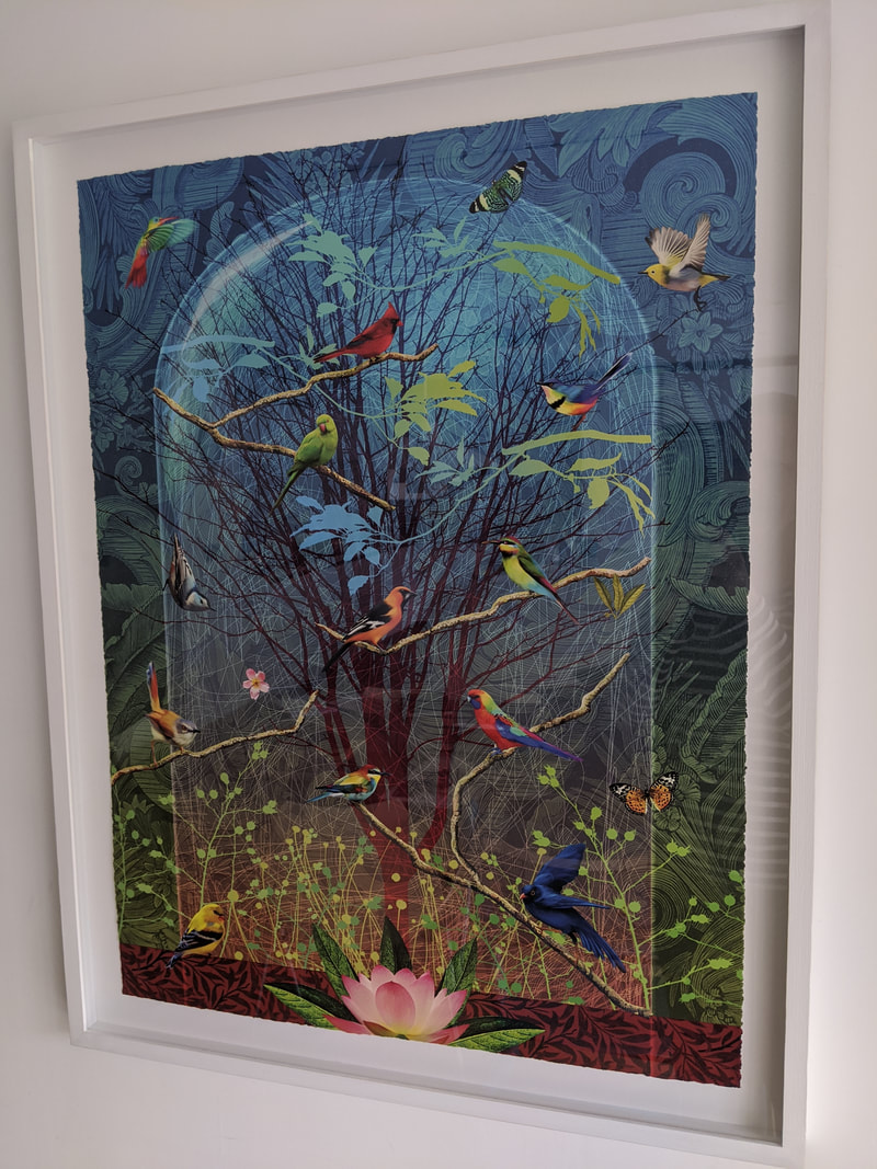
The PaletteThe Inspiration..The main inspiration I took from these pictures are of the garden and an existing piece in the space. I loved the greens and blues in this digital print - and the pops of pink in the florals in the garden. The final piece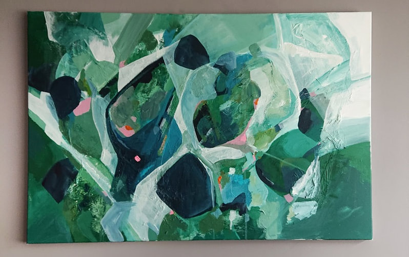 'The Japanese word Komorebi describes the moment when sunlight filters through trees and leaves - the interplay between the light and the leaves.'
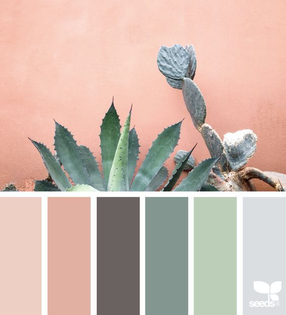
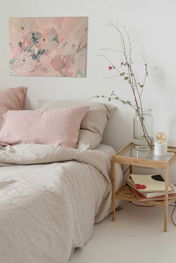
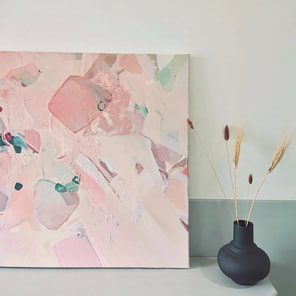
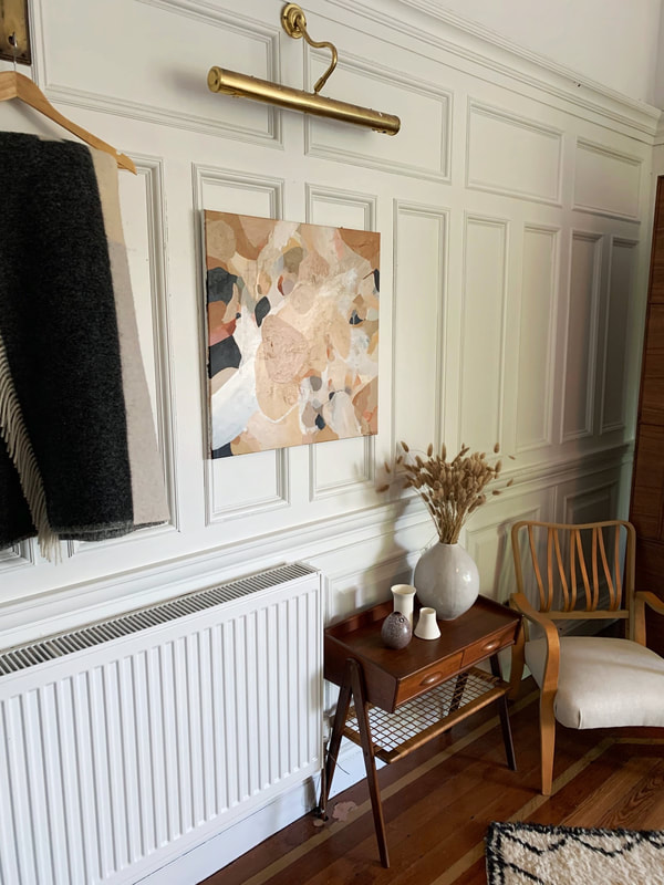
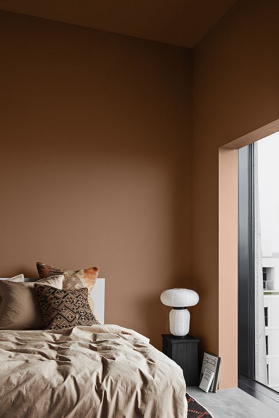
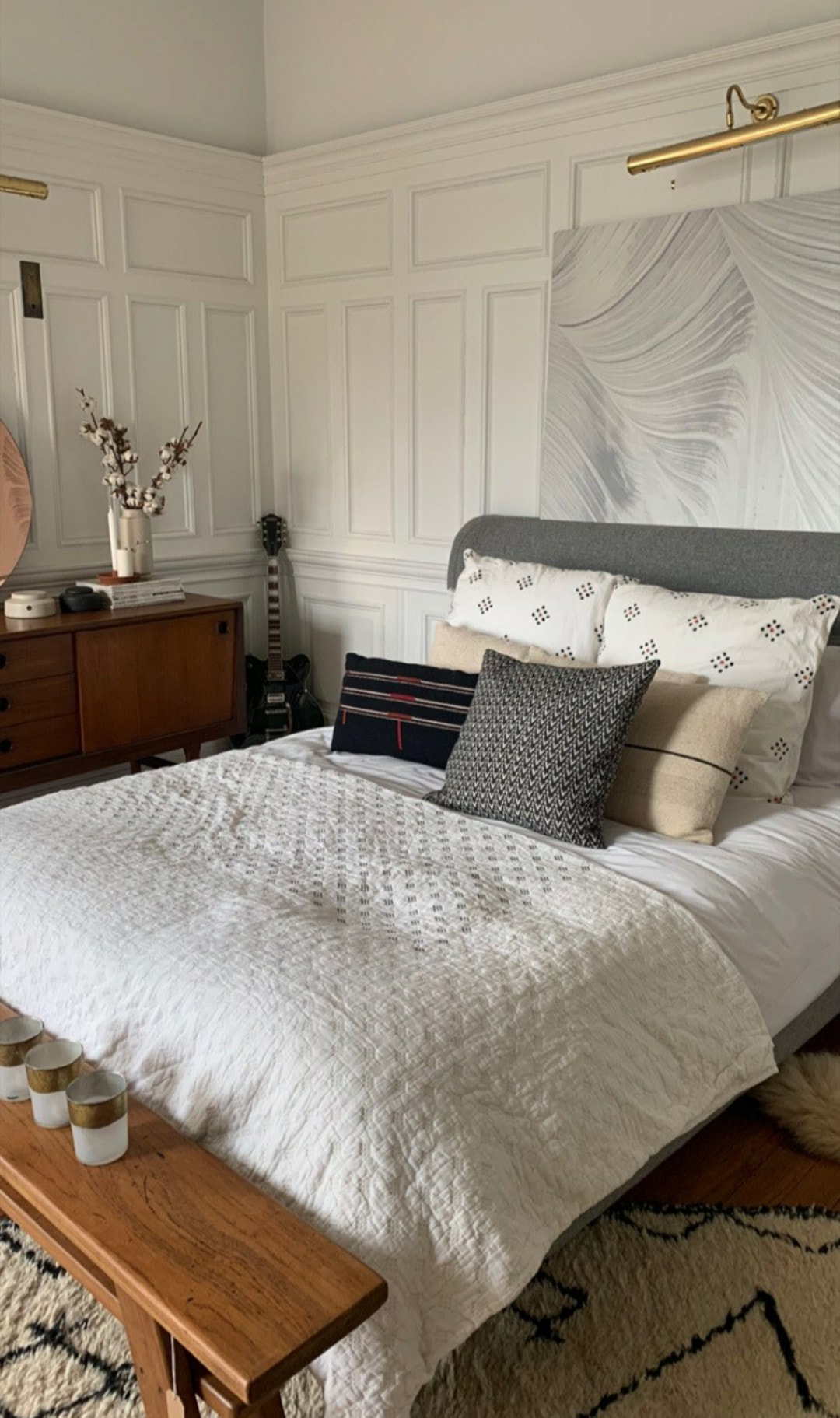
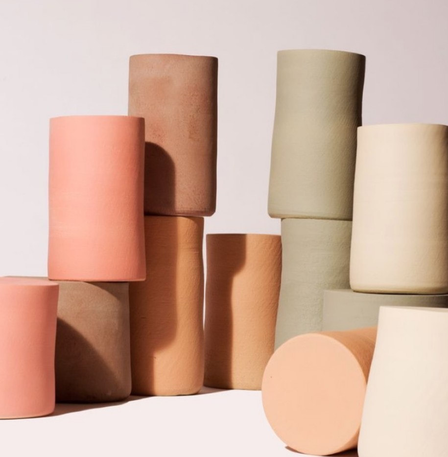
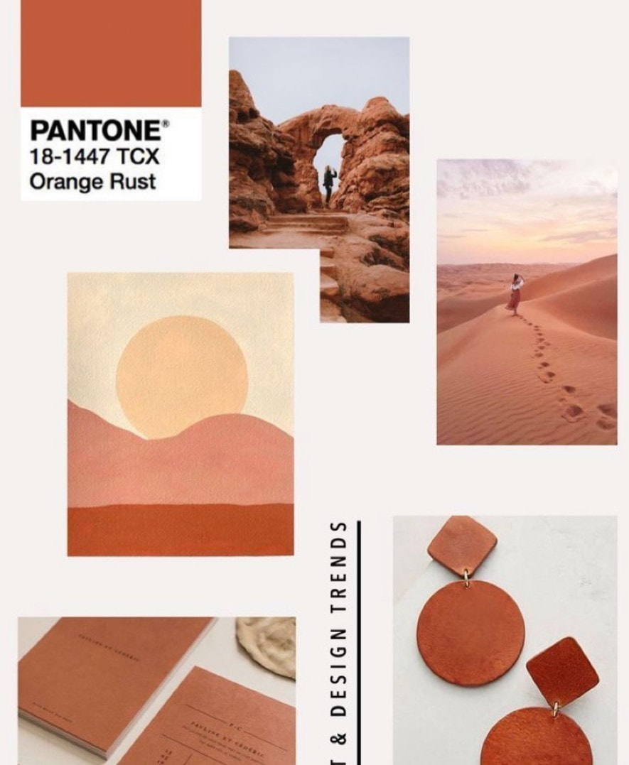
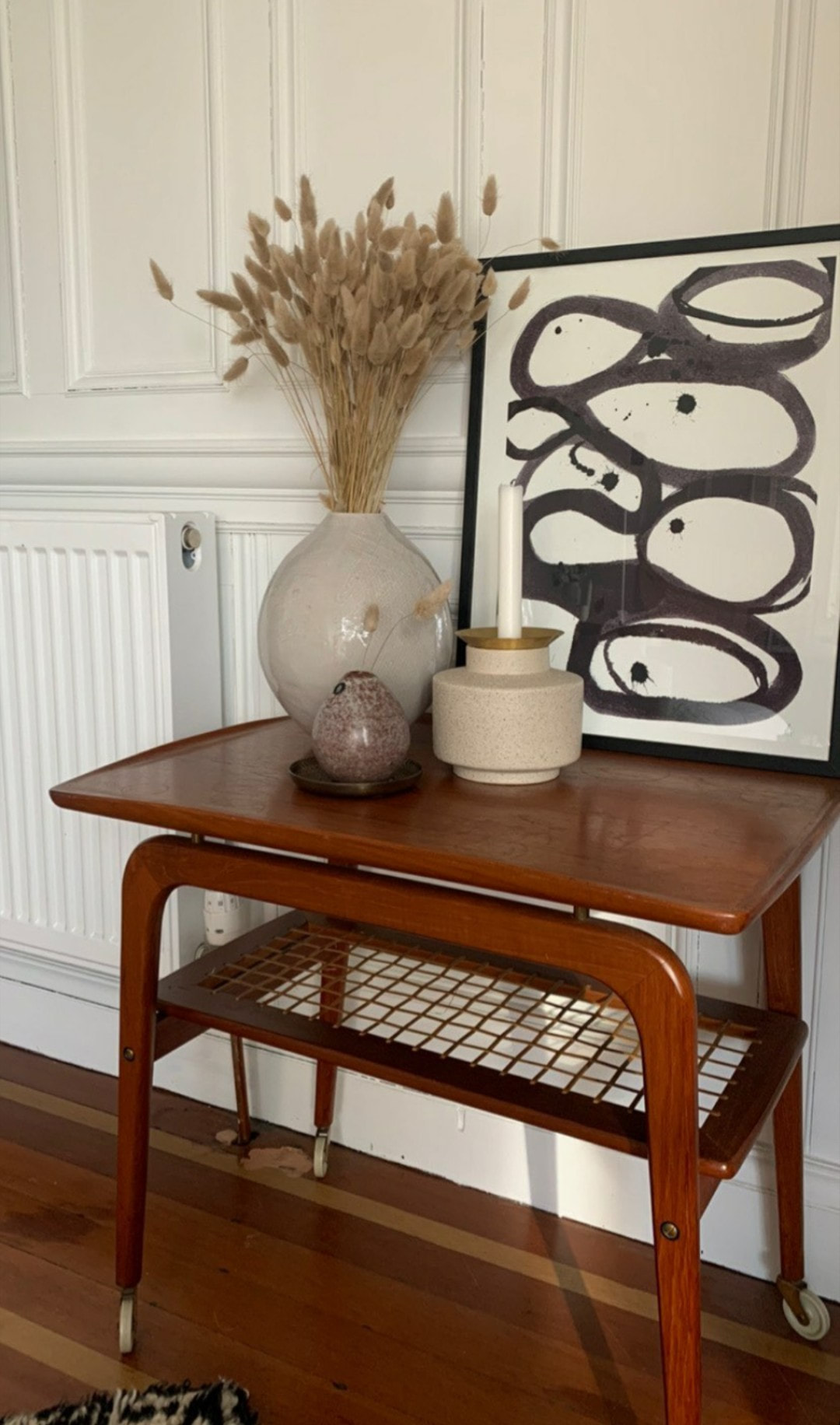
These are some of the images Claire sent to me in regards to colour palette for the piece. You can see how this would tie in to her guest bedroom palette - think fresh, contemporary with warm terracotta colours. I got started and sent her pictures and videos throughout the process. My first attempt with this piece was a bit pink, and had to reign it back in to become a bit more neutral. This happens more often than not on a commission, and why it is so important to me to work closely with the customer to make sure I am on the right track for their vision of what they want in the room, as well as mine. I find working with the customer closely to be more rewarding, as its more like a 'collaboration' and makes it much more interior focused. The guest bedroom has a definite Scandinavian look, along with eclectic ceramics and warm tones in the furnishings. I was particularly inspired by the ceramics and pottery pictured in the lower left image. I wanted to capture the textures, beiges and clay colours which capture the room so well. The finished piece...Ta-da! The finished painting. I called this 'clay sunset'. Clay because it reminds me of handmade pottery, sunset because of the warm colours and fades. You can see how the colour palettes that Claire had chosen & the mixture of the existing room interior has influenced the final piece. The size for this was 600 x 600mm, and was mostly acrylic combined with some collage to create a lot of texture.  I dropped this off to Claire as she is Glasgow based, and it was amazing seeing it being featured in her open virtual house at the weekend along with all of the other goodies on offer (the full video I will link below). You can shop the look for this bedroom and the rest of the house via her website. This piece was a pleasure to do, I had so much fun, and it looks amazing combined with her eclectic taste - now I can't wait to get started on my next piece! |


 RSS Feed
|
|
Contact us |


|