|
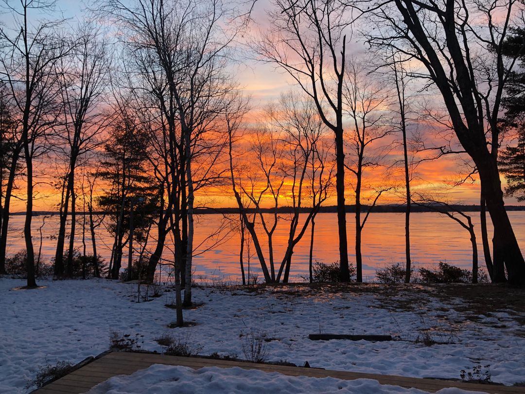
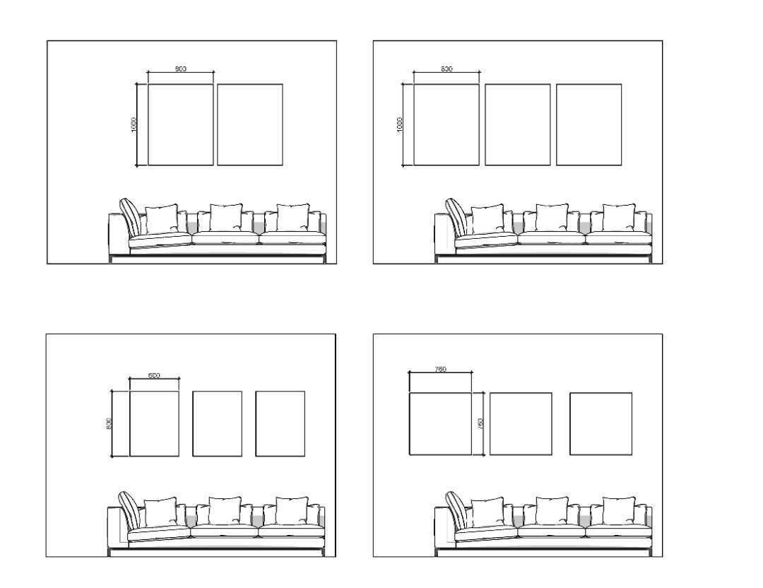
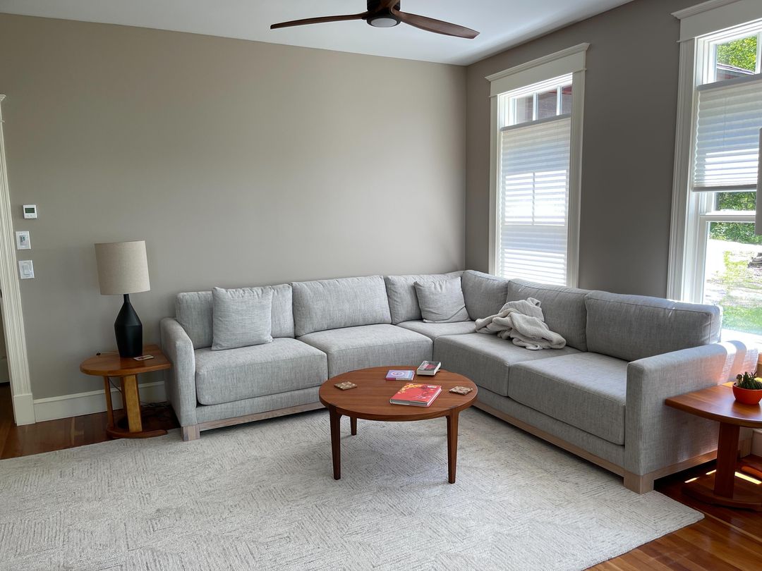
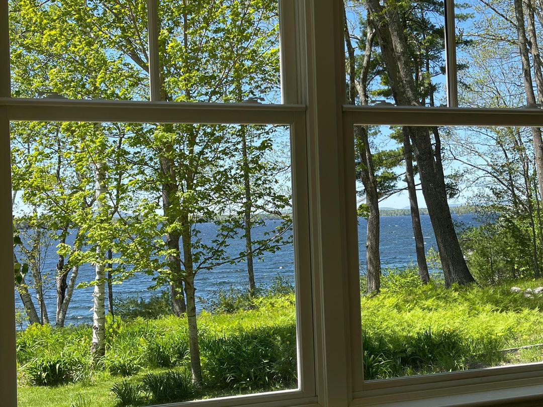
Between life & work the time to write a blog at the moment is a luxury, and something I have not done for a good while - but for these two commissions I just had to! They are so special. I was approached from clients 'over the pond' in America to create something special for their lake house in Maine. They wanted two or three pieces above the main sofa. The sofa looks out onto the lake. The space is fairly neutral, but they had one clear objective: bright orange needed to be in the painting. As always, I ask clients to send through pictures of the room before starting a mood board to give them a feel for the painting. To get a good feel for sizing in the space, I worked up an elevation showing the canvas sizes against the sofa size. I've been doing this a lot with clients who are not sure which size to go for - I find it really helps narrow things down. They decided on two 100 x 80cm canvases. The pictures below show the scene to the lake - and the sunset picture was my main source of inspiration for the paintings. The brief was to create something fluid and abstract, whilst capturing the 'feel' of the scenes below.
  The mood board put together combined red, brown and creams with contrasting greys and black. By definition 'A diptych is a painting or relief carving made of two parts, which are usually joined by hinges.' In this case the paintings didn't hinge, but when creating them I really wanted them to work together as one. 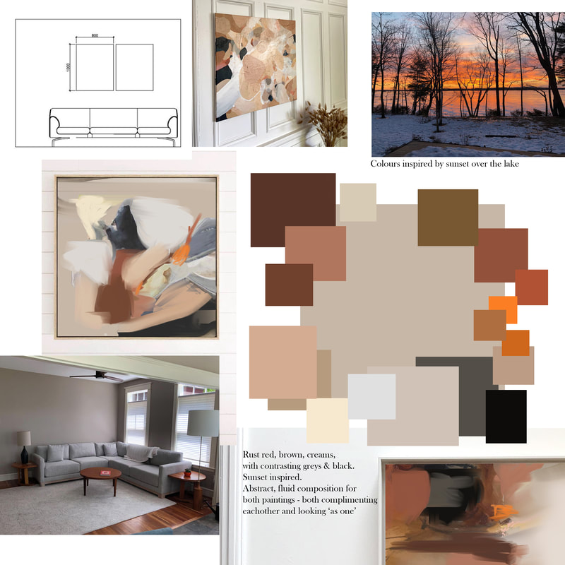 The final paintingsSometimes I'm lucky with the creative process and I'll work up something that the client loves so much it needs no changes! I put these together and really went with my gut on what would look good in the space combined with the colours / composition chosen. Once finalised, we discussed framing options and went with a white shadow gap frame. 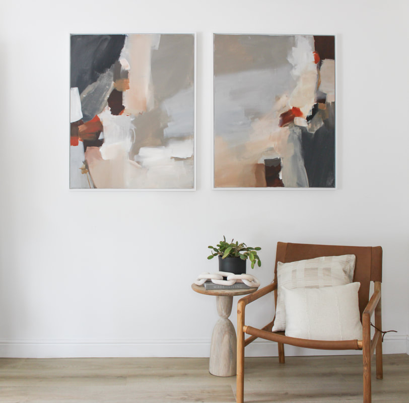 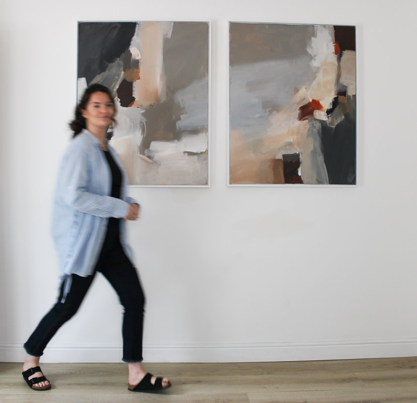 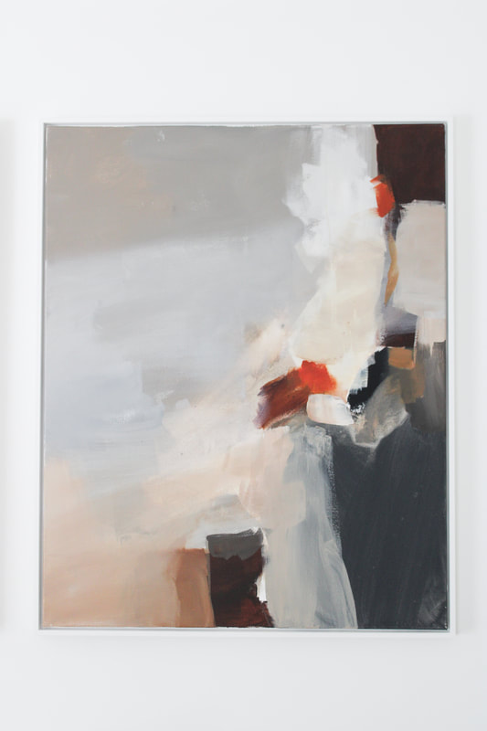 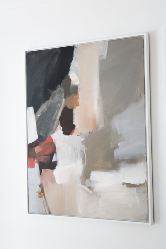   The paintings are my current favourite because they are so fluid in composition and the colour is so unusual. Red/orange can be quite a hard colour to work with but in this case the pops of vibrant red really lift the paintings.
Now I'm looking forward to shipping them across the Atlantic to their new home!
0 Comments
|

 RSS Feed
|
|
Contact us |


|