|
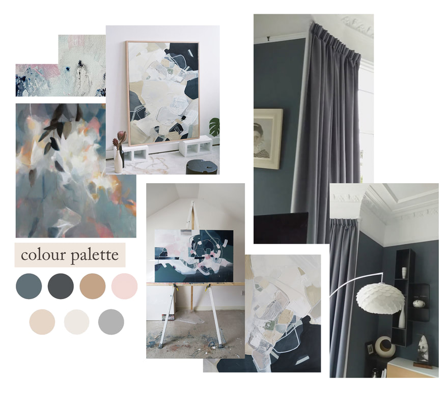
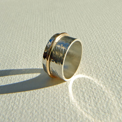
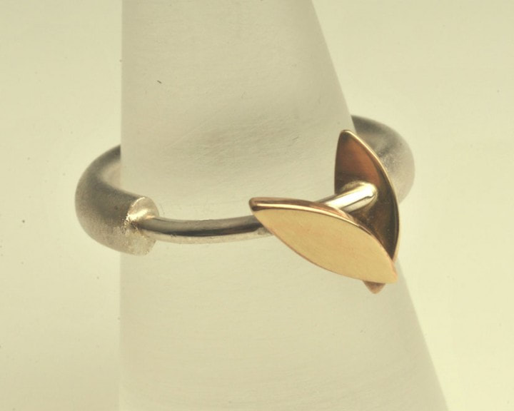
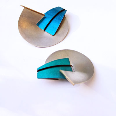
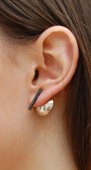
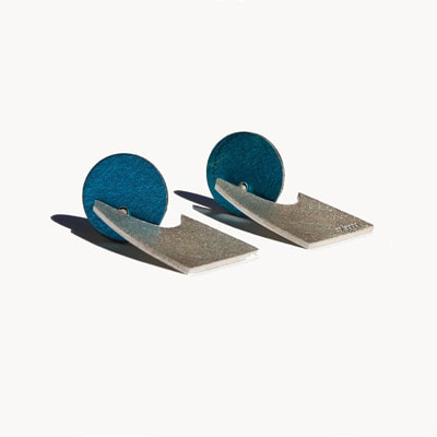
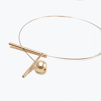
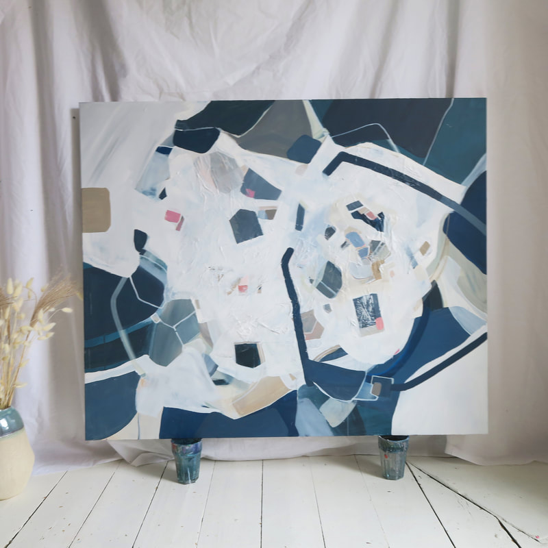
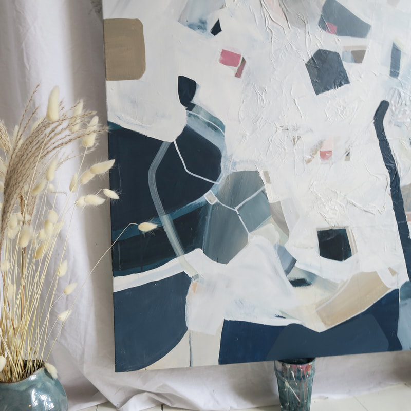
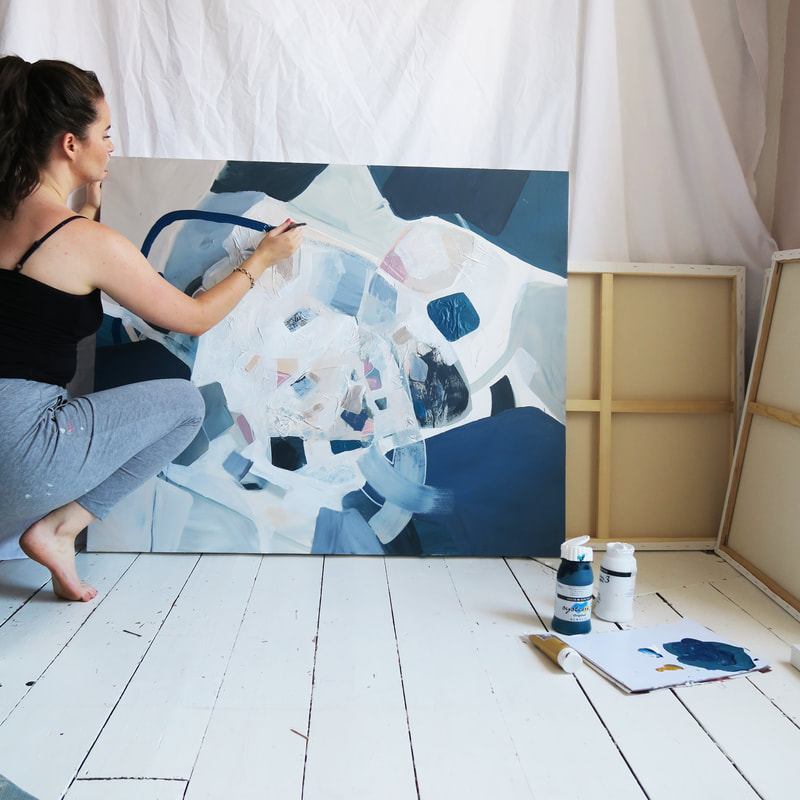
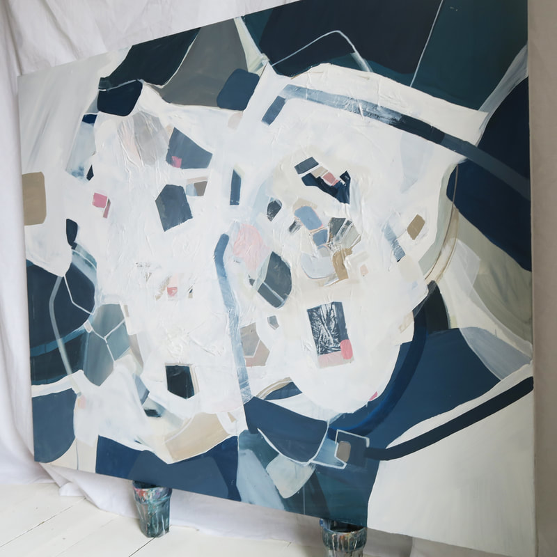
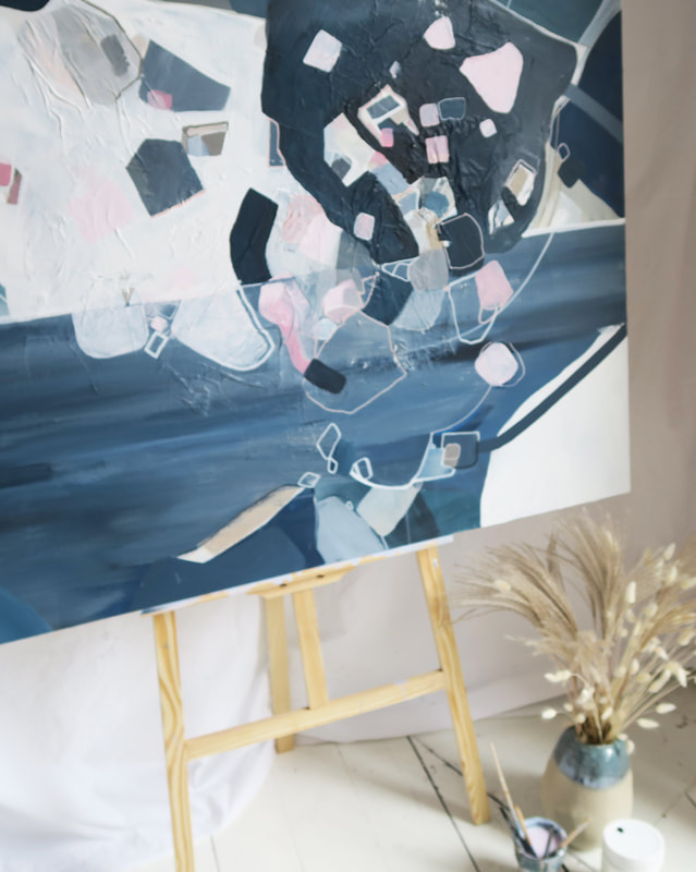
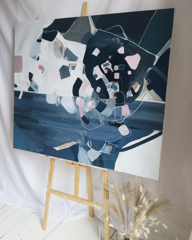
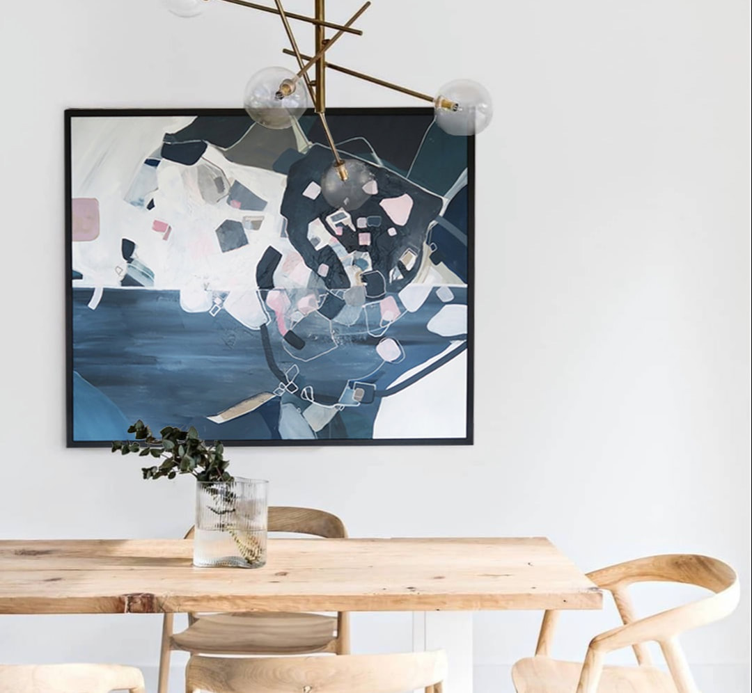
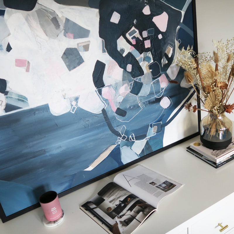
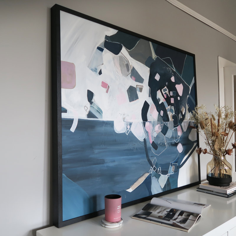
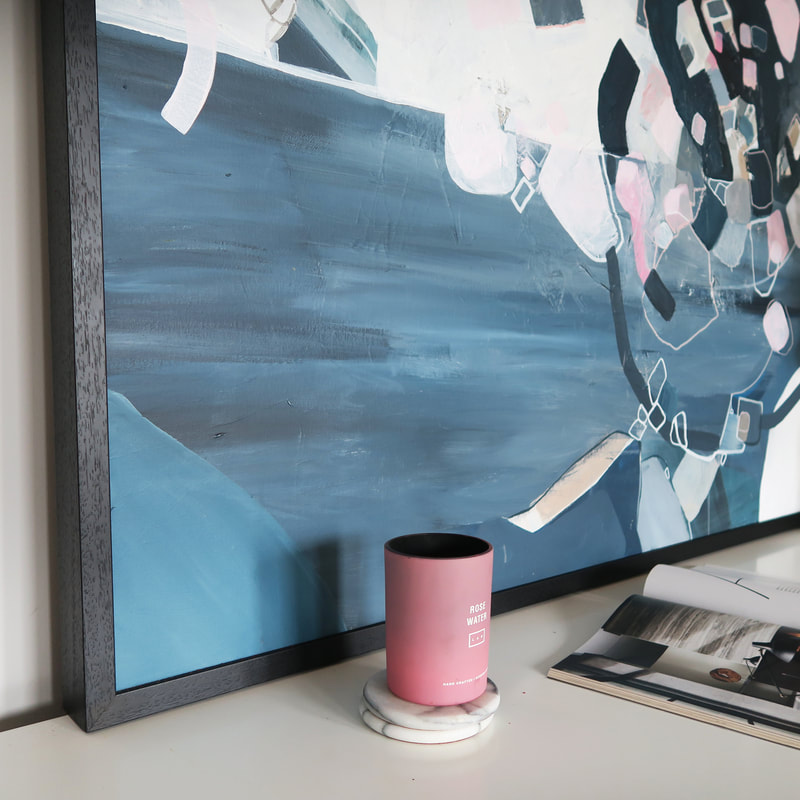
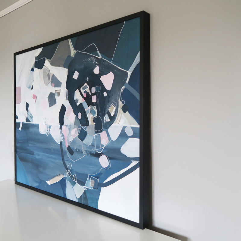
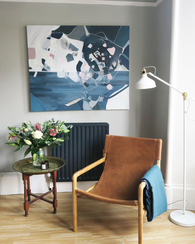
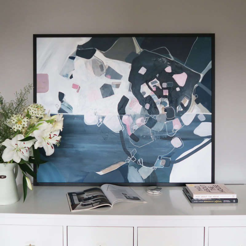
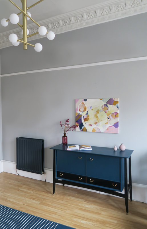
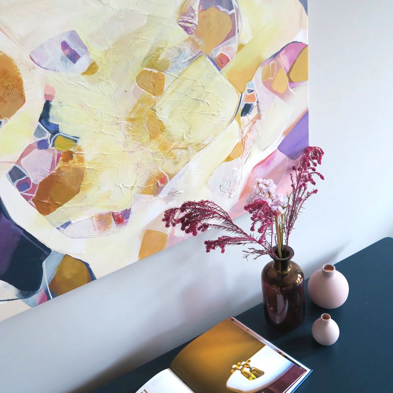
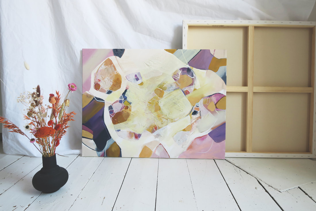
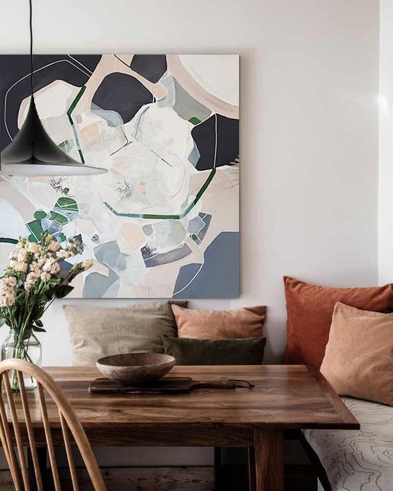
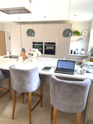
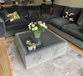
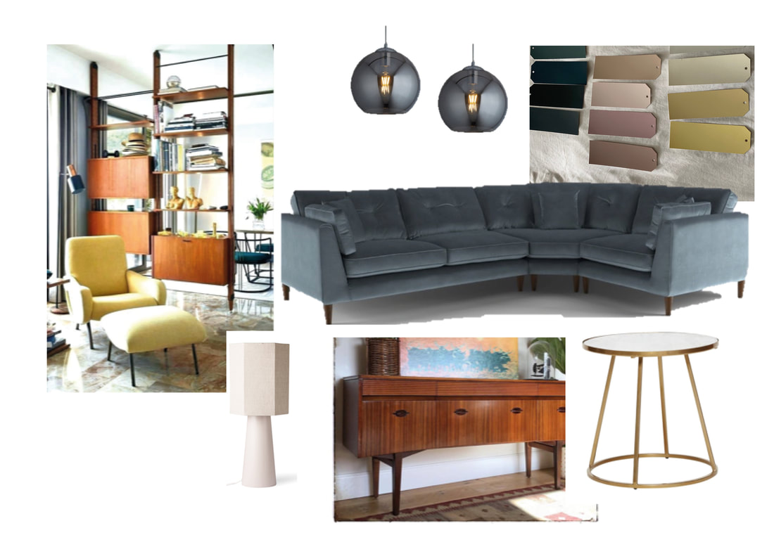
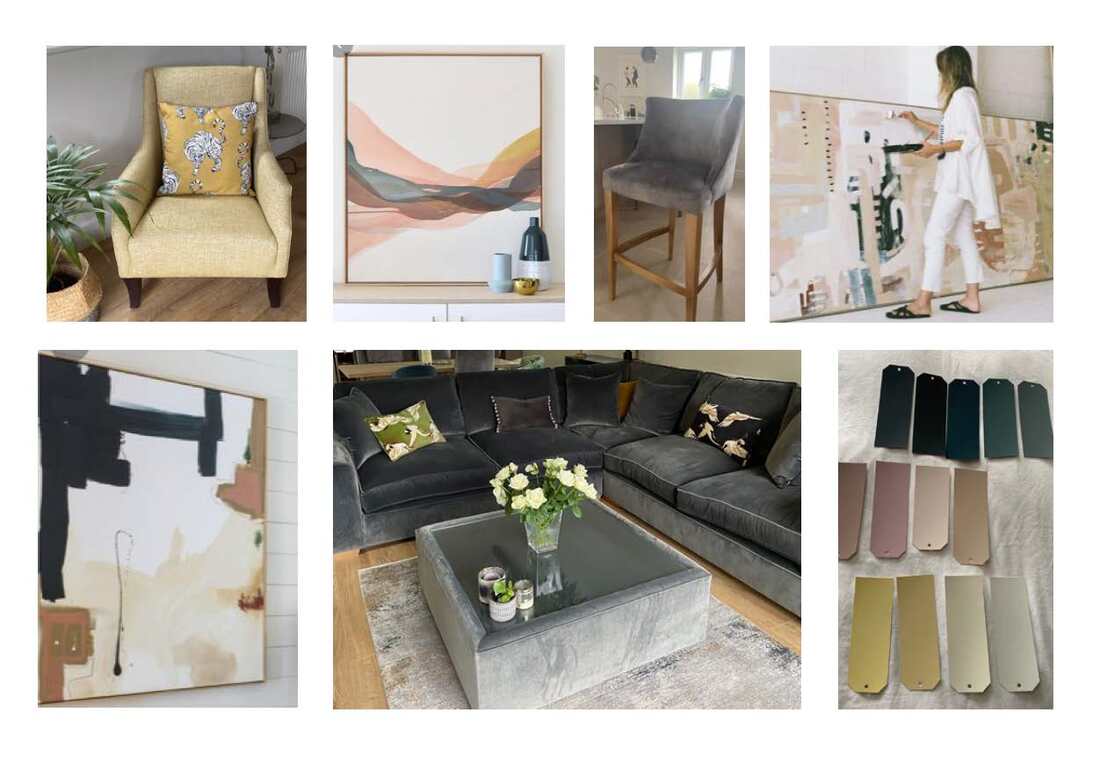
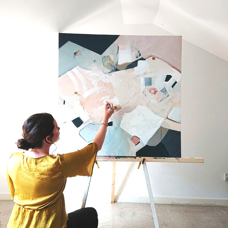
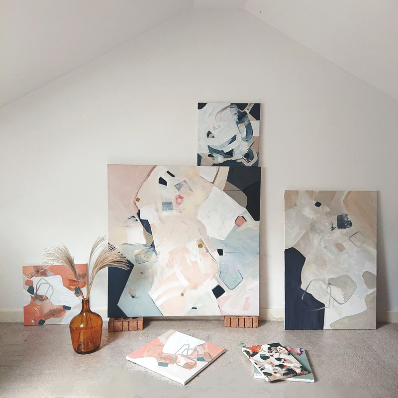
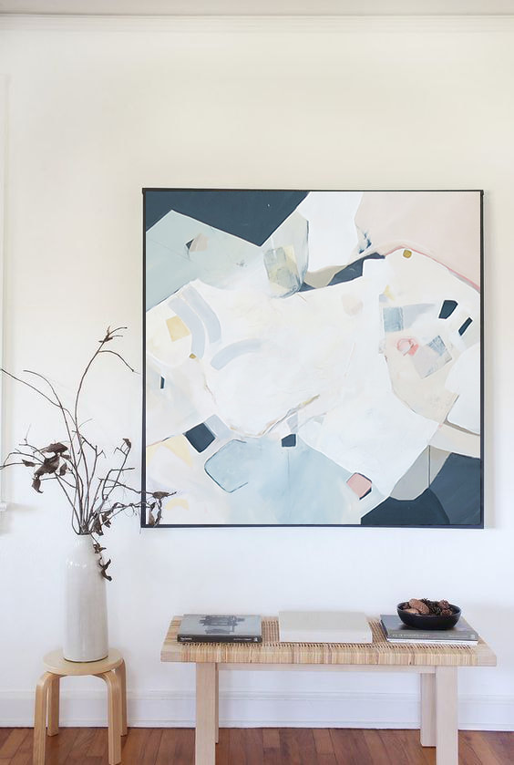
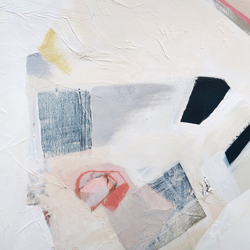
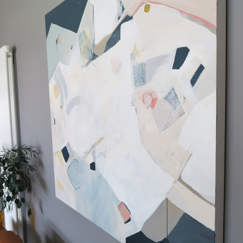
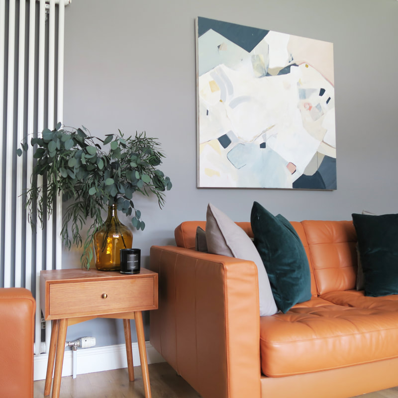
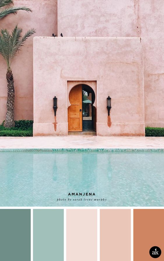
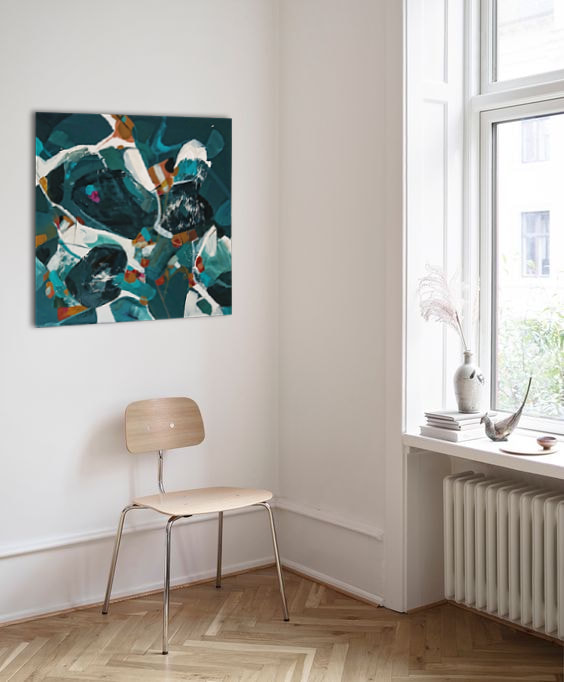
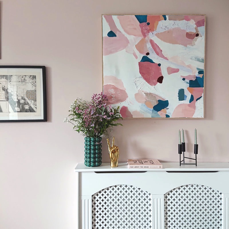
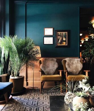
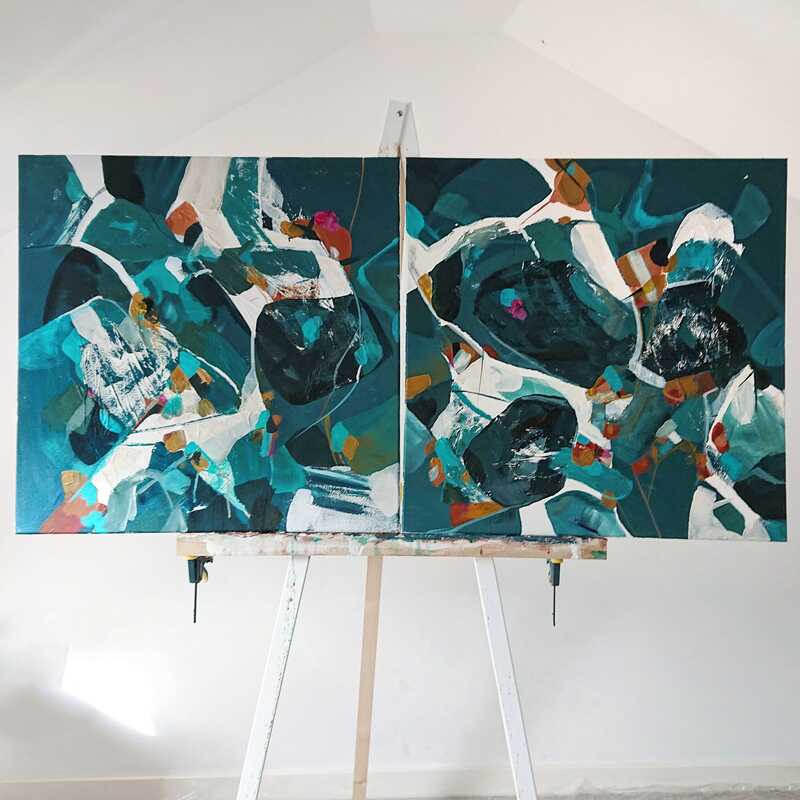
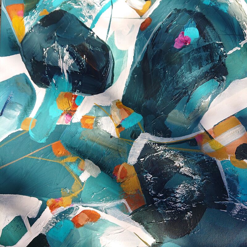
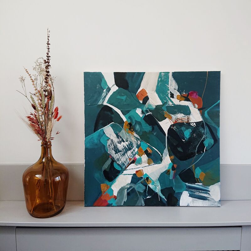
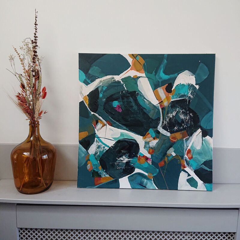
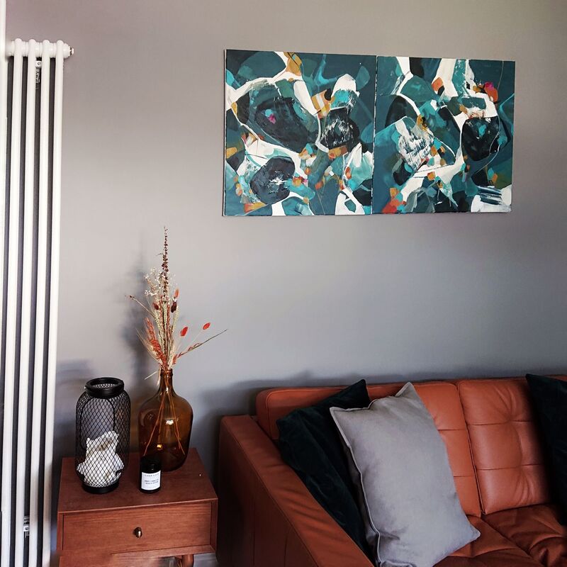
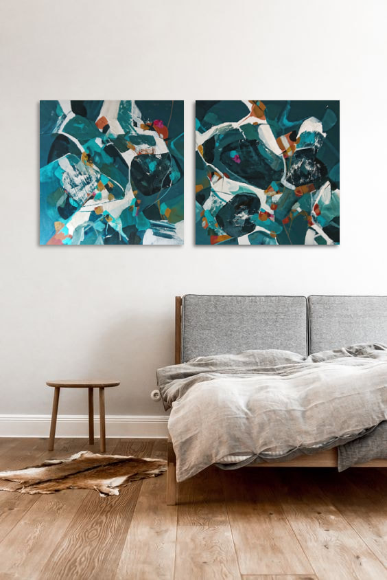
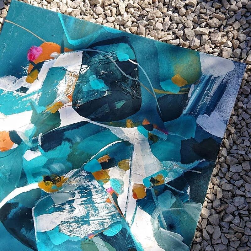
Since launching my business I have met many interesting people. The client who commissioned this painting was one of them. Helen owns her own jewellery brand (I'll link below), and makes the most gorgeous abstract intricate pieces. Working with someone who has their own creative vision is really exciting; and I'd say it was more like a collaboration between us rather than just me painting the piece on my own, which I loved. She asked me to work up a commission for her gorgeous townhouse in the west end of Glasgow. The main objective of this piece was to create something which would compliment the interior wall colour and the other artworks in the space, so everything in Helens living room would sit together in harmony. She wanted something moody, with deep blues, greys and dusty pinks. I wanted to also include some warm neutral colours as this would be used to tie in some of her furniture and accessories she owned. The mood board below shows shots of her room, and inspiration images and colour palette I used to create the painting from. The mood boardI wanted to use Helens jewellery as inspiration; which would add a lovely bit of personalisation into the painting for her. I focused on capturing some of the shapes Helen often uses in her pieces. Some are quite graphic, others are more organic. I had fun playing with pops of colour and contrasting linear shapes and lines. I tried to create almost 'jewel'-like shapes. Helens JewelleryStudio Shot & Works in ProgressIt took a while to get the balance working of the dark blue and contrasting white, you can see some of the top images are quite different to the final painting - again, its all a process and it was great being able to run things past Helen. The final painting; ready for its new home!I dropped the painting off to Helen in person which was lovely, and she sent some photos of the painting hung above her sofa. It looks perfect for the space and her grey walls and decor. I've decided to call this piece 'nights by the bay'. I asked for name suggestions on instagram and almost everyone suggested something sea themed - I can see why and it definitely reminds me of a peaceful water scene. Doing this piece was a pleasure and I'm really happy with the way it has turned out. Please give Helen a follow on her instagram below, and I'll link her website. I'm all about supporting small, Scottish creative businesses and her work is so beautiful!
0 Comments
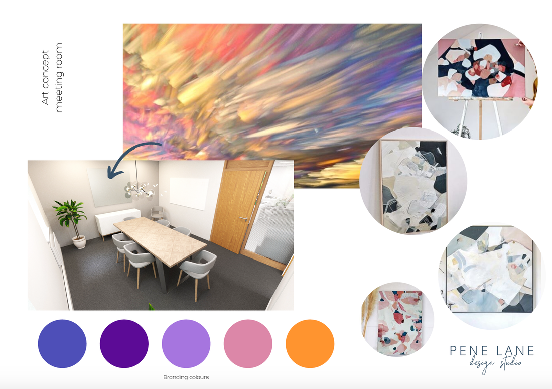
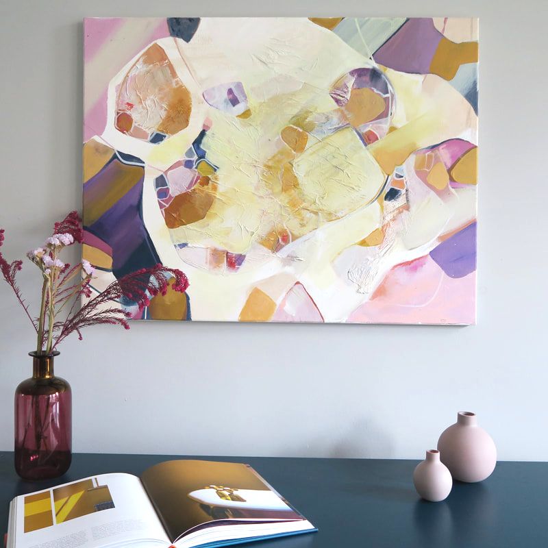
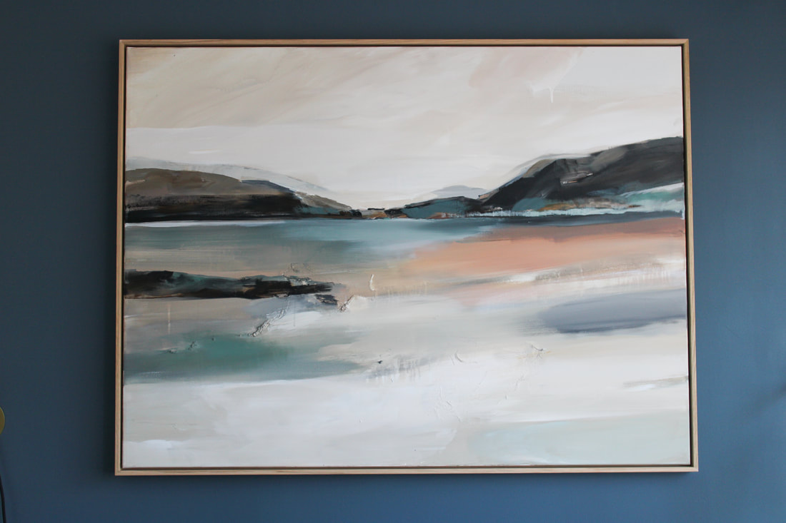
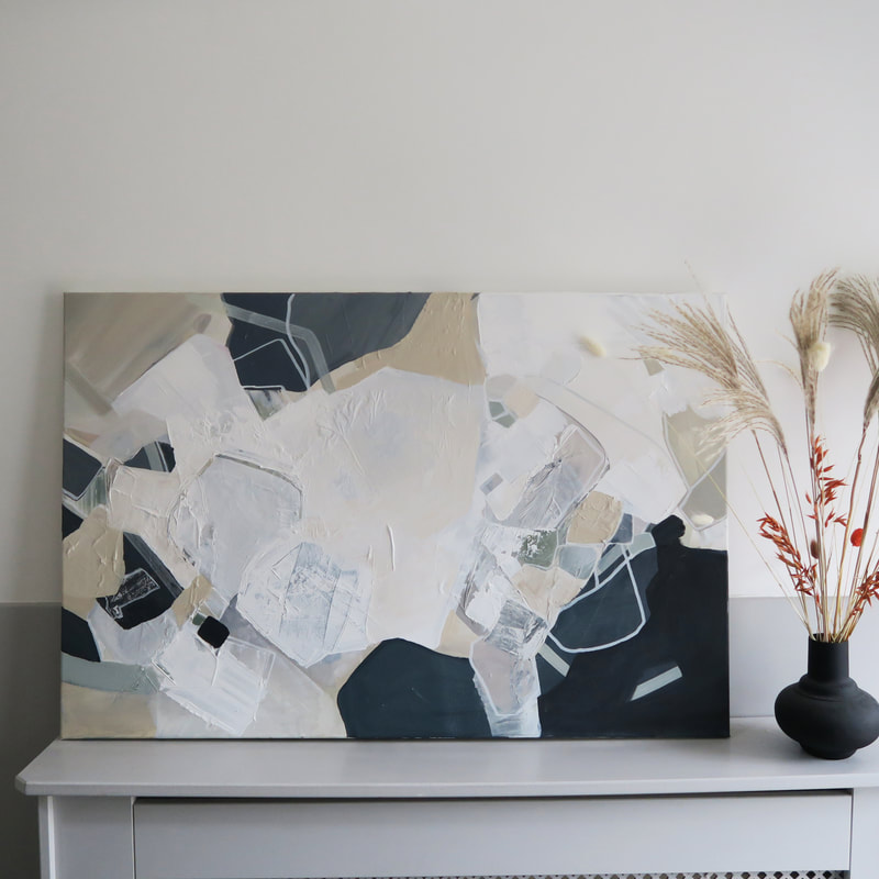
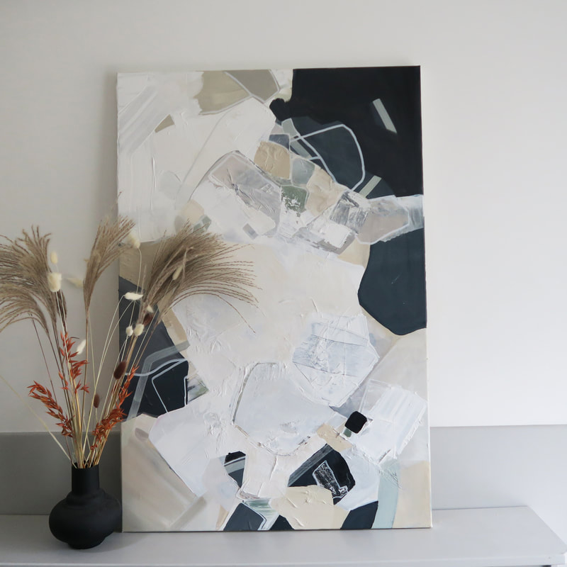
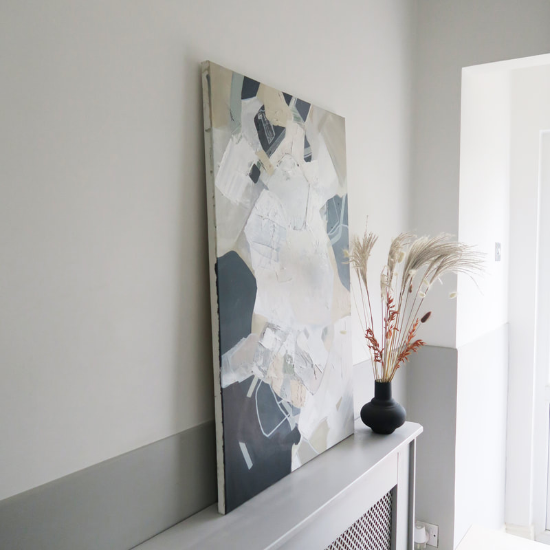
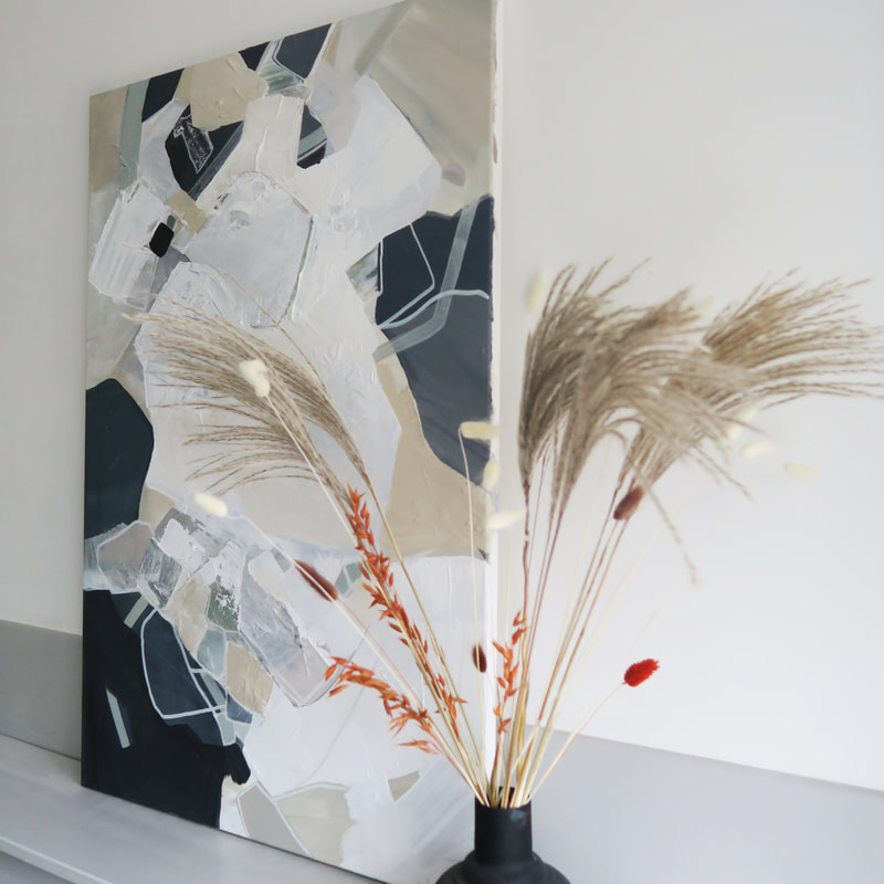
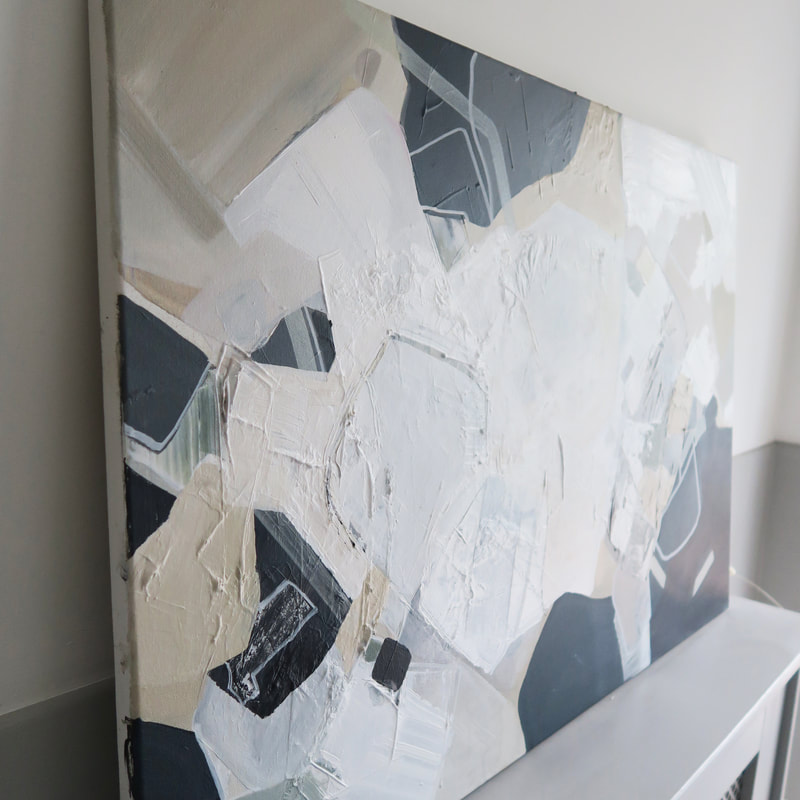
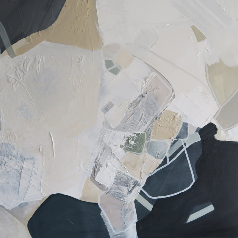
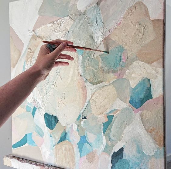
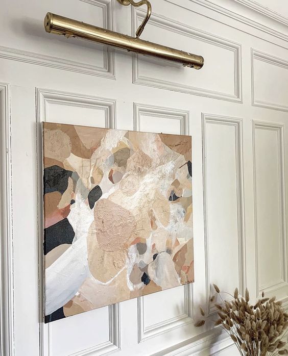
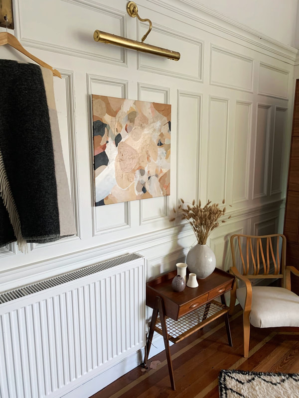
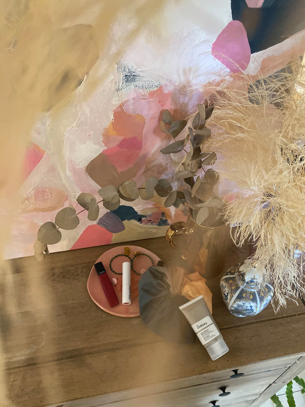
I was approached by the lovely Carima from Pene Lane. Pene Lane is a interior design studio based in Leeds and specialises in rental property design and corporate interiors. As I have a background in interiors, I was super excited to get started and work with another designer to help create their vision and satisfy the project brief. Camira and myself had a skype call to chat the project through. She sent me a moodboard she had put together and some information about what the client requirements were and why the colours were so important to get right. As always I referenced the colours, moodboard and brand image and made a start in my studio. I knew this would be a tricky commission because the colours are so bold, to get the balance right it would take a lot of layering and manipulation of colours. I imagine a lot of people viewing my work for the first time probably don't realise the process behind it - and this is what I remind many of my clients during the working up of a painting, it is very much a process and requires some back and fourth before I'll work something up that works for both me and my client. I always working closely with the client for feedback and keep them up to date on my progress, and this was essential for this piece. This piece took several attempts to get right with the help of Carima and her vision, but I'd like to think the final piece captures the brand image of the clouds very well. Here it is, styled up in my living room before it gets sent down to its new corporate office! I really enjoyed working this piece up because it had a very small, set brief and was a challenge - in a good way! I normally wouldn't ever work with such bright colours but I think that 1) it'll look fabulous in its neutral meeting room, and many modern offices incorporate bright colours so it'll look contemporary and fitting with its space. 2) its proven to me that I can work with colours out-with my comfort zone and thats a nice feeling! I also loved this because working with a designer means they have their own vision. Carima was lovely and it was an absolute pleasure to work with her. I've linked her website and instagram below and will definitely be keeping up with her future projects - she's always busy working on something new! This painting was named 'shifting sand' because it reminds me of the rocks and sand left by the tide at the beach. I feel like this piece was super special because the palette is very minimal, and this is something I'd like to continue to explore in my work. My client for this commission has very specific taste and style in her home and wanted to capture her style in this painting. Her home interior features lots of whites, creams and neutrals with hints of sage greens and dusty mint colours. She put together an amazing mood board, and I got started. 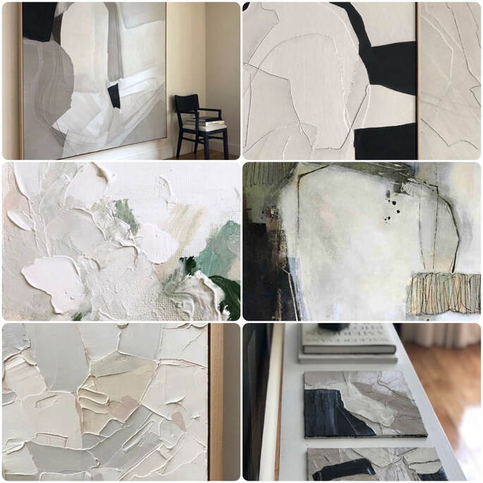 Her taste was super refined so I wanted to capture this in the painting. She liked these images of thick paint creating texture and then combining this with minimal colour, so I used my palette knife and layers of gesso to create the final textural piece. I also added pops of very subtle sage colours in to create a tiny bit of contrast - but the initial change in colour is so subtle that its almost unnoticeable! Once I had the texture and colours finalised, I then went in with finer details and small brushes to create linear mark making which added some more detail to the piece.
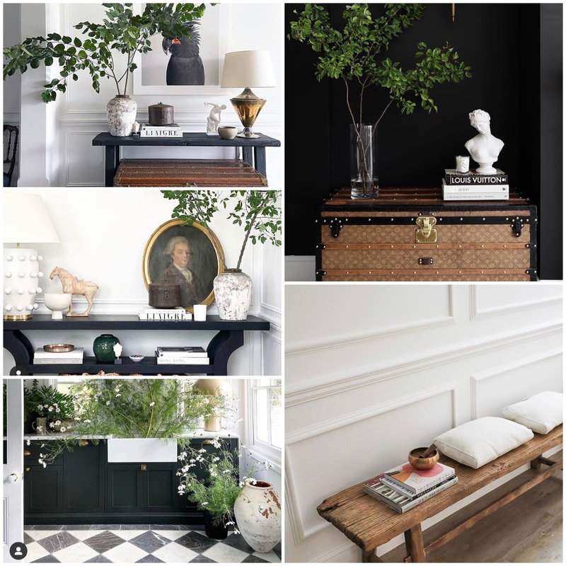
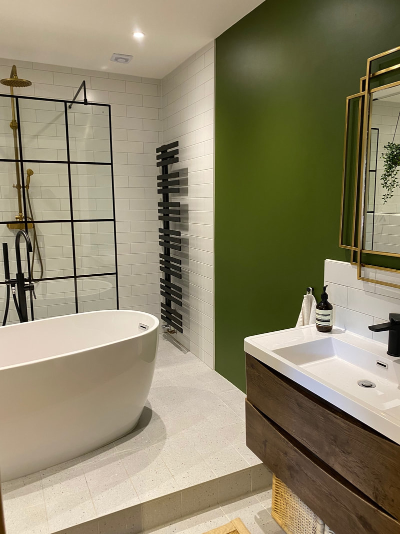
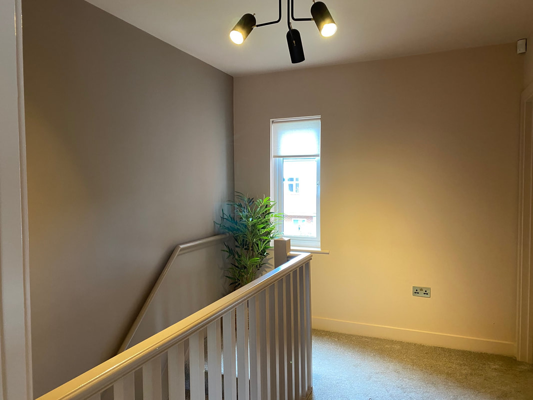
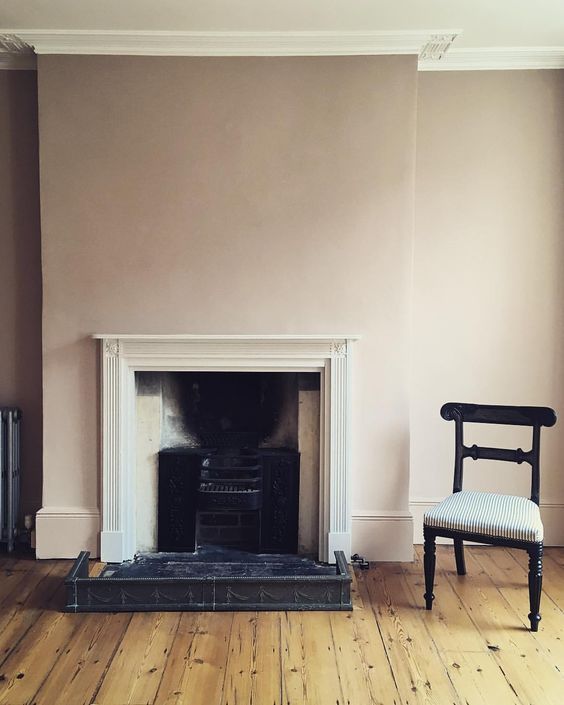
Products from I am Nomads shopThe Mood Board
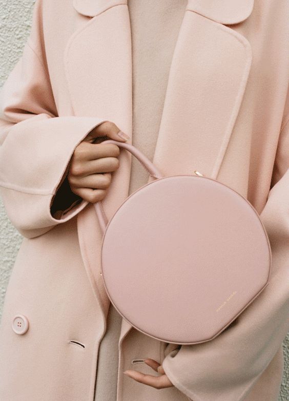
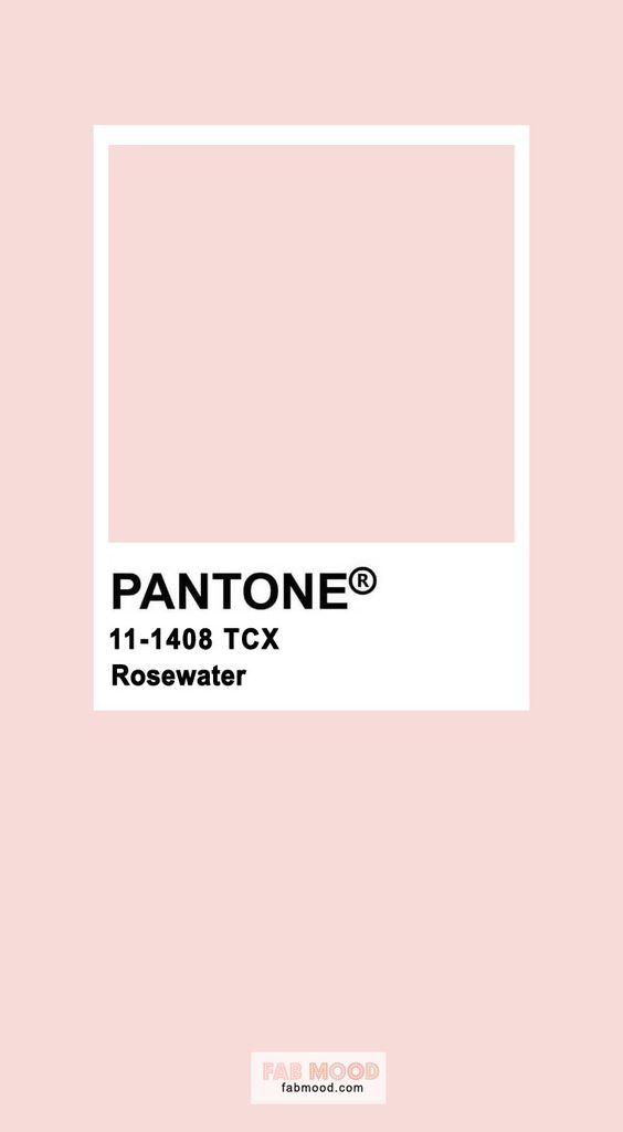
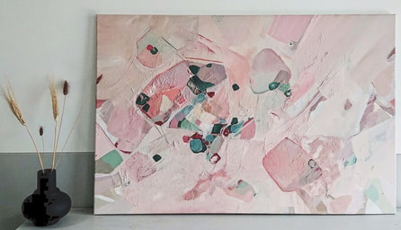
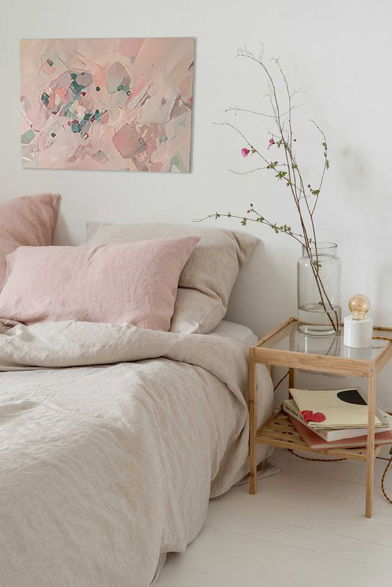
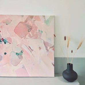
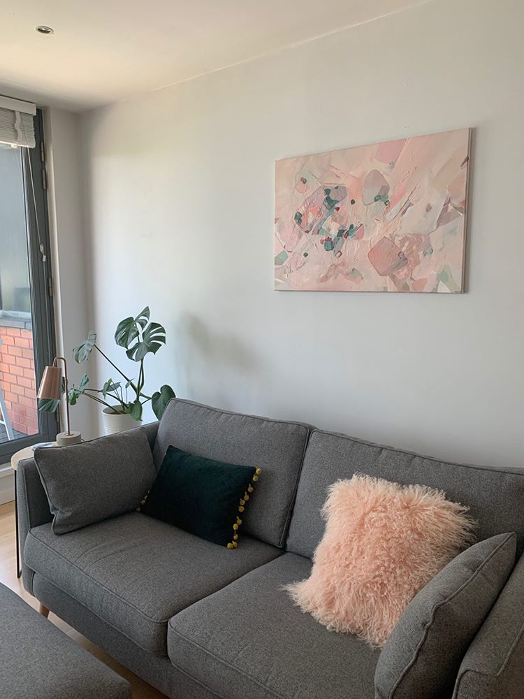
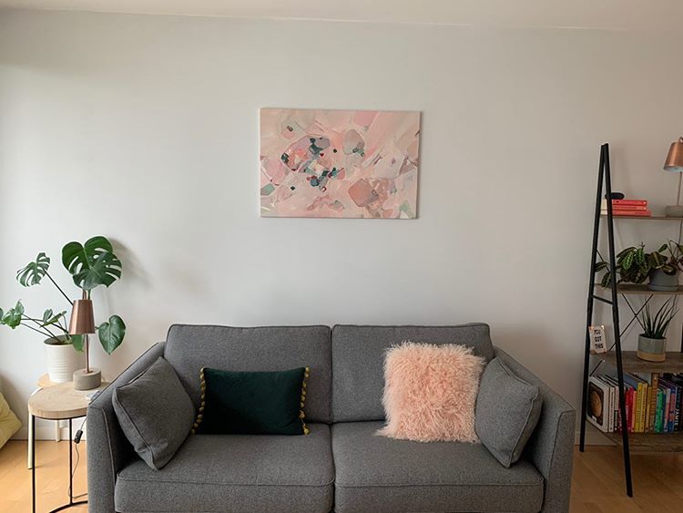
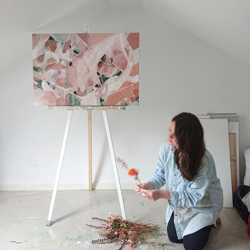
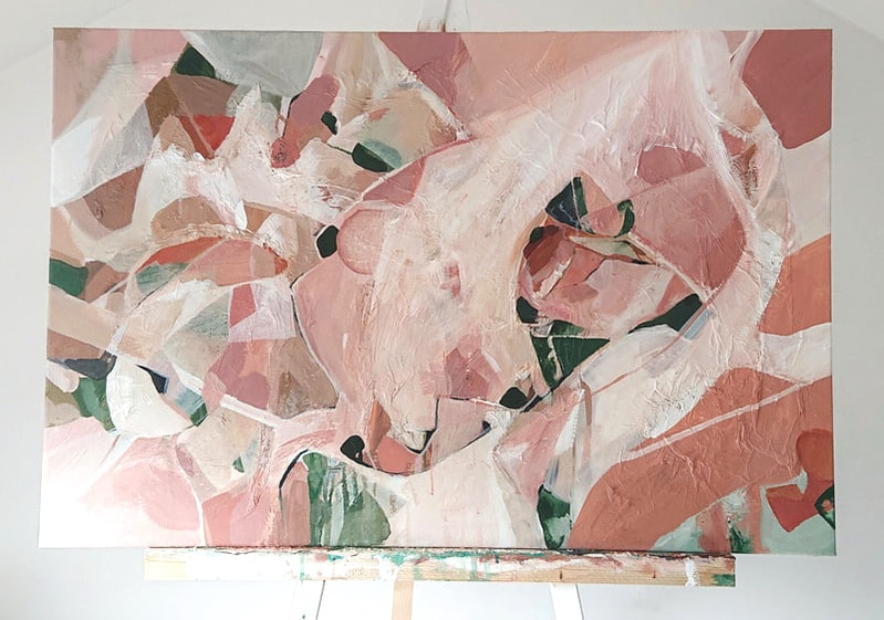
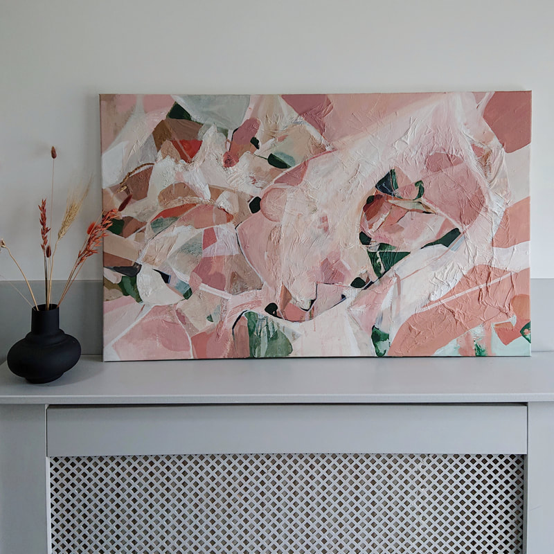
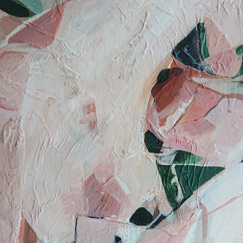
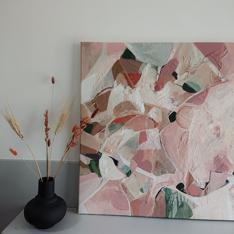
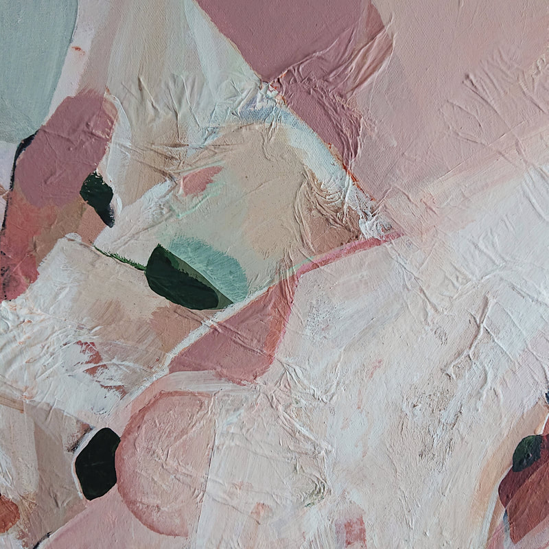
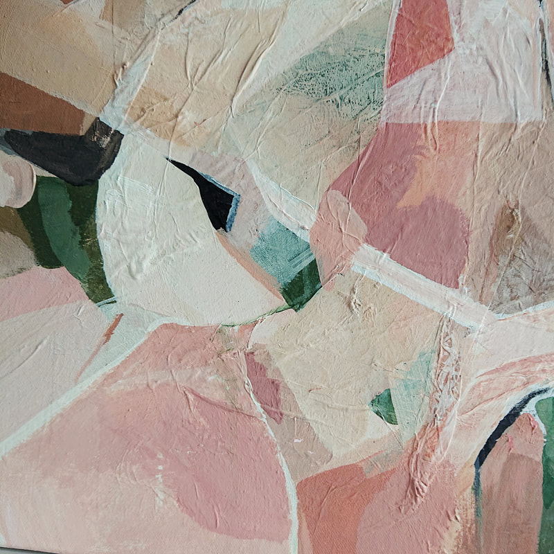
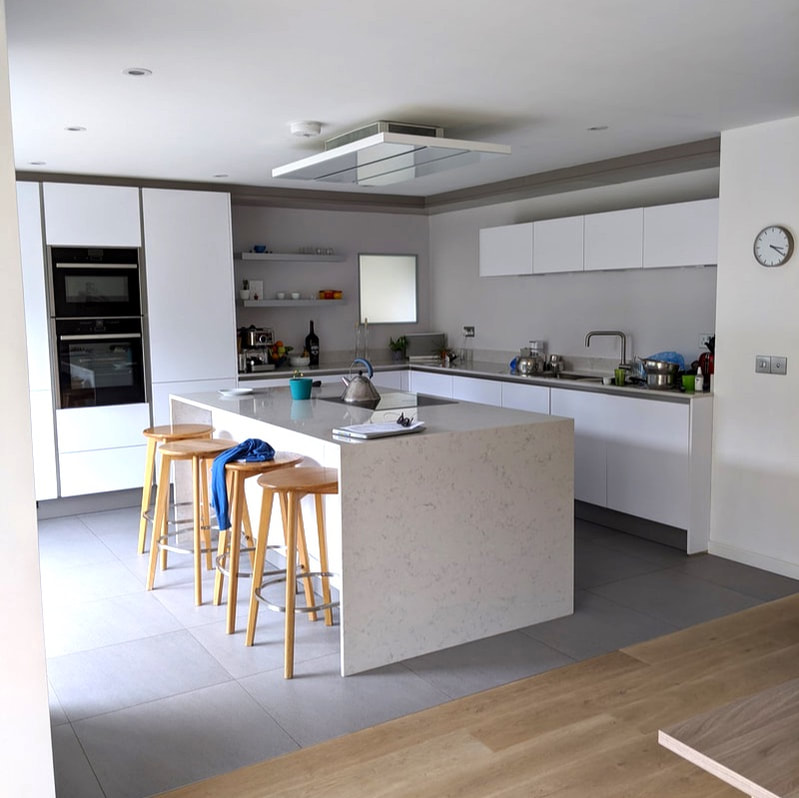
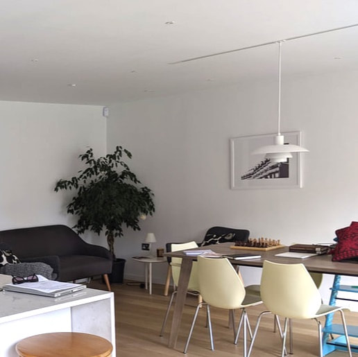
The Finished PieceInitial MoodboardsThis month I had the chance to create a super feminine piece of work which was commissioned for a modern new build in Glasgow. The interior itself was very neutral with pink accents and an emerald green velvet chair & cushion. There was also copper in the solid furnishings and lighting which allowed me to introduce subtle hints of warmer colours. The client wanted a rectangular piece to sit above the grey sofa. The Finished Piece.
MoodboardThe painting.I was really happy with how this piece turned out, although it was a slow process and there was a lot of trial and error with composition - once I got there I think the piece looks super statement yet soft because of the colours chosen, and the client loves it.
This will be packaged up with a lot of love and care and sent to its new home in Manchester, I'll hopefully get some pictures from the client and do an update with how it looks in its new home. I love seeing how the pieces sit in the interiors they are designed for. Watch this space!
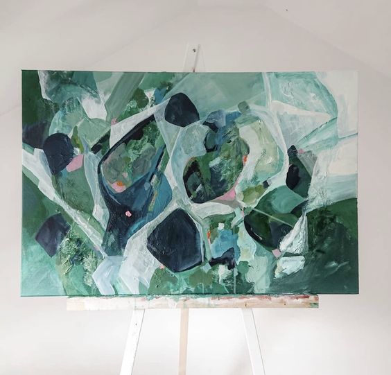
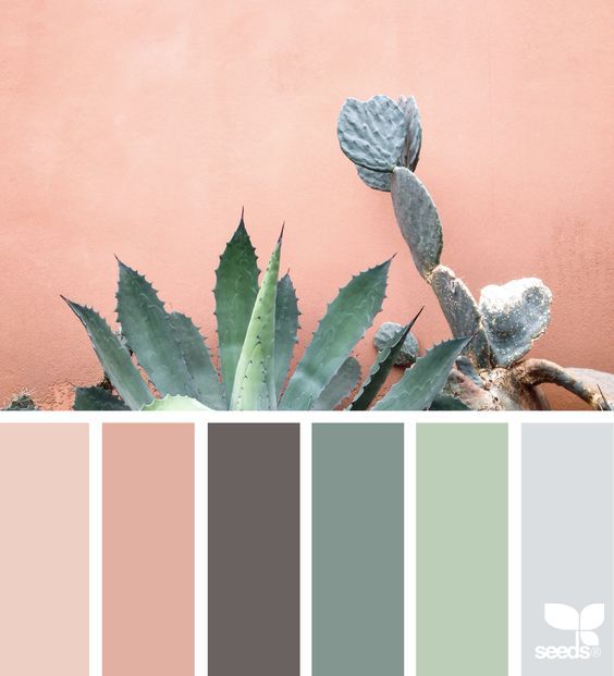
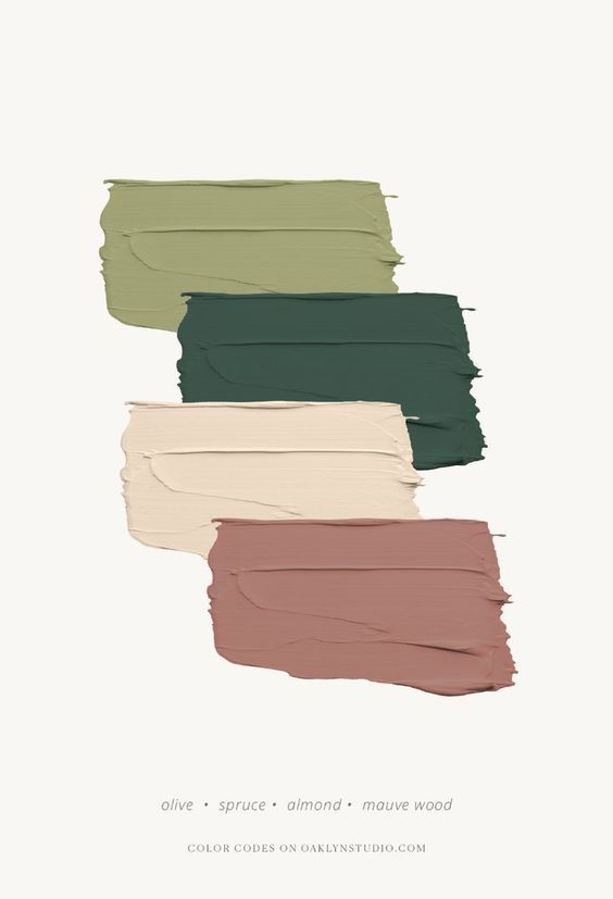
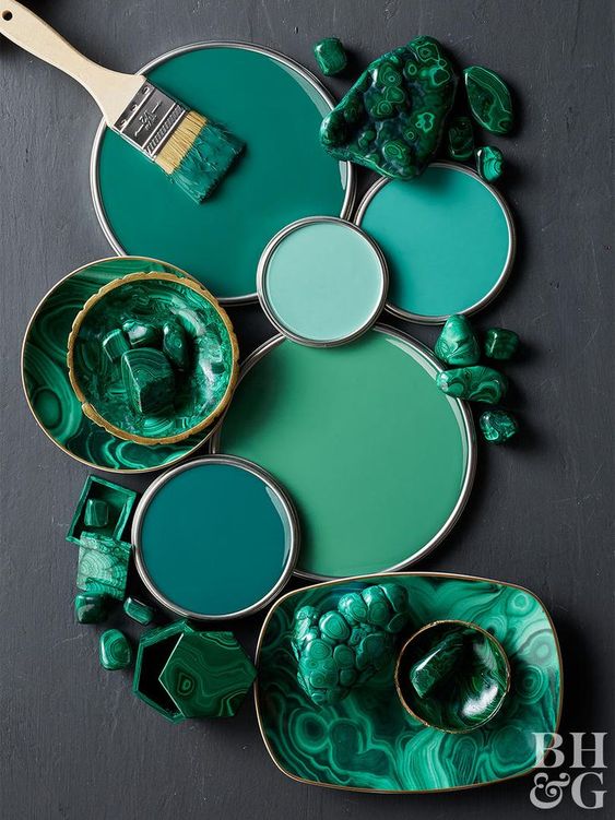
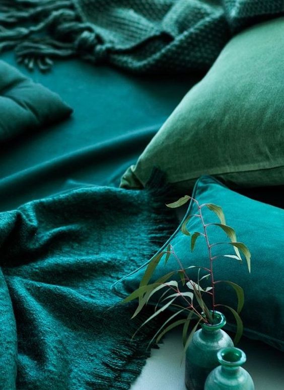
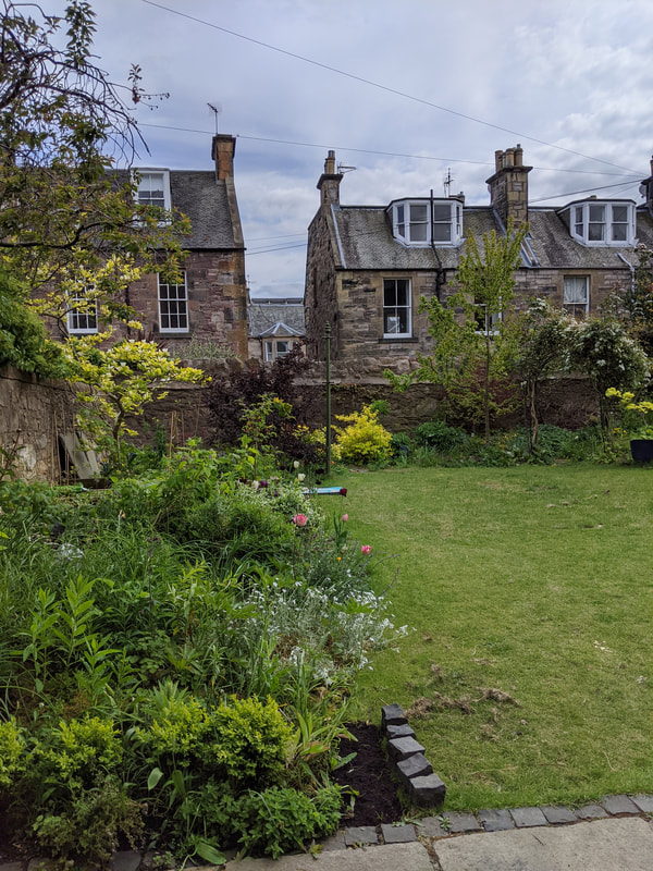
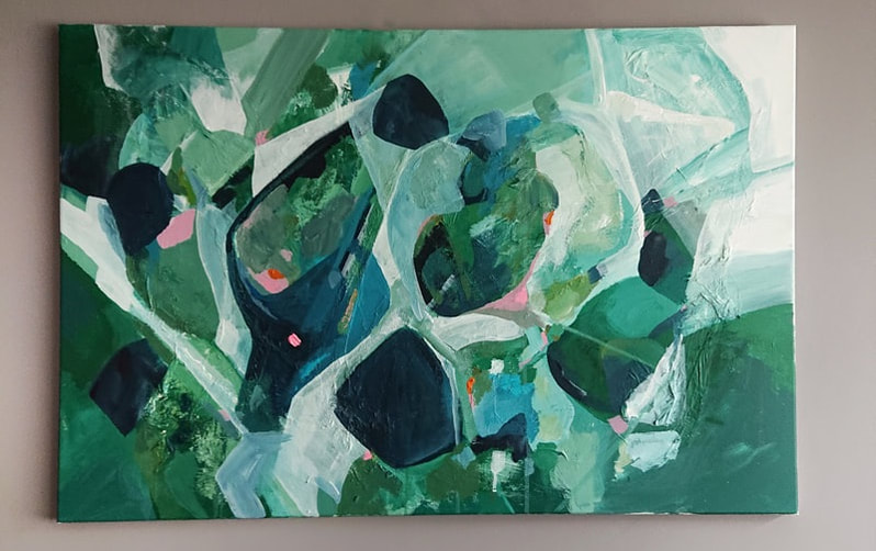
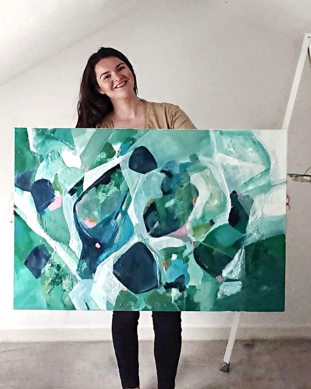
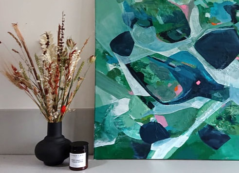
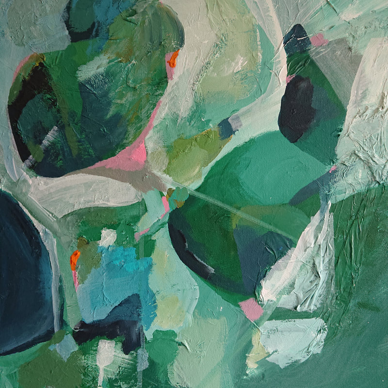
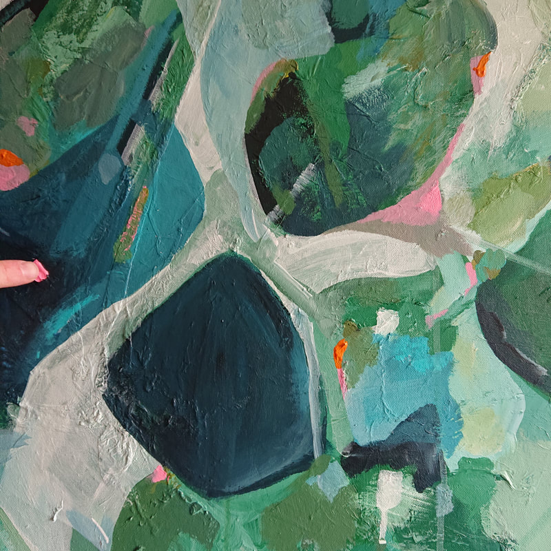
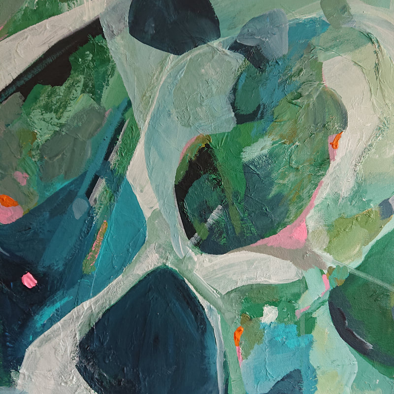
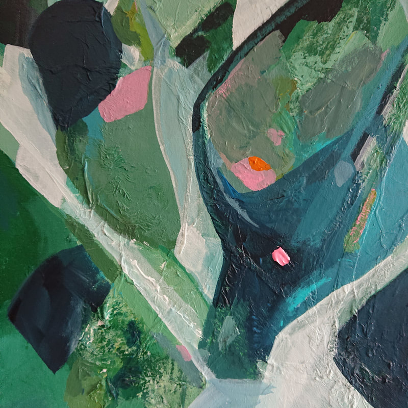
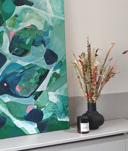
The PaletteThe Inspiration..The main inspiration I took from these pictures are of the garden and an existing piece in the space. I loved the greens and blues in this digital print - and the pops of pink in the florals in the garden. The final piece'The Japanese word Komorebi describes the moment when sunlight filters through trees and leaves - the interplay between the light and the leaves.'
|








 RSS Feed


