|
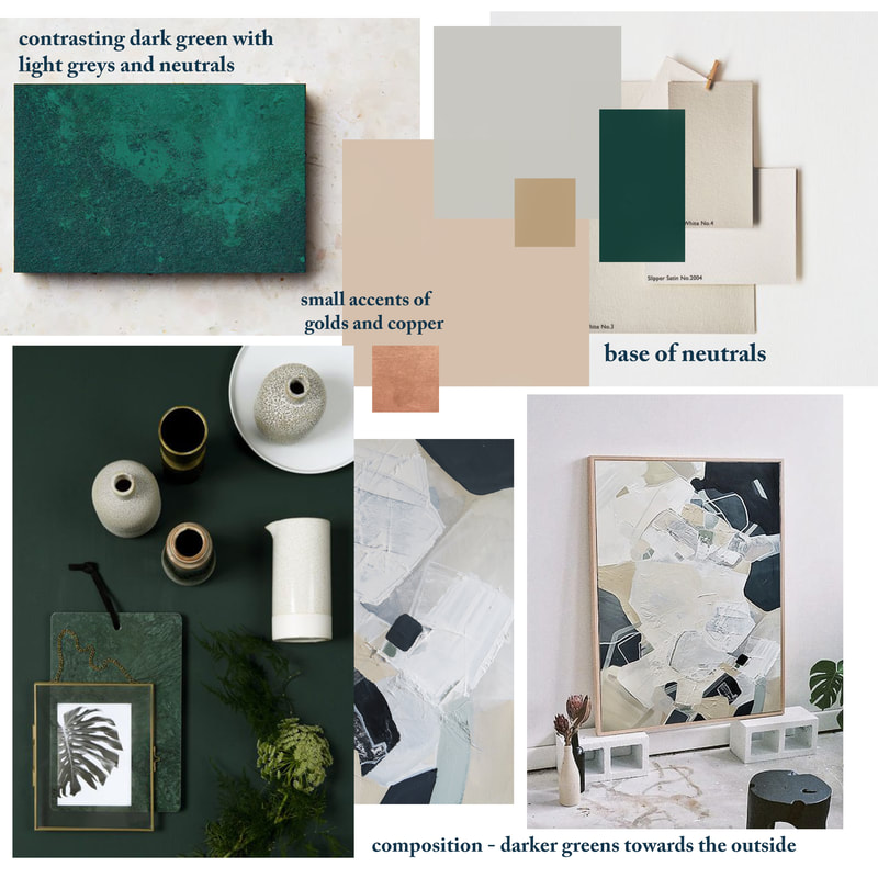
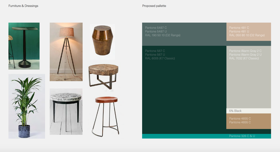
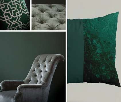
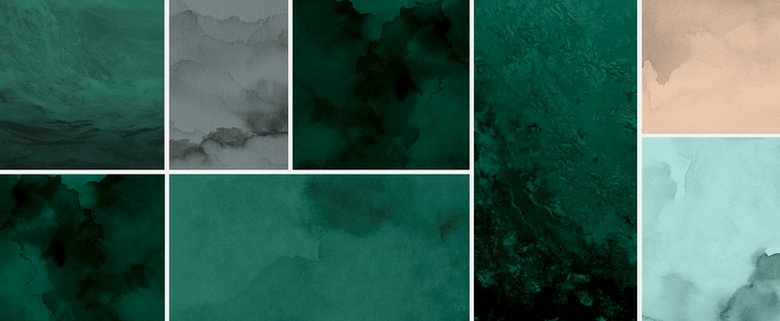
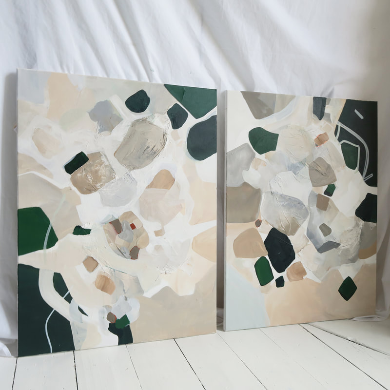
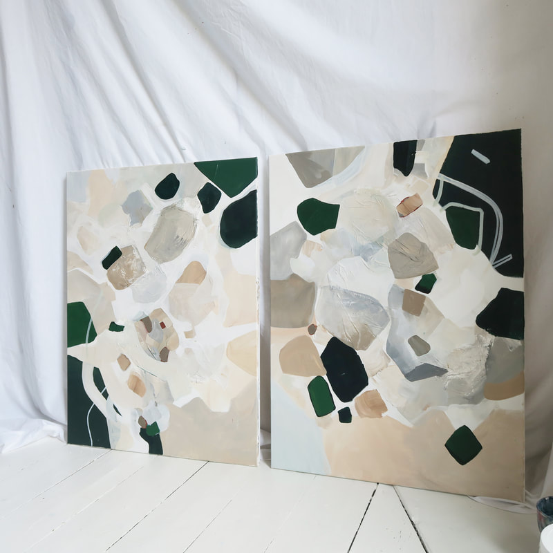
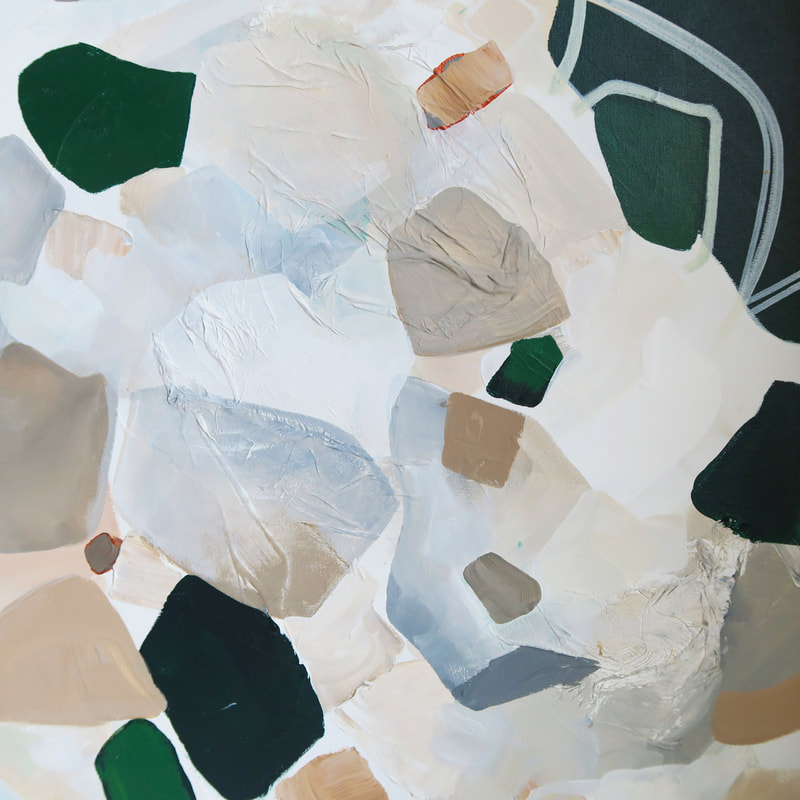
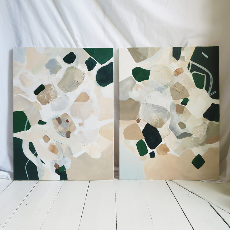
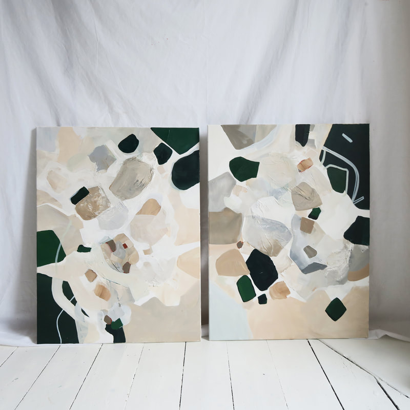
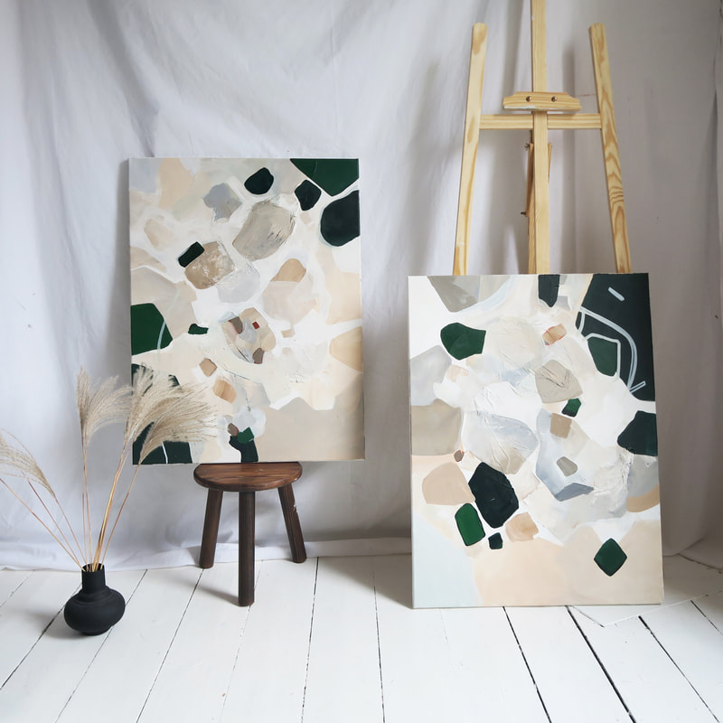
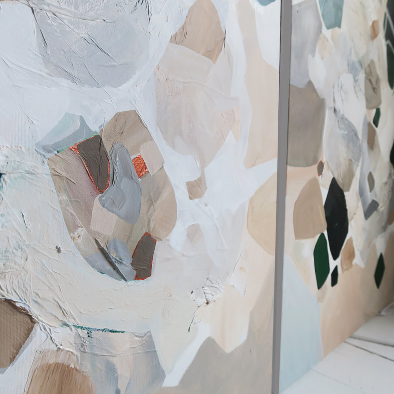
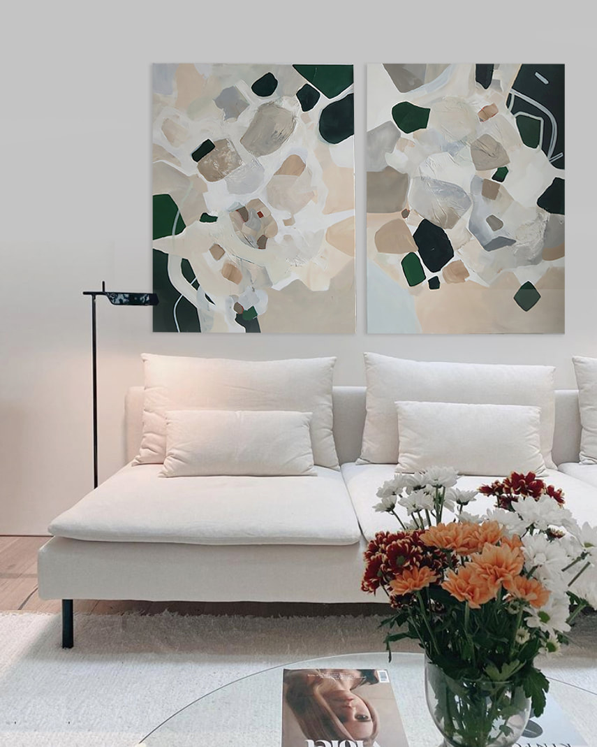
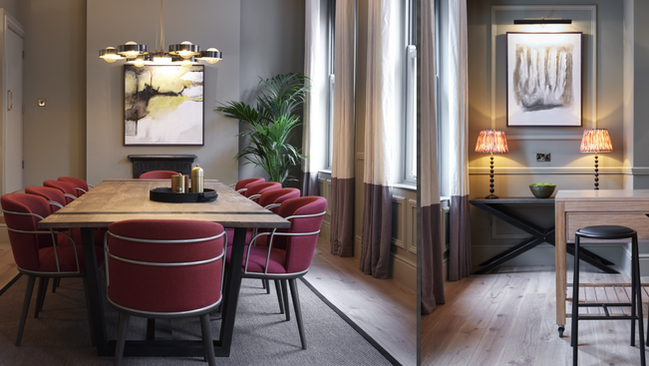
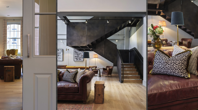
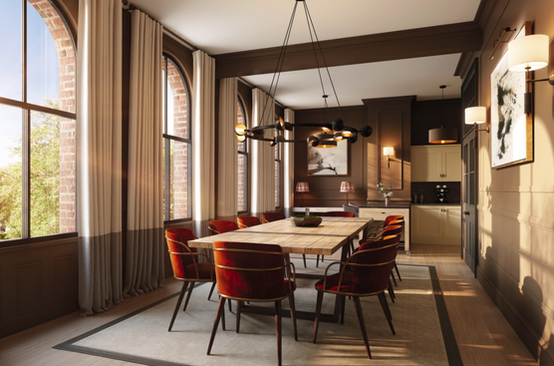
I was so excited to be commissioned to create two paintings for an interior project run by Kibre Studio in London. The space they were commissioned for was a lounge/ games room for a Build to Rent scheme in Sutton. Kibre Studio specialise in Build to rent schemes and have worked with some of the UK's largest landlords. Kibre sent me through the branding document, as they ideally wanted them to tie into both the furniture / finishes and the new branding. Below are the furnishings, interior finishes and moodboard which should help paint a bit of a picture of the brief they gave me to help create the paintings to tie in with the overall project. The brief was incorporating mainly the Dark green RAL 6003/ grey tones from the branding, with some hints of the dark blue that’s in the furniture. Then I planned to add accents of the copper/rust tie it in with the accents in the furniture and lighting. From this brief I put together a moodboard which is below. Below are some of the proposed furnishings and palette which influenced the piece. Part of the brief involved creating a 'water' effect which linked to the projects branding. I tried to incorporate this by using some watered down acrylic neutrals and green, layering these and letting them contrast again some harsher lines. Studio ShotThose copper accents & finer details..The Finished PiecesBecause there was such a clear brief from the team at Kibre, the paintings were completed within a 4 week lead time from the initial commission and in 4 weeks sent down to site ready to be hung! I can't wait to see them in the space next to the furnishings, fittings and decor the team at Kibre have chosen. It was great to explore some of the other projects Kibre have completed, involving some gorgeous artwork from other artist and furnishings - I'll link there website here and include some images of their previous projects below. This was such a pleasure to do for them, I loved working to such a beautiful design brief and can't wait to see the project come together. Who else loves those emerald greens?! Kibre Design Studio
0 Comments
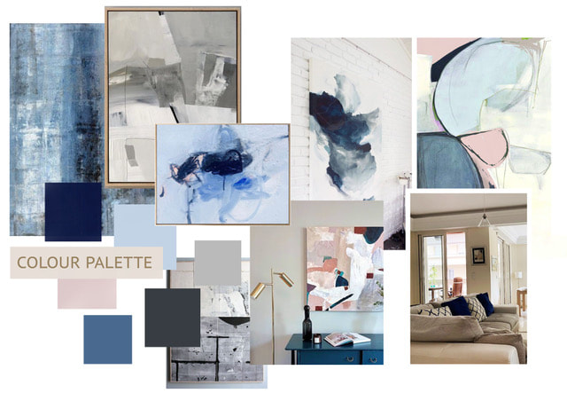
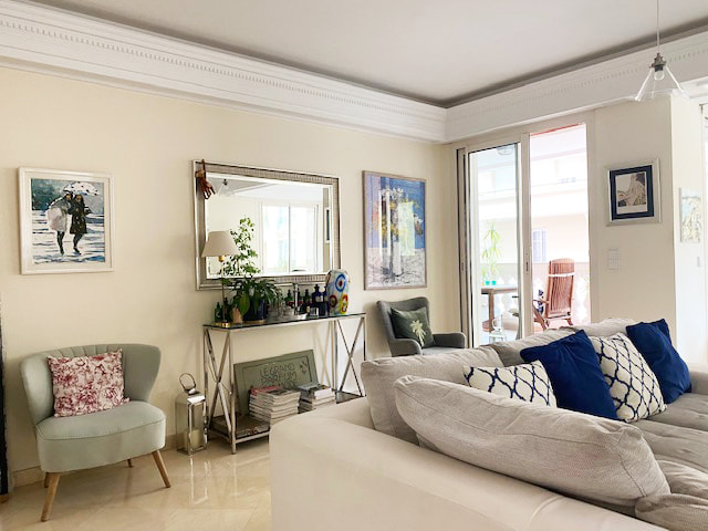
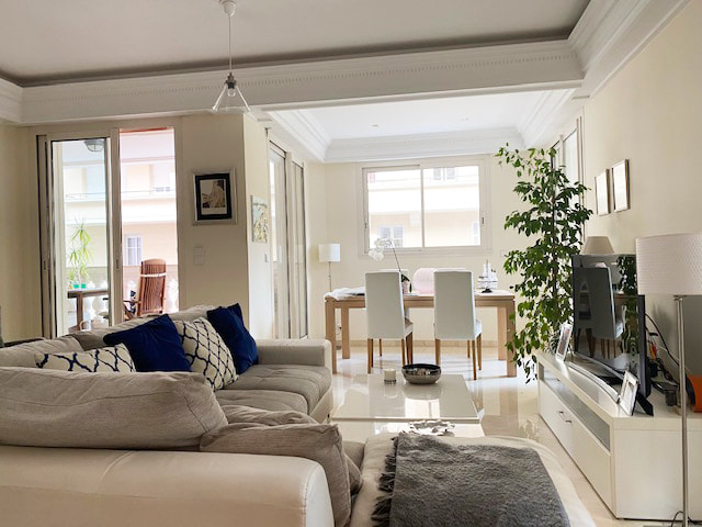
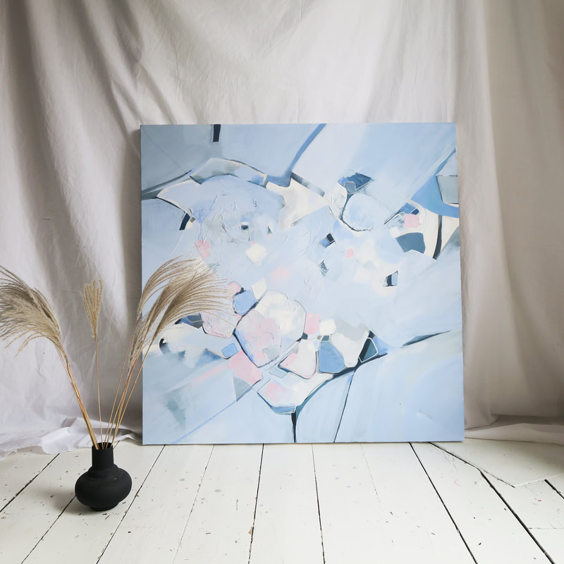
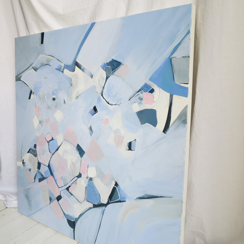
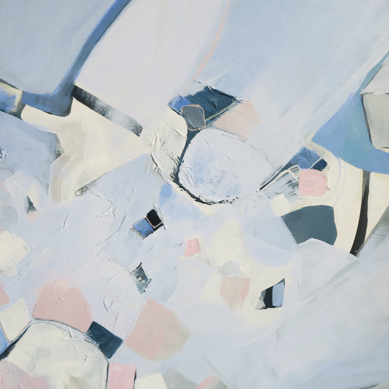
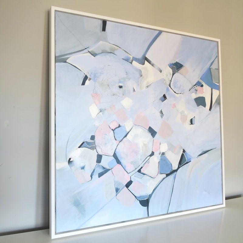
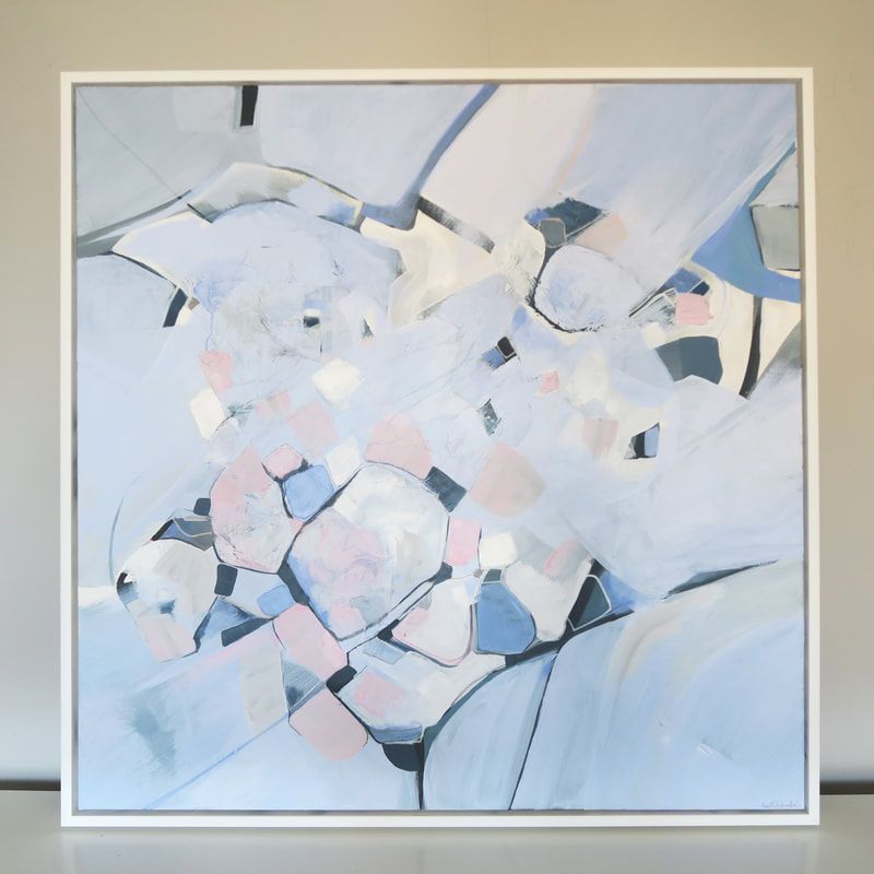
I was delighted this month to be asked to work up a commission to sit in a beautiful apartment in Monaco, France. My client had a vision of pale blues, whites, and pinks. She wanted the overall feel to be light, airy and peaceful. I worked up the below mood board for her which consisted of some of my previous pieces she liked, a colour palette, and references to other pieces I thought worked well and fitted her brief. The Mood BoardThe ApartmentIn the StudioI really enjoyed using the colours in the palette as I've never used them before - this pale blue was a bit of a challenge just to get the balance right. I started working the painting up in dark blues and lots of texture, and then painted on top of this to work up a base of this pale baby blue colour. I started shaping forms and colours and creating an almost 'terrazzo' effect out of shapes. At the size this piece was which was 1m x 1m, it had a really statement effect despite being such soft colours. The Final PieceUpon completion of the painting, we decided to go for a shadow gap white frame which just brought the piece together - it instantly gives it a contemporary edge! 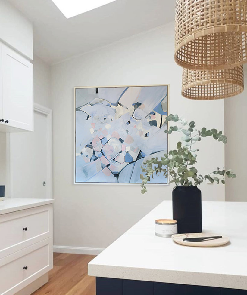 I'm pretty happy with how this piece turned out - so much so that once it was sitting in my living room I didn't want to give it up!
I've decided to call this piece 'pearl blue' because of its light, fresh (and obviously blue) palette. Its now arrived safely in Monaco and I can't wait to see it up in the apartment. |

 RSS Feed

