|
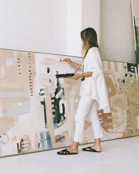
I’ve worked with private residential clients as well as interior designers, all over the UK and abroad since starting my business in 2019.
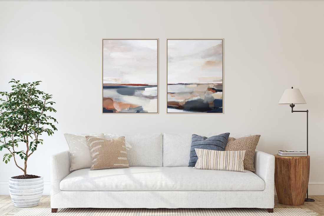
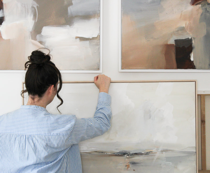
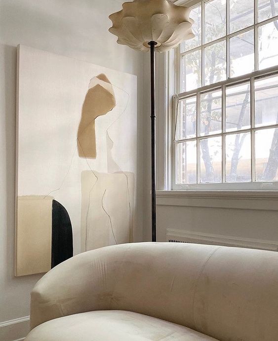
Coming from an interior design background I realised when designing a room how hard it is to source the perfect piece of artwork and so Christina Studio was created to provide a solution to this - offering bespoke, design led, affordable artwork. Artwork is often the very final piece of creating an interior scheme, and one that is often overlooked. Artwork can make (or break!) an interior look. From the choice of furniture to the smallest decor accents, each element plays a vital role in crafting a cohesive and inviting space. One of the most impactful elements in interior design is artwork. While ready-made pieces can certainly add charm, there's something truly special about bespoke artwork. 1. Unique Personalisation Bespoke artwork offers a level of personalisation that mass-produced pieces simply can't match. Custom art allows you to tailor every aspect to fit your client’s style and the specific needs of the space. Whether it's a specific colour palette, a particular theme, or an unusual size, bespoke pieces can be designed to perfectly complement the overall design.
2. Telling a Story Every home has a story, and bespoke artwork can be a powerful storytelling tool. Custom pieces can reflect the homeowners' personal journey, their interests, and their unique taste. This adds depth and meaning to the space, making it not just beautiful but also significant.
3. Flexibility in Design One of the greatest advantages of bespoke artwork is the flexibility it offers. As an interior designer, you can collaborate with Christina Studio to create pieces that perfectly align with your vision, with lots of room to make changes and get things right. This ensures that the artwork not only fits the space in terms of size and scale but also compliments the design concept seamlessly.
4. Supporting Local (and small) businesses. Choosing bespoke artwork often means supporting our local, small creatives. This not only adds an element of authenticity to your designs but also helps foster a sense of community and supports the arts.
5. Long-Term Investment Bespoke artwork is not just a decorative element; it's an investment. Custom pieces are often of higher quality and can appreciate in value over time. For your clients, this means that the art they incorporate into their homes can become cherished heirlooms.
6. Ease I can either work directly with your clients or your team, and coordinate framing, delivery and drop off for any installation. We will work to a specific deadline if needed. This means you can sit back and relax, knowing this part of the project is taken care of. To summarise Incorporating bespoke artwork into your interior design projects offers unparalleled advantages. It provides a unique personalisation to your project, tells a compelling story specific to your clients, elevates the design, offers flexibility, supports local artists, serves as a long-term investment and provides you with ease knowing that from concept to delivery the painting is taken care of. At Christina Studio, we believe that bespoke artwork is not just an addition to a space but an integral part of creating a home that is beautiful, meaningful, and uniquely tailored to the people who live in it. So, next time you embark on a design project, consider the transformative power of bespoke artwork. Your clients will thank you for it! Christina x
0 Comments
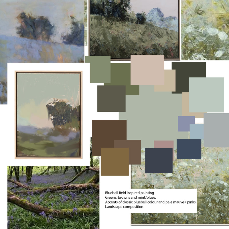
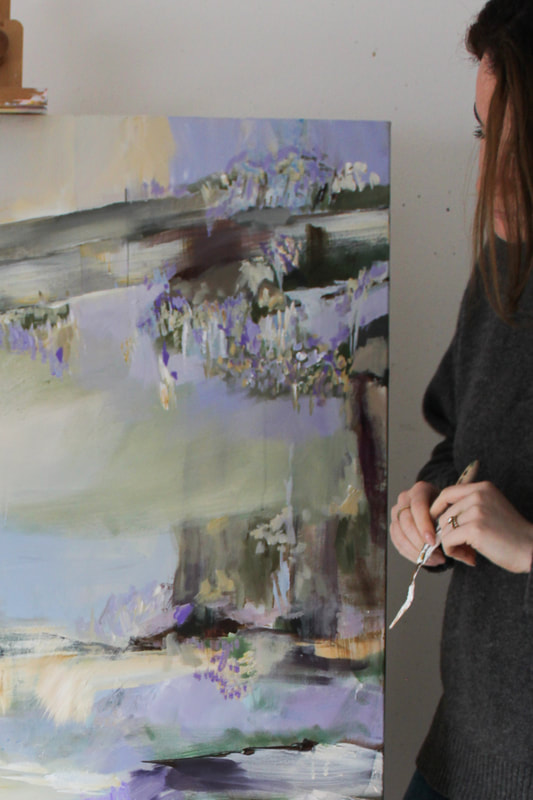
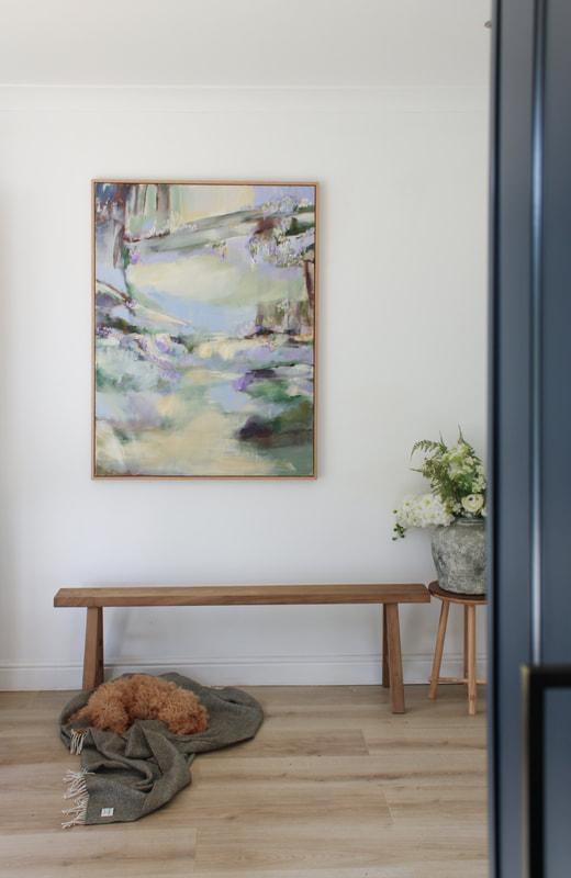
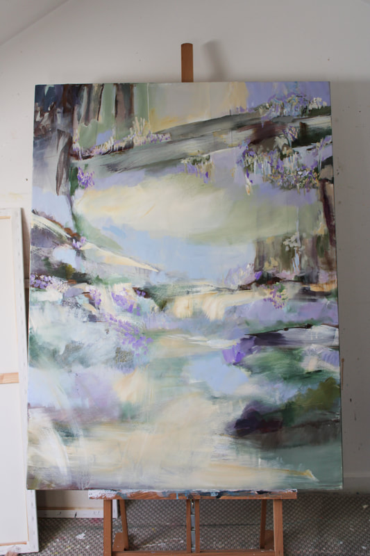
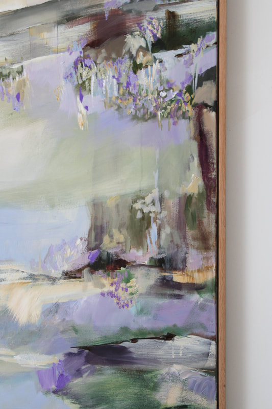
This has to be one of my favourite commissions I've done so far - with a unique colour palette that took me outside my comfort zone. My client commissioned me to create a painting inspired by a bluebell scene; a reminder of fond memories for my client. The painting was created to capture a spring/summer bluebell day - think dappled sunlight, leafy foliage, bird song and pops of bright bluebells. The Mood BoardThe ProcessThe finished paintingCreating a bespoke duo for an interior project, carefully tailored to match the colours and ambiance of the space, is similar to weaving a unique visual narrative.
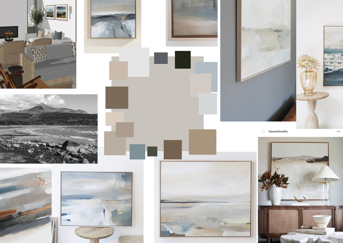
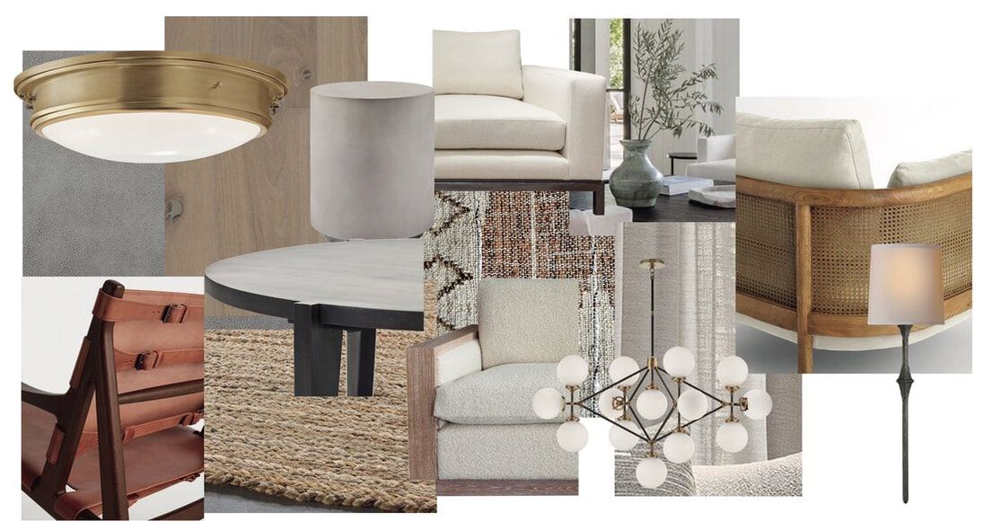
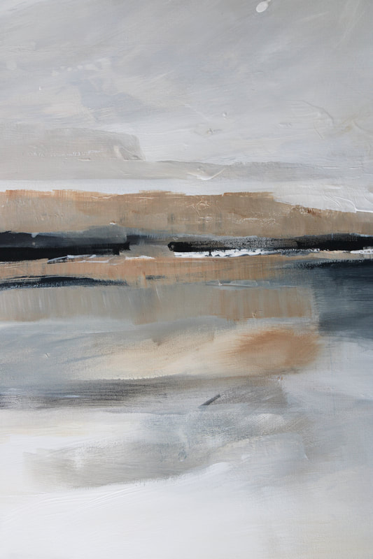
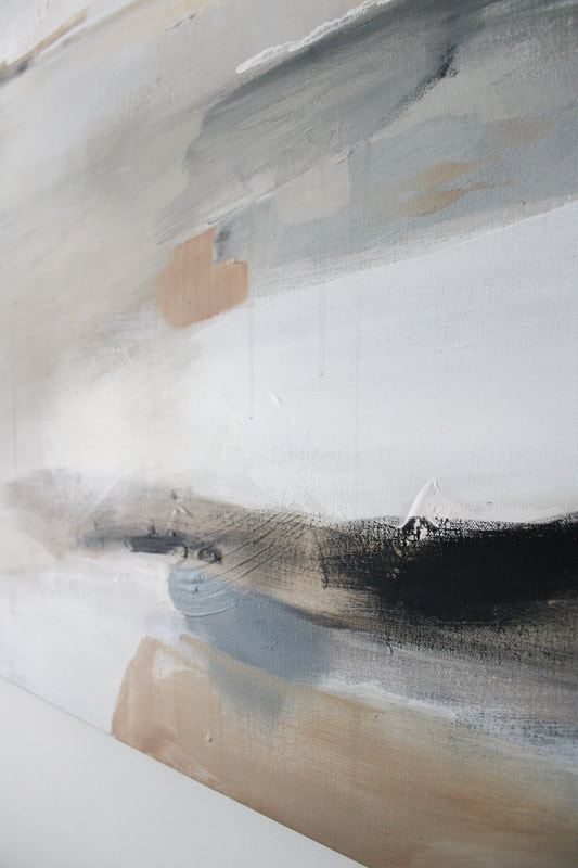
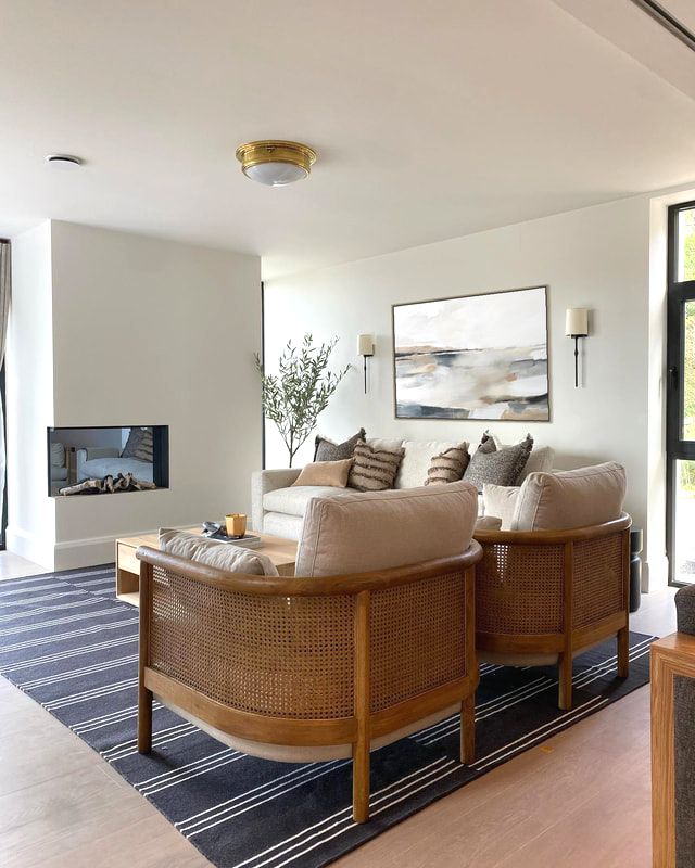
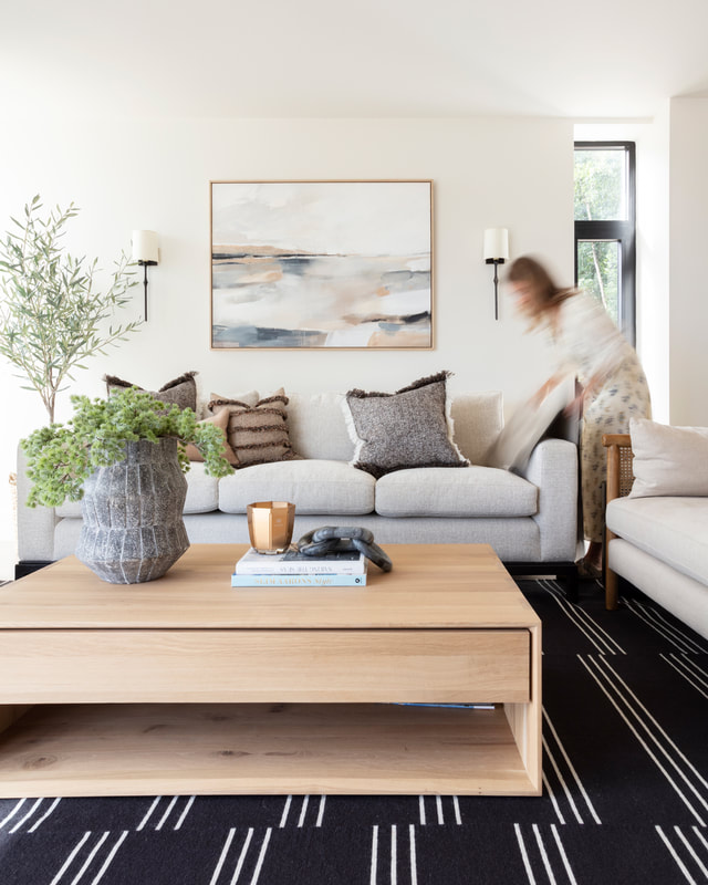
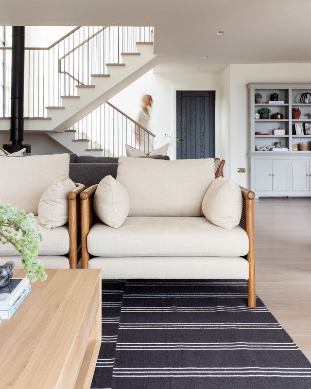
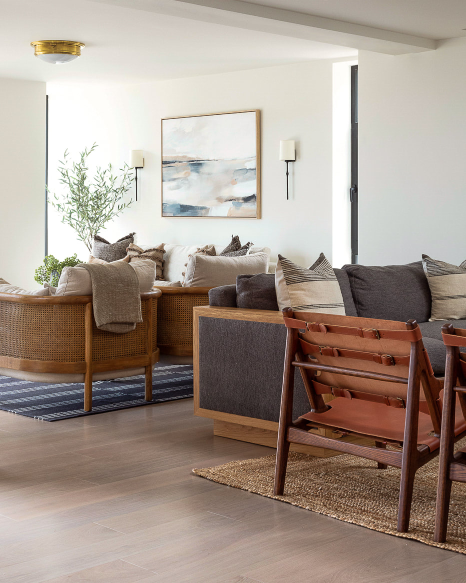
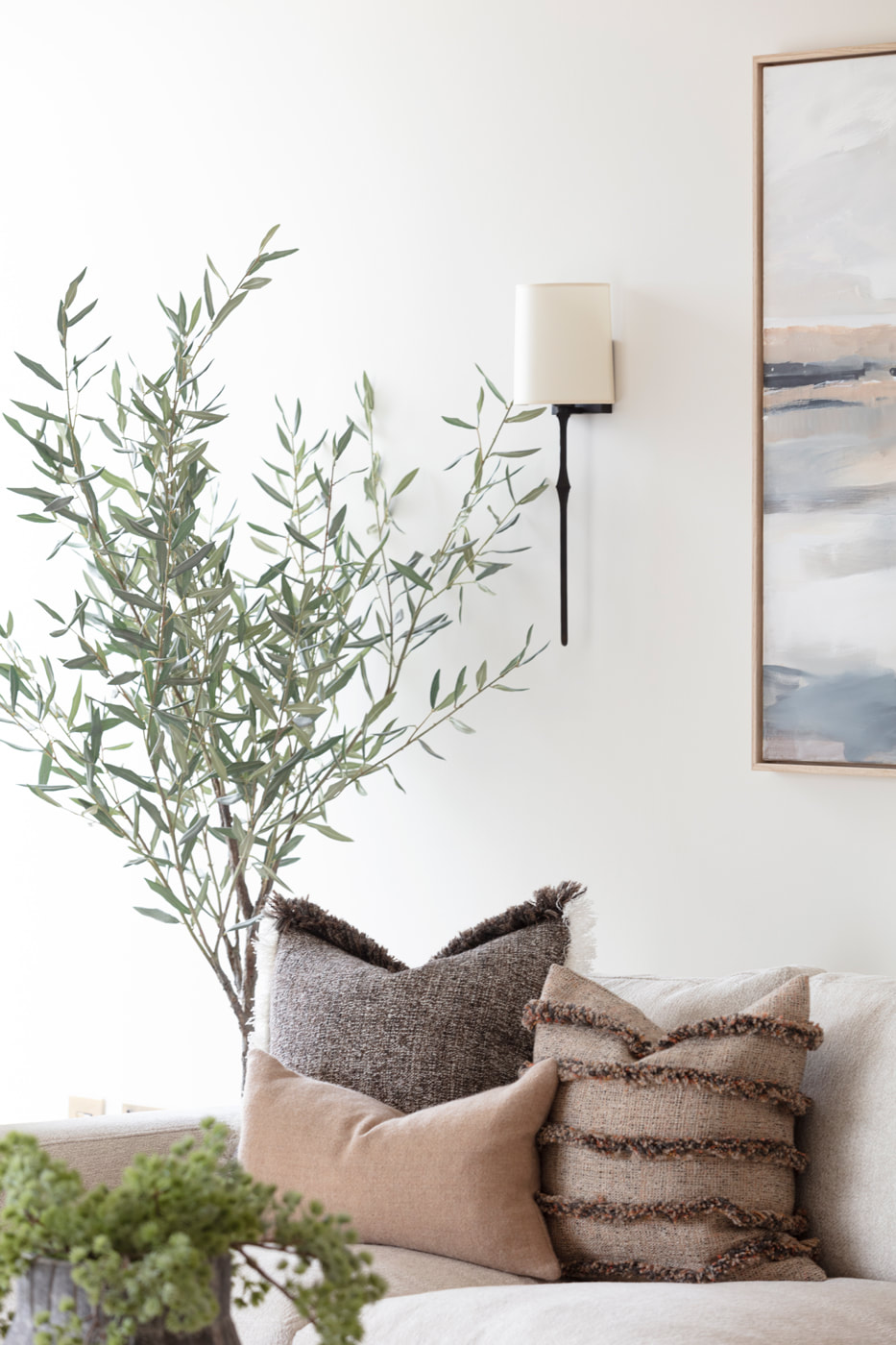
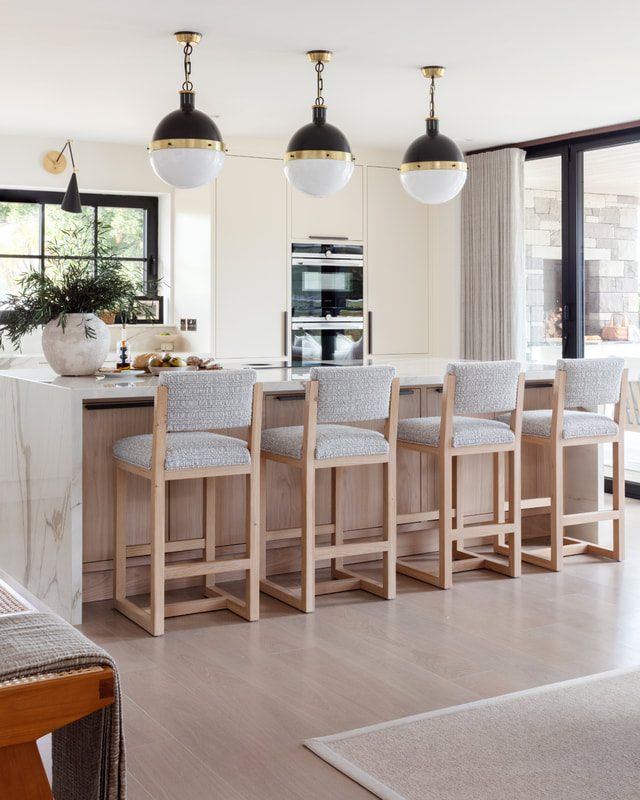
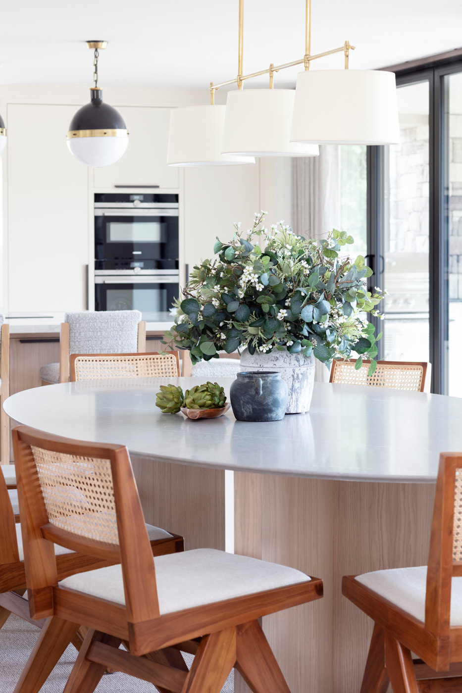
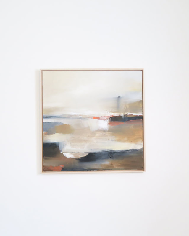
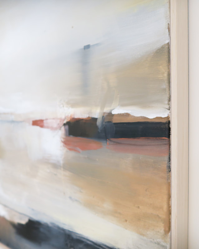
The main task in creating this painting for this lovely Studio LBI project involved incorporating colours and textures which had been input into the space. The 120 x 90cm canvas was to be hung above a sofa in the main living area which looks out onto the sea in Arran. The canvas was measured to perfectly fit in-between the two wall lights above the sofa. The seaside/coastal element was to be incorporated into the composition; creating a scottish landscape piece with natural tones to mimic the natural setting of the building and interiors. Mood BoardInterior Moodboard - Studio LBI The designers at Studio LBI incorporated nature inspired, earthy tones into the scheme - think lots of neutral weaves, rattan, wood, natural stone and marble, warm brass, and greenery. I wanted the painting to capture the interior scheme in its palettes and be used to tie the space together. The Finished PaintingDetail shots below highlight the varied neutral tones and layered texture in the painting. Once the painting was ready to go, a 3D view was developed to give a real idea of what the painting would look like in the space. The finished imagesThe painting was finally framed with a solid oak frame to tie in with the natural wood in the scheme. The finished images show the calm, coastal feeling of the room - a definite favourite paintings of 2022! Interior design: StudioLBI & Photography: SuzieLoweStudio
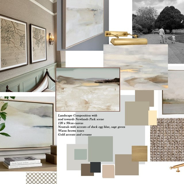
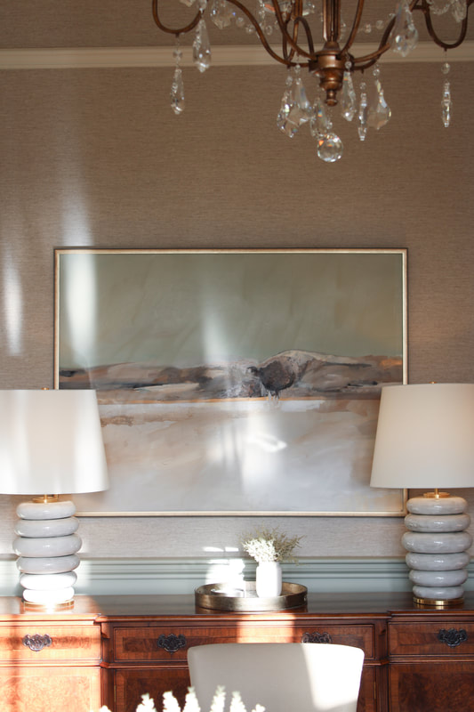
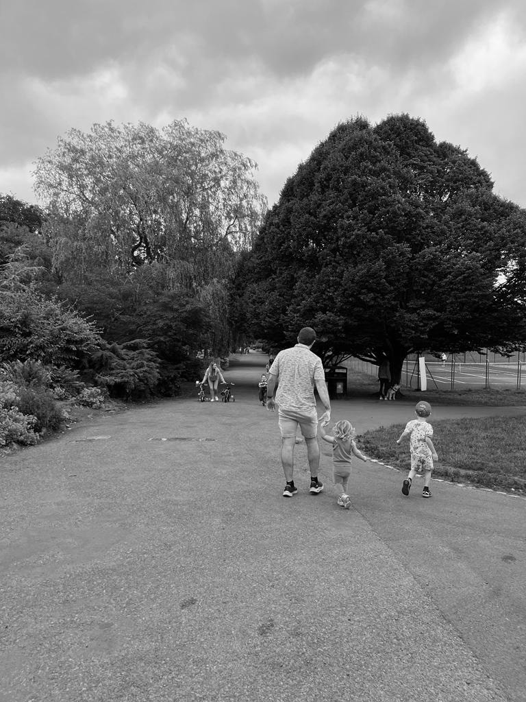
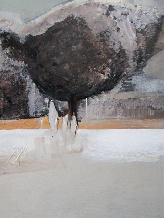
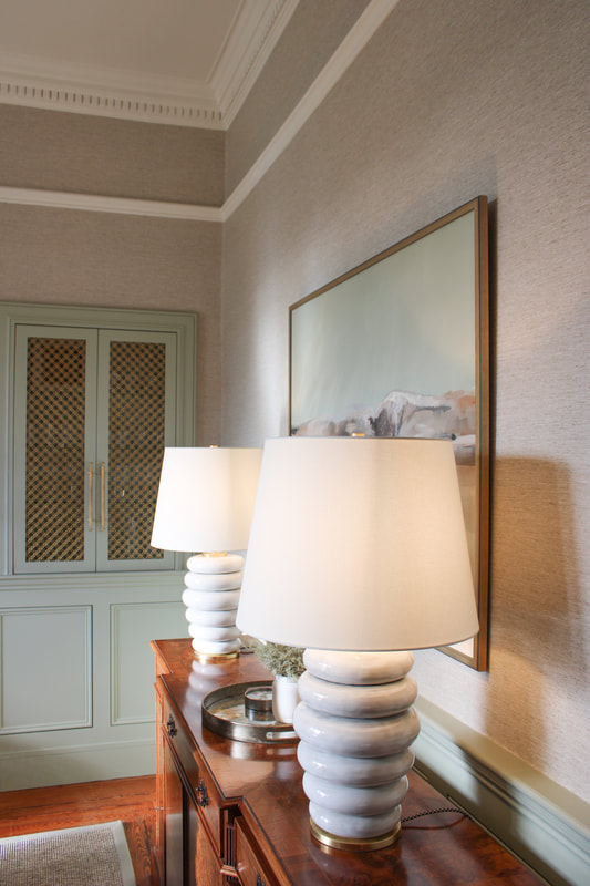
I've been working as part of the team at Studio LBI for 2 years now - time has flown by! During this time we have been busy with some exciting projects. Sometimes it is really hard to find the perfect piece of art for a space - and this is where a bespoke commission can come in perfectly. We have been working on this lovely dining room in Glasgow. The whole scheme introduces lots of earthy colours and textures, with a hint of opulence in the crystal chandelier and wall lights and introduction of antique brass. The main feature is the panelling in the room which is painted in Benjamin Moore Tree Moss - a beautiful soft sage colour. The client wanted something special to incorporate a family photo into the painting, whilst complimenting all of the interior features we had introduced into the space. Mood BoardThe mood board - using the family walking away in the photograph as inspiration - the task was to create a timeless landscape piece that would go perfectly with the green panelling in the room. The main palette needed to compliment the room best would be sage green, duck egg blue and warm brown tones and gold accents to tie in with the beautiful brass lighting & hardware in the space. The Finished PaintingI wanted to create something soft, timeless and calming. The final painting shows this beautiful landscape piece with the bespoke touches introduced; a family walking in the park - silhouettes of trees and a landscape feel. Colour matched to the panelling with warm neutral tones to compliment the scheme.
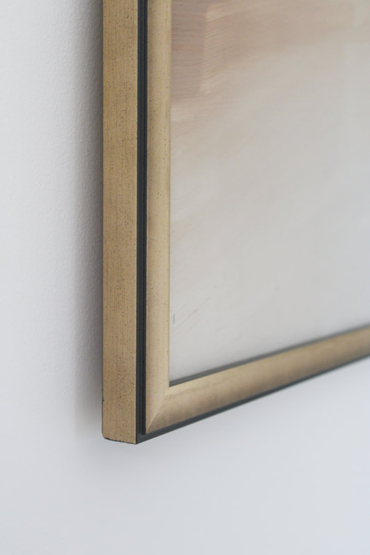
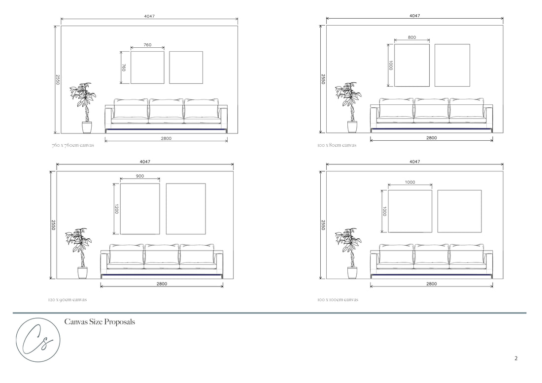
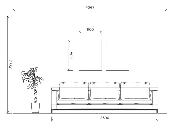
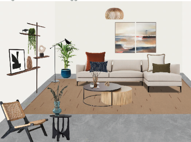
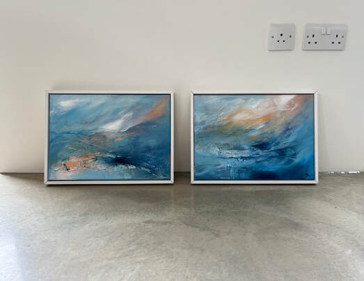
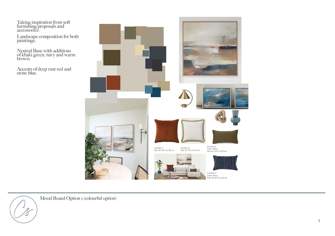
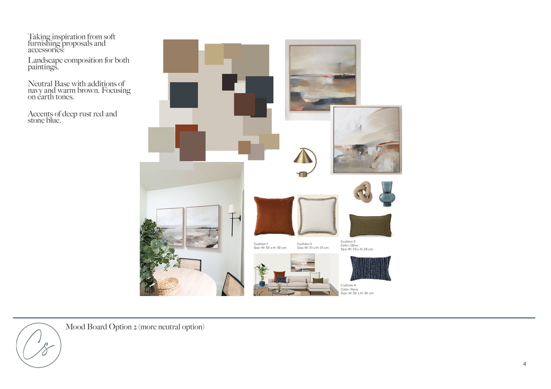
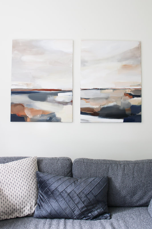
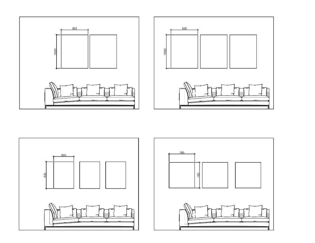
We finished off the painting with an antique style frame which I am now obsessed with - its gorgeous!! A truly timeless piece! Brief: Create a duo of paintings to go above a corner sofa in a contemporary new build apartment, London. This painting was made to compliment the proposed interior design scheme by @muchmoredesign. I started off the commission process by creating elevations with different canvas sizes to narrow down some options. The paintings were to be hung above a sofa in an open plan living room - taking the sizes of the sofa, height and width of wall we could really nail down the options on sizes. Sometimes this is the most confusing part of the process - choosing sizes! I feel like showing elevations or 3D renders as part of the process really helps clients make decisions. The client decided to go for a 80 x 60cm duo. After this stage it was time to move onto mood boards - I did one option which was more neutral, and another one that was slightly more colourful, taking into consideration the colours in the interior scheme - burgundy, blue, neutrals, browns. Muchmore Design put together a beautiful scheme with lots of my favourite earthy colours so I was really excited to get started. There was also existing artwork to the space - these two vibrant pieces below, so I wanted to add in bright accents of blue to coordinate with these. The finished duo was signed off first time. Because of the clear brief, I had quite a good idea of what my client wanted. The duo sing together perfectly with subtle nods to the interior furnishings. The composition was a classic abstract landscape - with lots of colour blocking, rusts, burgundy and even some pops of copper pigment.
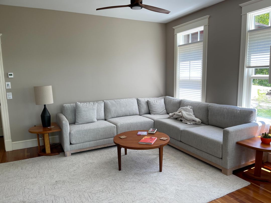
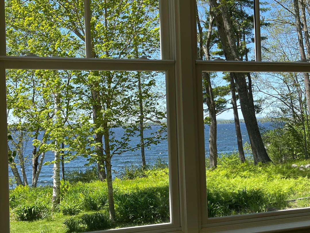
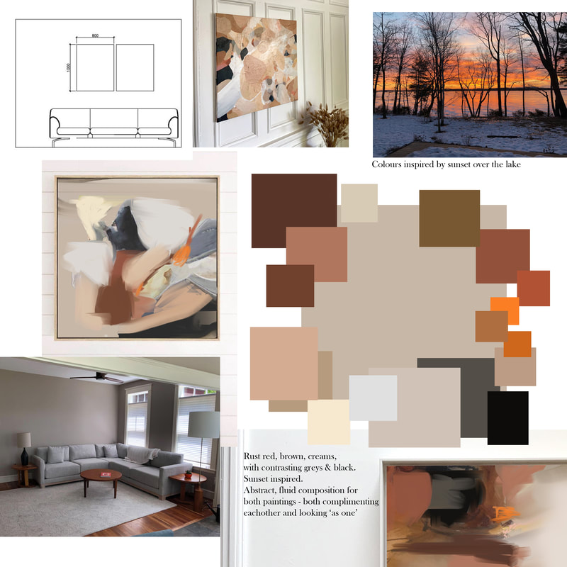
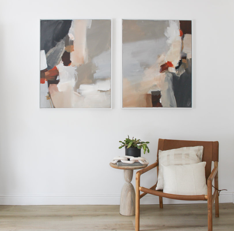
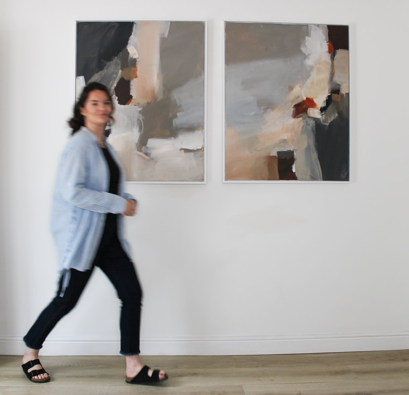
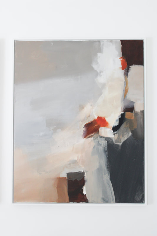
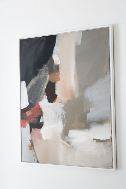
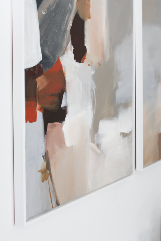
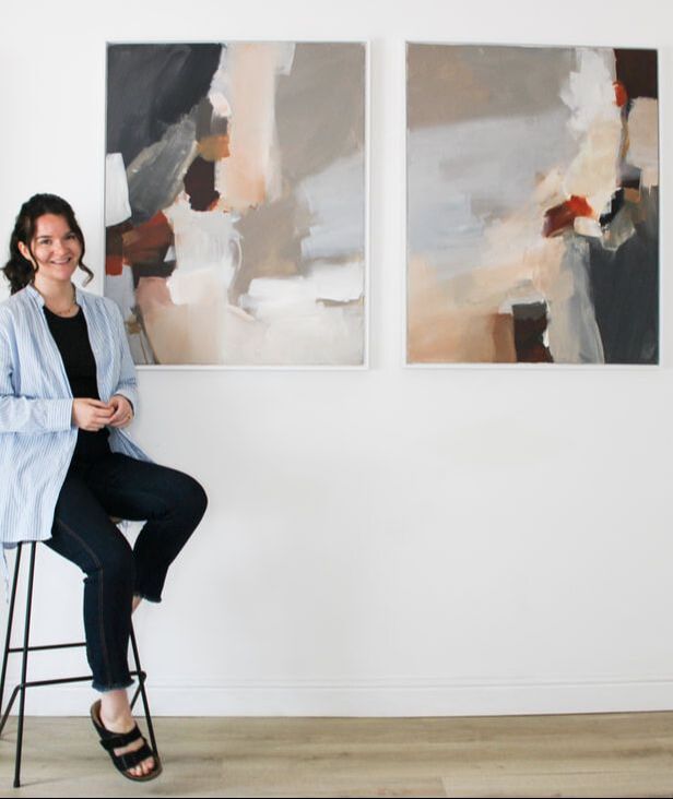
Once the paintings were ready the client opted for a solid wood premium frame which compliments the pieces and the rest of the room so well. Framing can really make a difference to the overall feel of paintings, I think this was a great choice. I love these two and can't wait for an update once they are up in their new home! Between life & work the time to write a blog at the moment is a luxury, and something I have not done for a good while - but for these two commissions I just had to! They are so special. I was approached from clients 'over the pond' in America to create something special for their lake house in Maine. They wanted two or three pieces above the main sofa. The sofa looks out onto the lake. The space is fairly neutral, but they had one clear objective: bright orange needed to be in the painting. As always, I ask clients to send through pictures of the room before starting a mood board to give them a feel for the painting. To get a good feel for sizing in the space, I worked up an elevation showing the canvas sizes against the sofa size. I've been doing this a lot with clients who are not sure which size to go for - I find it really helps narrow things down. They decided on two 100 x 80cm canvases. The pictures below show the scene to the lake - and the sunset picture was my main source of inspiration for the paintings. The brief was to create something fluid and abstract, whilst capturing the 'feel' of the scenes below. The mood board put together combined red, brown and creams with contrasting greys and black. By definition 'A diptych is a painting or relief carving made of two parts, which are usually joined by hinges.' In this case the paintings didn't hinge, but when creating them I really wanted them to work together as one. The final paintingsSometimes I'm lucky with the creative process and I'll work up something that the client loves so much it needs no changes! I put these together and really went with my gut on what would look good in the space combined with the colours / composition chosen. Once finalised, we discussed framing options and went with a white shadow gap frame. The paintings are my current favourite because they are so fluid in composition and the colour is so unusual. Red/orange can be quite a hard colour to work with but in this case the pops of vibrant red really lift the paintings.
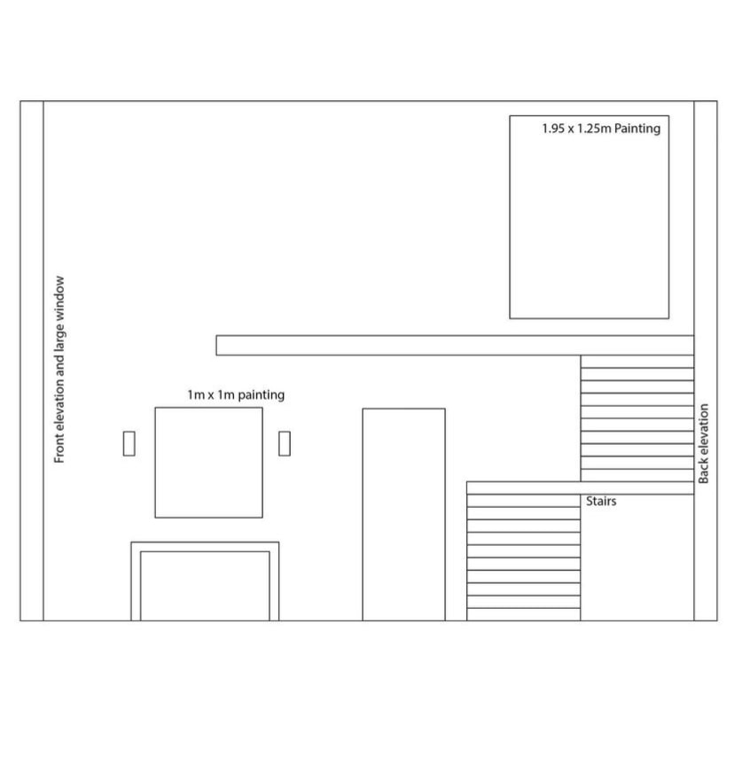
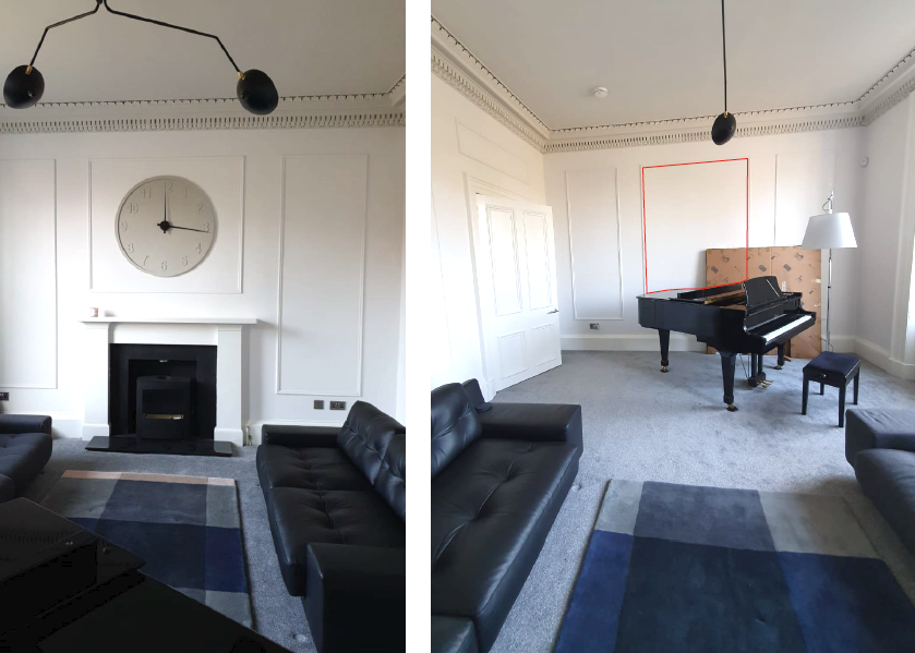
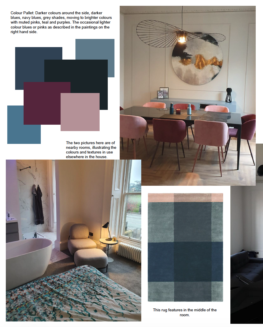
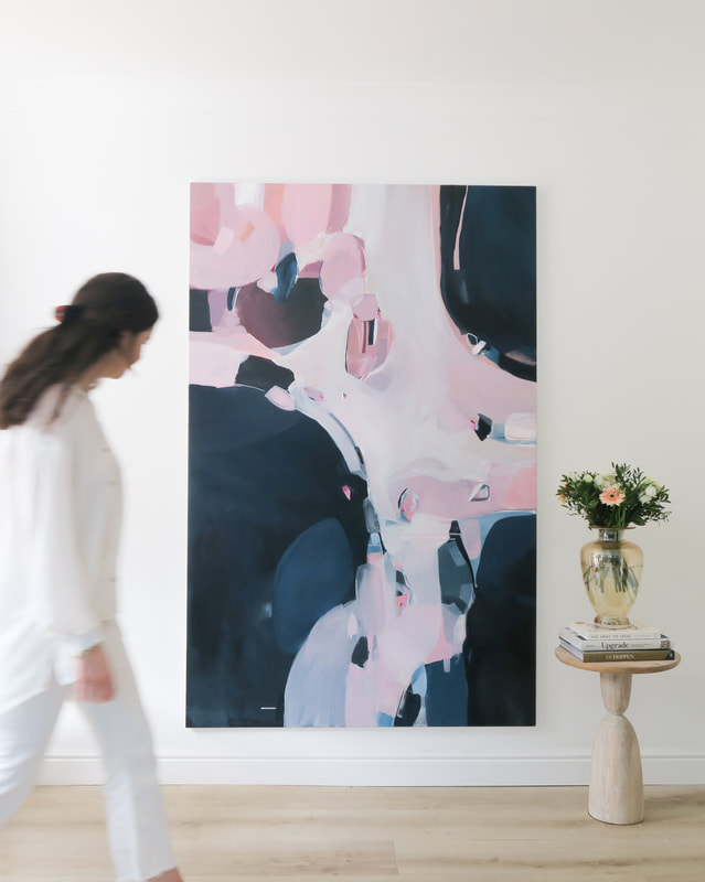
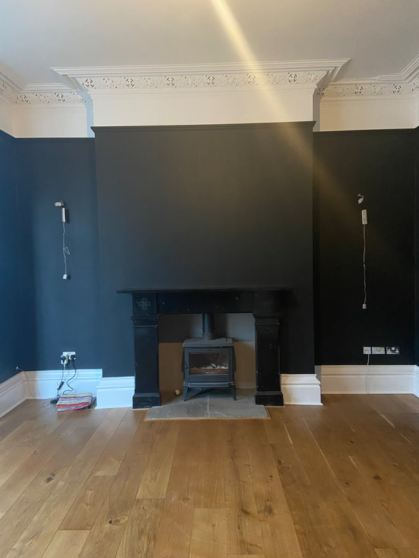
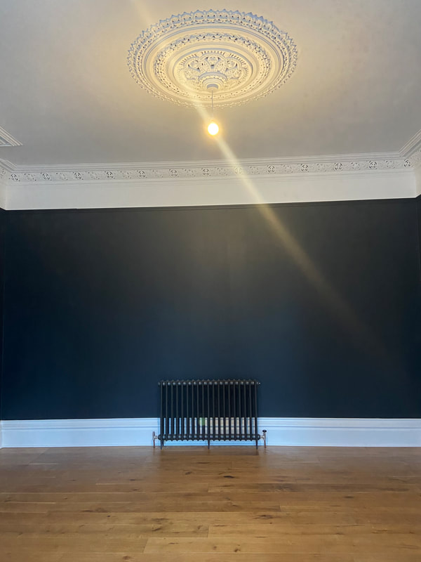
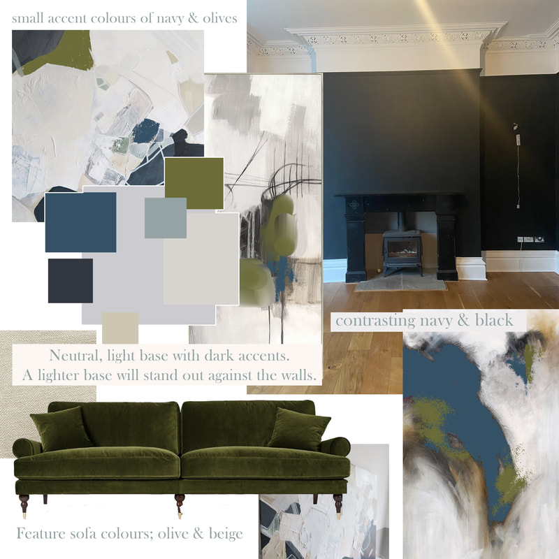
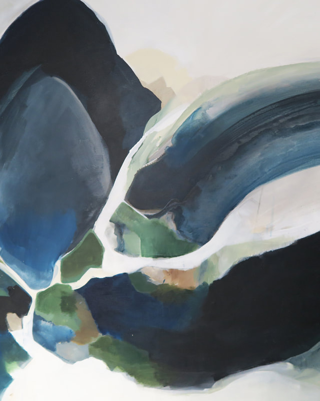
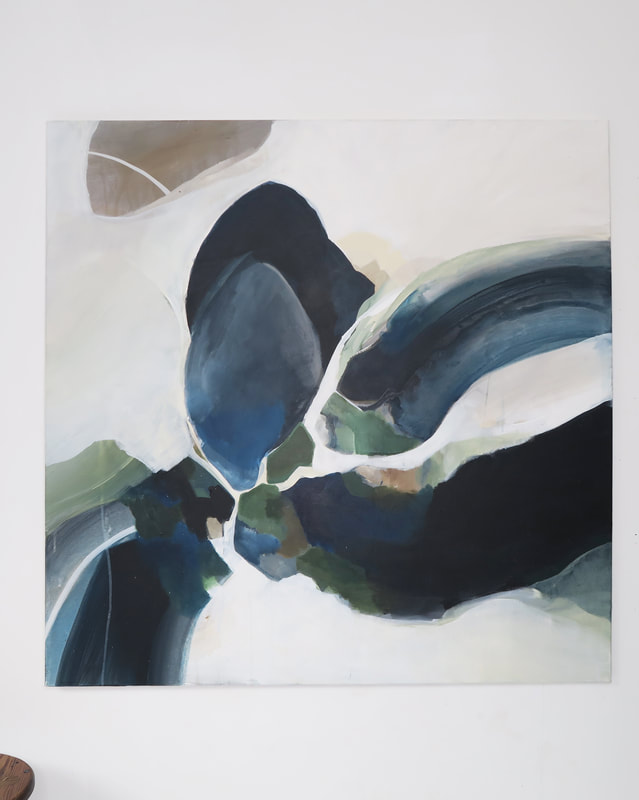
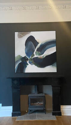
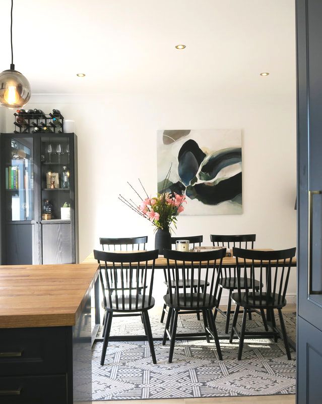
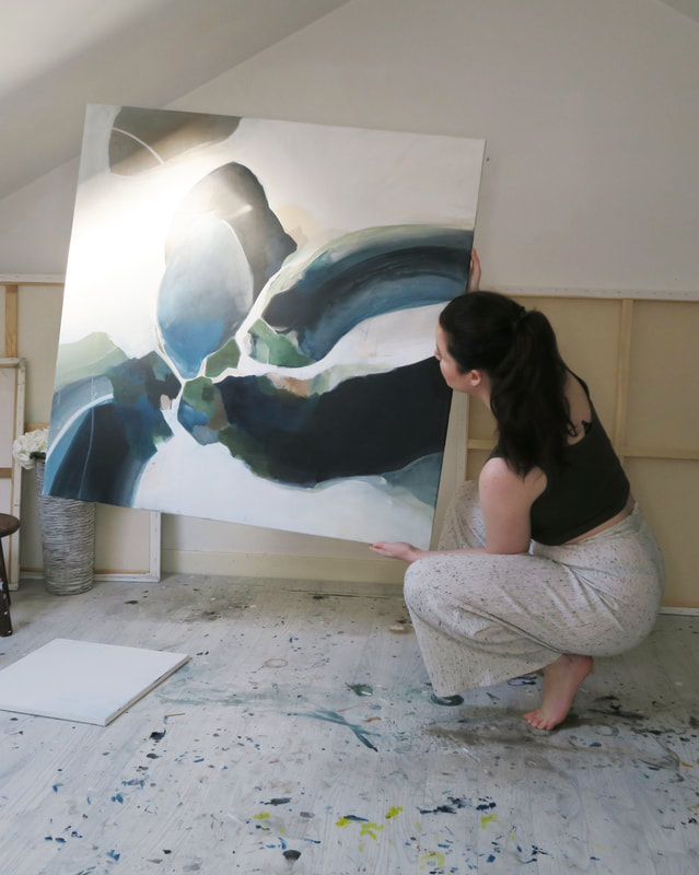
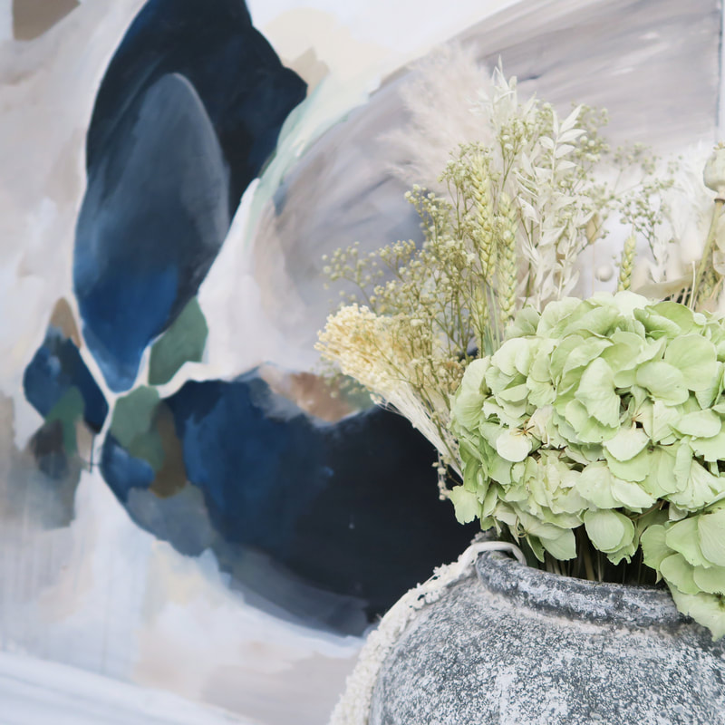
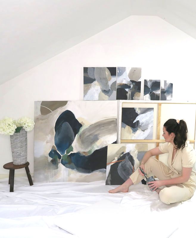
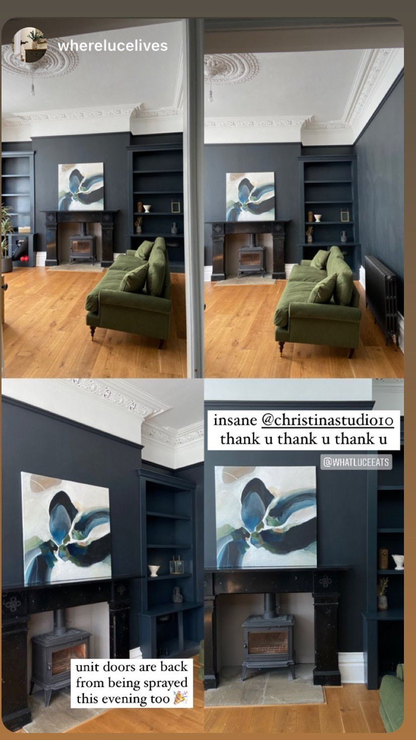
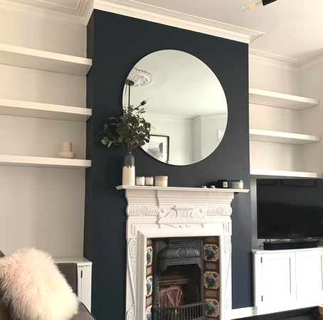
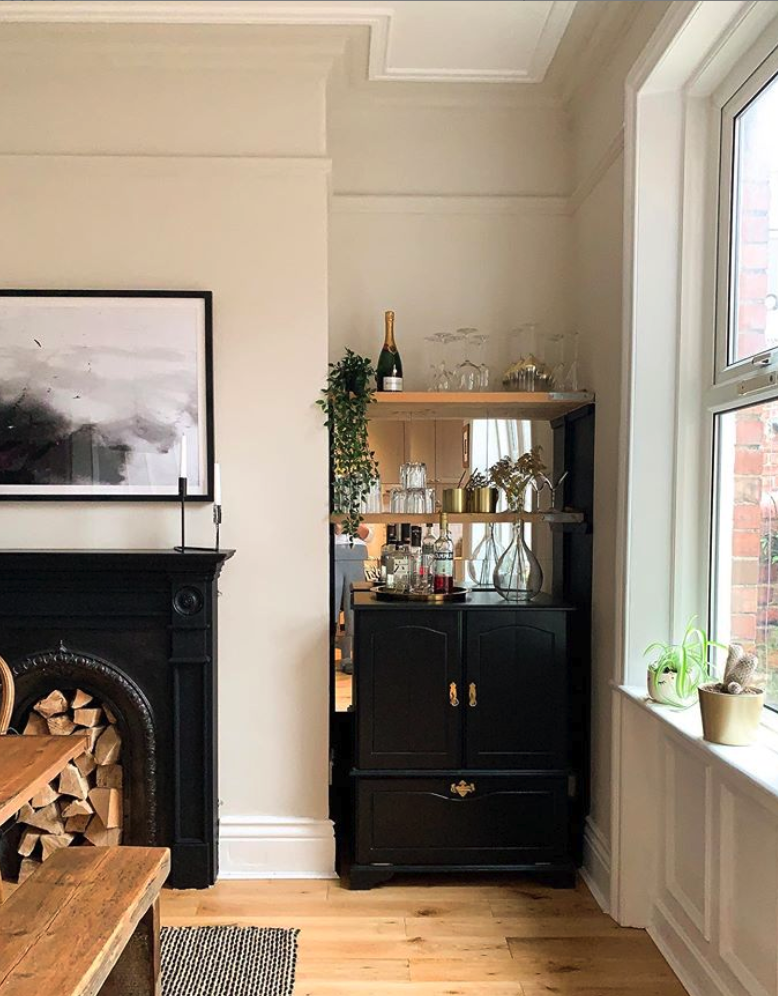
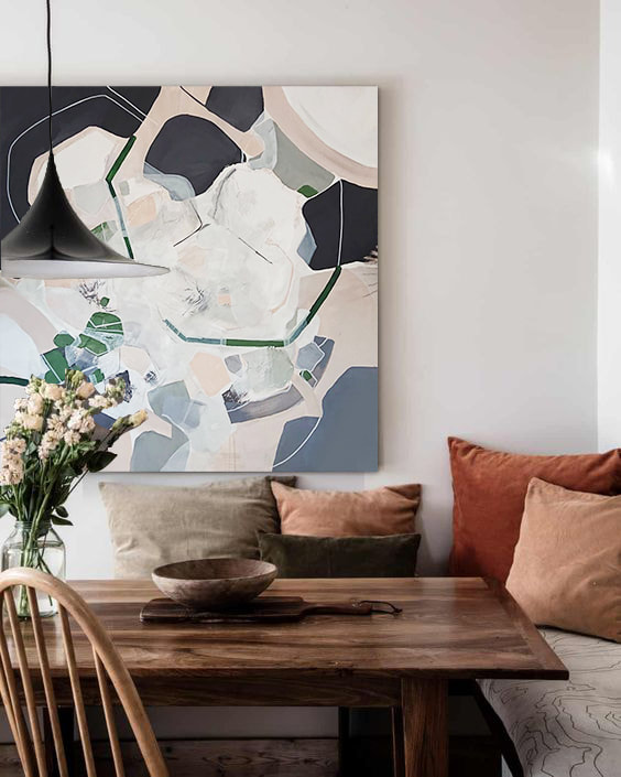
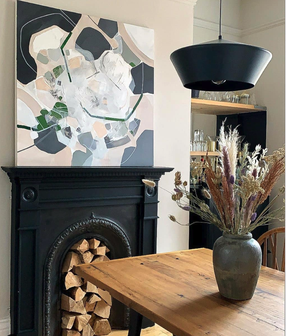
Now I'm looking forward to shipping them across the Atlantic to their new home! What. a. year. This year has flown by in what feels like one HUGE blur - how are we nearly in 2022 already?! I thought it was about time I did a summary of what I've been up to. Small wins for this year include launching a website for in-stock paintings and working with some fantastic designers including Studio LBI, VG Curation, Sienna Interiors and Kibre Interiors to name a few. I've sent paintings to the USA and France - had a full page spread in Hood magazine, been featured on an illuminated Billboard in Glasgows West end and for this first time this year I've introduced a wait list too which is crazy!! I'm still trying to balance work & life and find my flow with things - 2021 has been full of learning curves but I'm so grateful for all of my fabulous clients and for the fantastic projects I've been so lucky to have worked on. Every client and project gives me variety and the freedom to be creative. I've also been working part time with Louise and Nicole at Louise Bramhill Interiors as a designer and I'm loving it - I've always dreamt of having a career which will allow me to have one foot in interiors and another in art, and working with Louise allows me to do just that. Her projects & clients are quite literally A DREAM, consist mostly of residential projects - I'm constantly learning and the design work compliments my art business ten fold. I'd describe myself as a people person and although I have many clients I work with through my art, I do enjoy working as part of a bigger team at LBI. I think if I was working on my own full time, I would get a bit lonely! I know many artists feel the same, so its a good balance. But the good always comes the bad - I'm currently writing this after testing positive for COVID!! Isolating from my family this christmas isn't what I had imagined after a full on year but it is what it is. I know this year has been hard on so many so I'm counting my lucky stars that I have my health and good family & friends around me. My goal for next year is to launch a few more collections on my website and hopefully have a few more design collaborations. I'd love to continue to work with oversize paintings too and merge some design projects with my art. I've always done all my photography, styling, marketing, website etc myself but this year I think I might take on someone to help me with this side of things as demand for paintings get busier. A slight re-brand might be on the cards!! I'd also love to work with interior brands and possibly produce prints. I have a thousand ideas and it seems there is never enough time to do them - but one thing for sure is that I couldn't be happier doing what I love. Heres hoping 2022 is as busy as this year has been. Thank you to everyone who has supported me whether that be a like, share or purchasing / commissioning a painting - it is so appreciated. Heres to another year! Christina x Browse some of favourite commissions from 2021 below: Louise Bramhill Interiors - Kitchen DuoLouise contacted me whilst she was undergoing her kitchen renovation - which she designed herself and had made bespoke in scotland. She wanted me to match colours to her beautiful stone worktop and wood units. Something peaceful and calming was needed for the space. She wanted a duo, two canvases in portrait orientation which would compliment each other and create a nice focal point above her dining table. For any more information Louise has written a blog on how she designed her kitchen, with more kitchens coming in 2022! Size: 100cm x 80cm Derbyshire Double Mezzanine HallI was commissioned to create two bespoke paintings for a double height mezzanine space. One of the paintings was to be oversize - 1.95m and 1.25m and the other smaller at 1m x 1m. The hall looked out onto a gorgeous green garden, and my client wanted me to take inspiration and colours from the view. The two paintings had to compliment each other, as they were being hung at different levels but would both been seen from the ground floor (elevation attached!). The final paintings brought the outdoor textures and colours in, and created a nice unique statement for the hall. Install pictures coming in 2022! Sizes: 195cm x 125cm and 100cm x 100cm Edinburgh Stair DuoA duo created for a narrow stair space - the paintings were used to connect the ground floor and first floor and make the space more cohesive, bringing blue colours from the interior in and silver tones in furniture through the paintings. One of the best things about creating two paintings is the flexibility of how you can hang them and use them in an interior; if they work as one you can use them in a huge space and they will always sing together. Sizes 100cm x 80cm Edinburgh Townhouse Oversize PaintingA oversize 1.95cm x 1.25cm bespoke sized canvas made to fit inbetween the panelling of an edinburgh townhouse. A grand piano would sit infront of the painting so the focal point needed to be towards the top 1/3 of the painting. The brief was to work to dark pinks, purples and navys which had been used elsewhere in the house (pictures attached) - creating a bold. colourful, contemporary piece. Master Bedroom / VG Curation Interior ProjectLeanne from VG curation got in touch with me to create a painting for one of her interior projects for a master bedroom. She provided me with a list of interior elements to consider before working up the moodboard - The wall the painting would be hung on is painted farrow and ball Wevet, adjacent to this was a Craig and rose painted wall in Pullman. All wood furniture was oiled oak, with bed linen from piglet in bed. The canvas size was to be 120cm x 120cm. Her clients loved nature and warm orange tones so I wanted to bring in elements of 'leaves' and natural forms. As I started working up the painting I realised I was adding more pink than I originally intended to, but I think it complimented the green/brown tones nicely. The client was happy for me to take my own steer on the painting and thats just what I did. I loved the result and Leanne and her clients couldn't have been happier either! Its been a while since I updated my blog, or wrote about any commissions in general. 2021 so far has been overwhelmingly busy - for the first time since setting up business I've had to stop taking commissions and created a waiting list. I love doing what I do and feel SO lucky to call it work. I thought I'd write about one of my first commissions of the year for my first 2021 blog post. This painting was for a period property in england - big windows, traditional architectural details - dreamy! I was approached to create this piece for a living room from Luce - commonly known as 'whereluceeats' on instagram - shes a foodie blogger and creates the most AMAZING dishes. I'm lucky to have some very interesting clients! Her new living room was to be painted farrow & balls railings - a deep black colour with a tiny hint of blue. She was ordering one deep green sage sofa and beige sofa, and wanted the painting to be hung over the black mantel piece and wood burner. Below are some photographs of the existing space I was creating the painting for, and the moodboard I brought together for her. The moodboard combined a mix of neutrals, sage green and dark navys. Looking at the dark wall I thought something quite light and neutral would stand out against the wall colour, but then with darker blacks/navys to contrast this. I thought adding in some tones from the sofas would be great - the navy/blues and olive colours bounce well off of each other. I was also thinking a warm, beige tone might just bring in some of the warmth from the floor and really compliment the room as a whole. The process of creating the painting was a breeze - I wanted it to have a light base but with strong shapes and colours. The was the final painting. When sending it to Luce I also created a visualisation which allowed her to see what the painting would look like above the fireplace. The final look : seeing it in the interior it was made for!Always my favourite part, Luce is planning on getting the painting framed but sent me some photographs of the space when the painting arrived. I just love how it sits next to those dark walls!! I loved the painting so much and missed it when it was eventually sent away. This was a bit different as I used bigger blocks of colour than I normally work with, but I think it worked well!
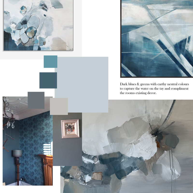
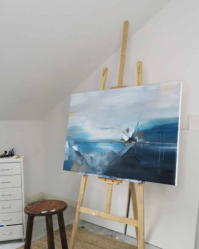
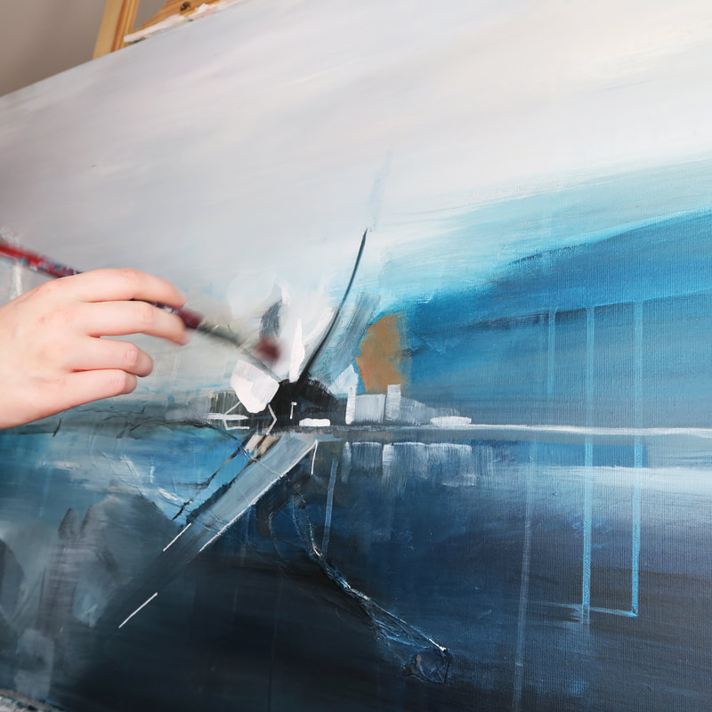
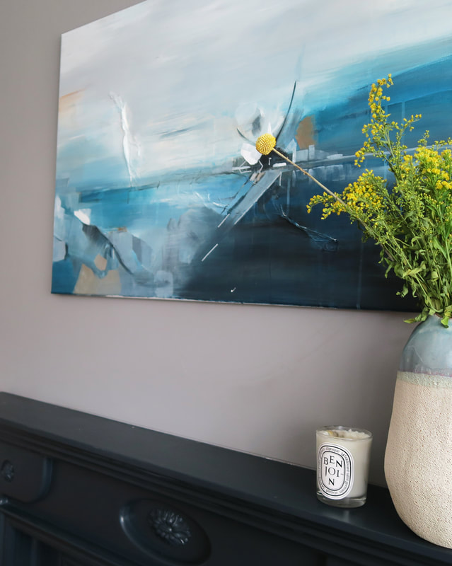
Thank you so much to everyone who reads my little blog or has commissioned/bought a painting from me this year already. Christina x One of the main things I love about commissions is how different each brief is and my clients visions can be. This month I was approached to do an abstraction on a 60 x 90cm canvas of a special location in Scotland, using colours to compliment my clients space. They have existing teal wallpaper in their period home, so the main objective was to use colours to compliment the space. The room has a huge window which opens out onto the river tay in Dundee, Scotland. They wanted to capture the tay in the piece and use the painting as a focal point above a fireplace. As always, I worked up a mood board for them before starting the piece. I focused on bringing in the colours in their walls, as well as introducing some contrasting neutrals to compliment existing architectural features and bring different tones to the piece. The river tay is a beautiful expanse of water, and I wanted to capture the flowing tones and reflections in the location, the bridge and its linear qualities, as well as some characteristics of Dundee city itself. Can you see the resemblance?and... TA DA! finito!
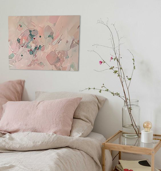
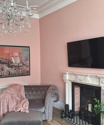
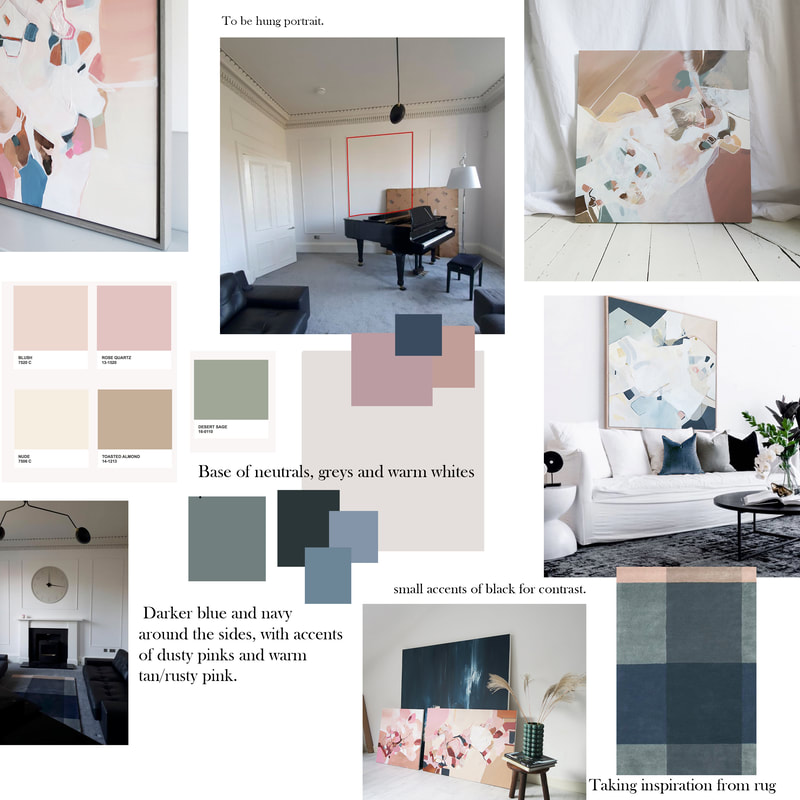
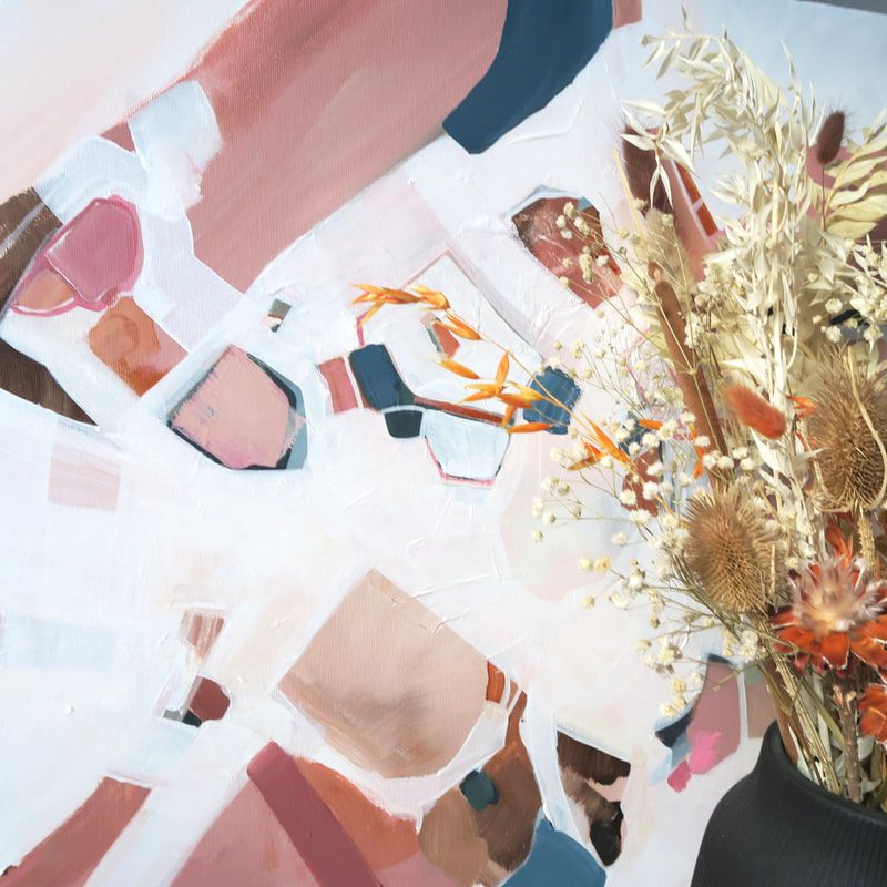
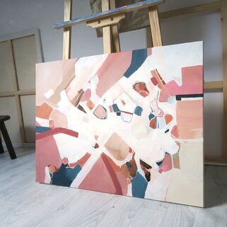
Can't wait to see this framed and up in its new home. I really enjoyed doing this piece and seeing the final result. For more info on commissions head to the commissions tab, where I will talk through the process a bit more and hopefully answer some questions! Christina x 2020 wasn't great for socialising, and 2021 so far does not seem much better. Instagram and social media has been a LIFE SAVER for me in terms of still managing to connect with clients, other creatives and influencers and I think I'd really struggle without having it there as a creative outlet. I was lucky enough to connect with Kim Mcfarlane who has her own insta page and following under 'the home kim built'. She is based in Glasgow and she loves pink just as much as me, so when she asked me to work up a new painting for her living room I was more than excited! Kims taste is luxe, SUPER feminine, classic and timeless with makes her house updates really interesting to follow - I do have a soft spot for feminine style and Kim nails it with her instagram page. The MoodboardAs I always do with a new commission, I discussed with Kim what kind of style she would like, and took all of the colours in her room to work up a palette which would influence the piece. I loved the mix of dusty purple in her sofa with the cool baby pinks on her wall. I also made a point of taking in the warm orange and browns from her flooring and neutrals found in her mantel piece. Kim then agreed with the moodboard I had sent her, and I used this as I was painting. The Final PaintingThe end result was this lovely pink painting. I think this painting has so much personality and adds a playful edge to the room - its mostly pink, with some graphic shapes and contrasting blues; A pleasure to create and lovely seeing it sitting in Kims lovely room!
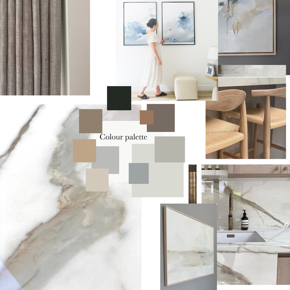
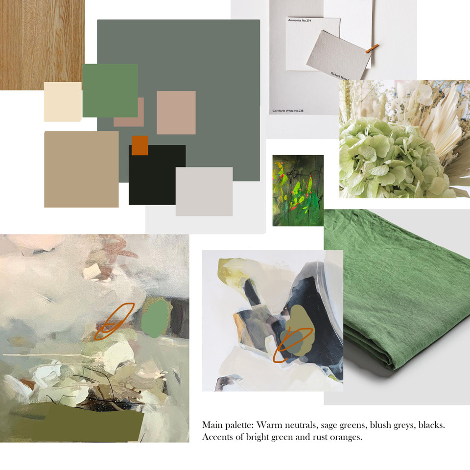
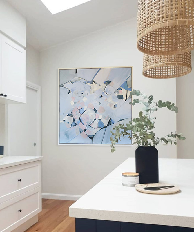
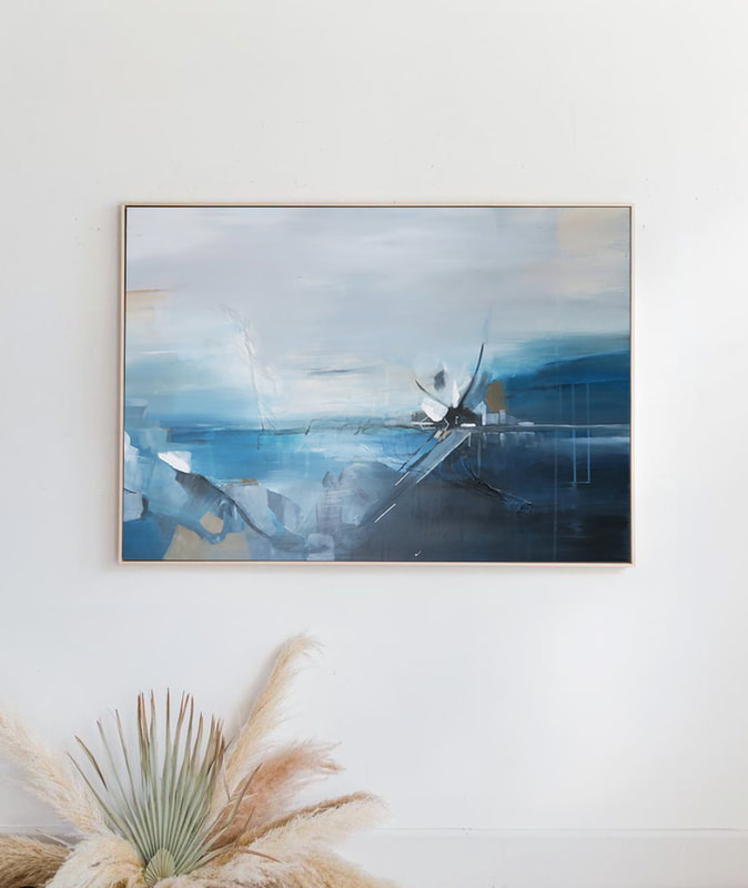
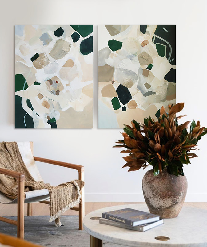
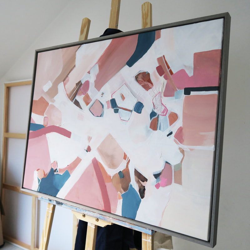
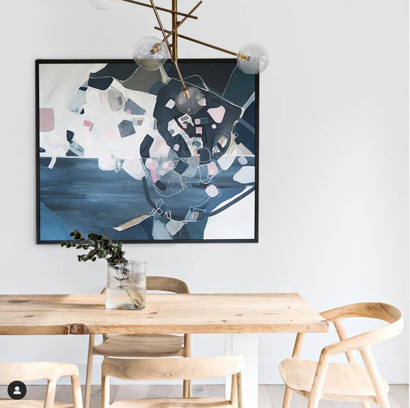
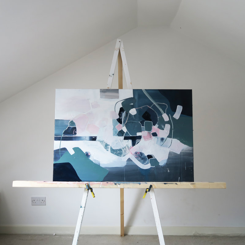
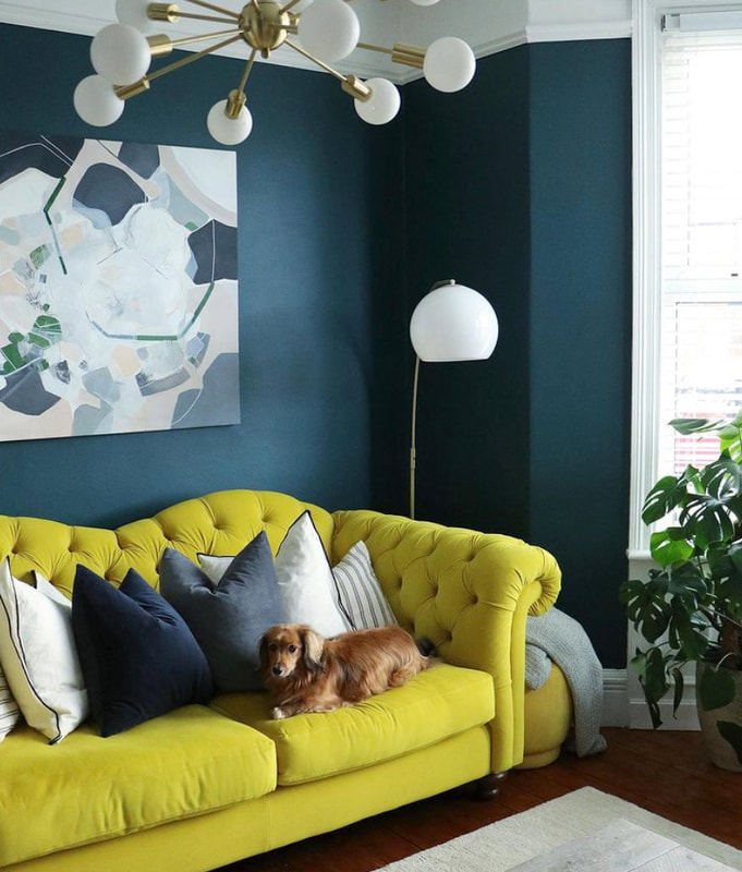
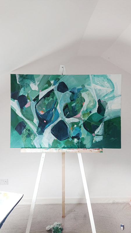
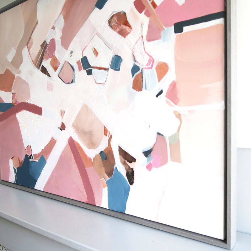
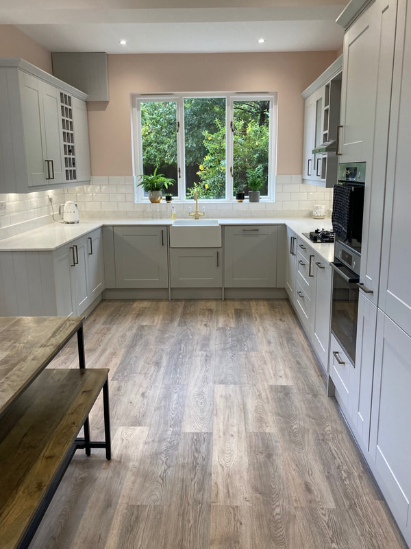
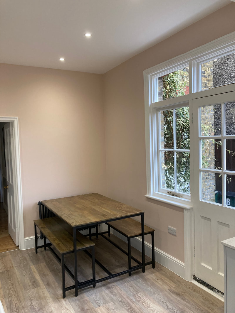
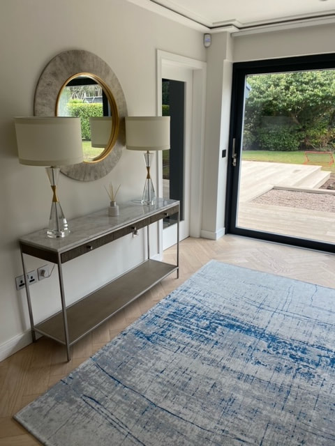
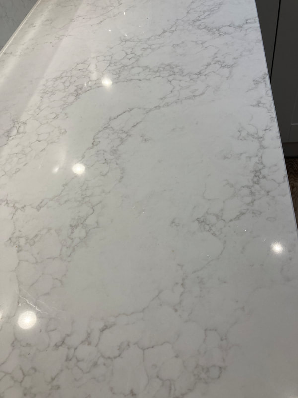
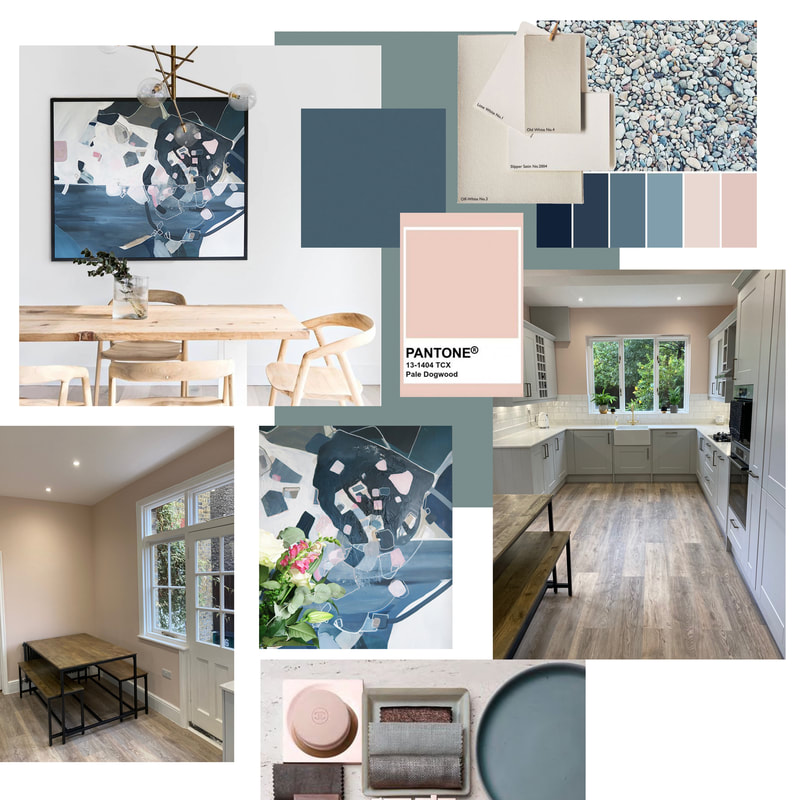
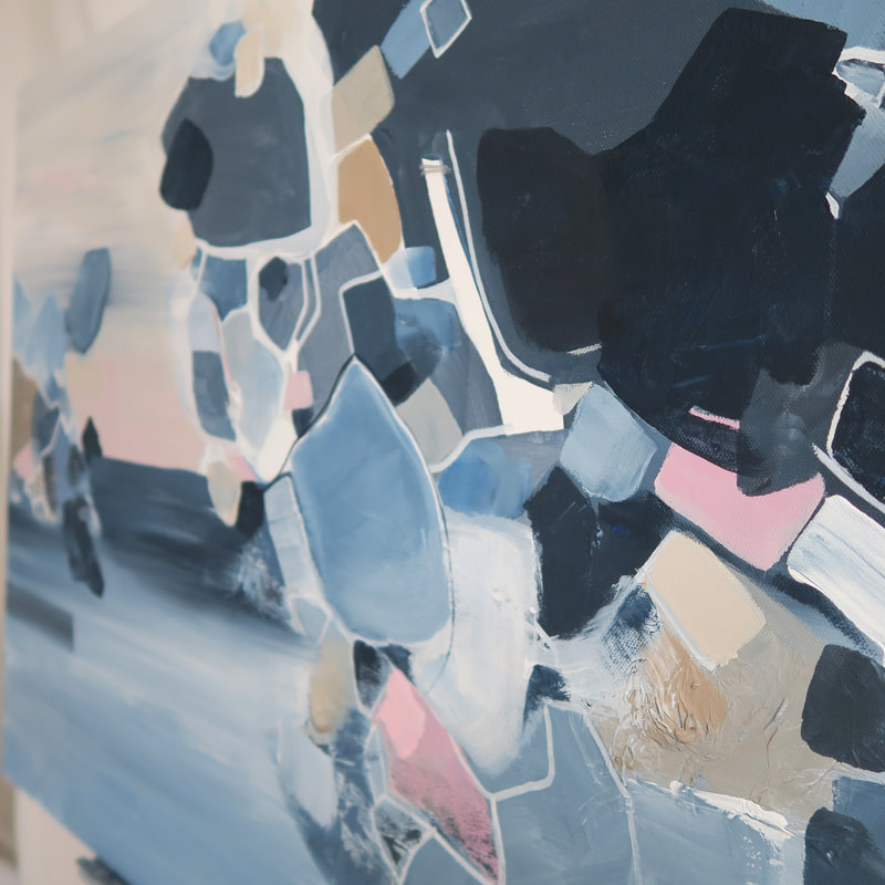
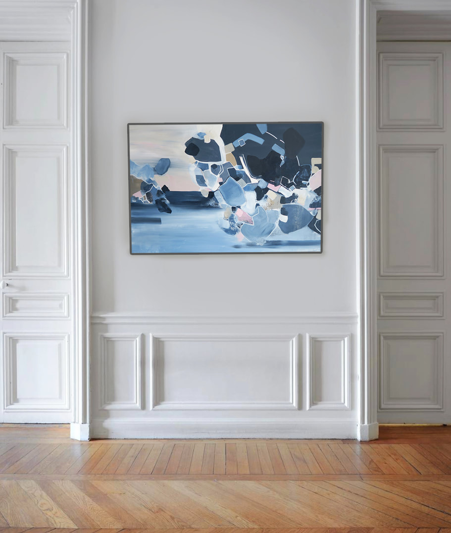
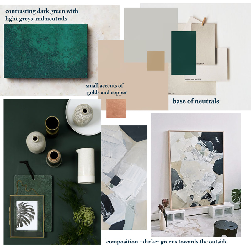
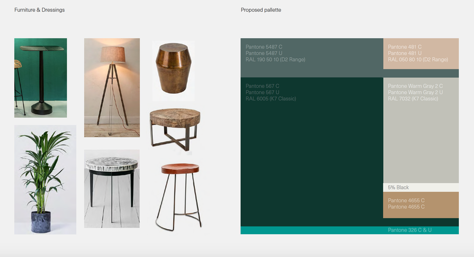
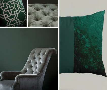
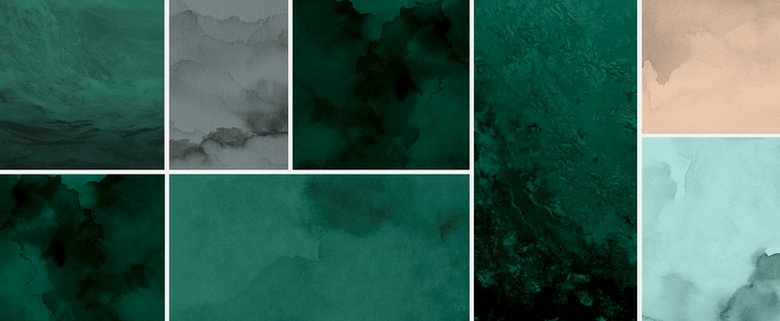
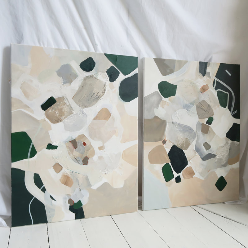
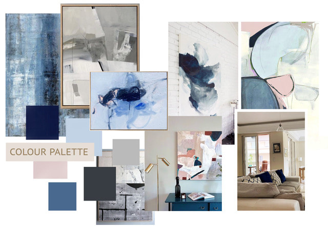
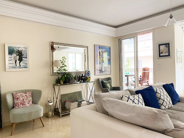
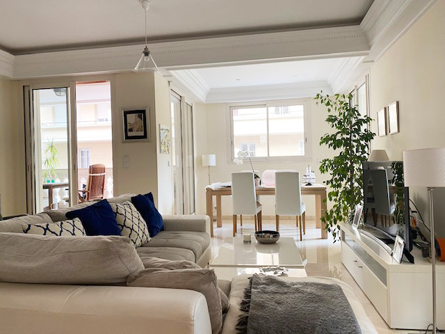
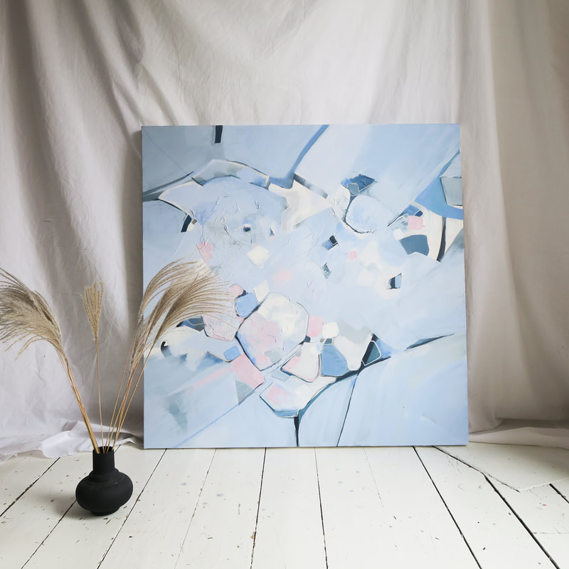
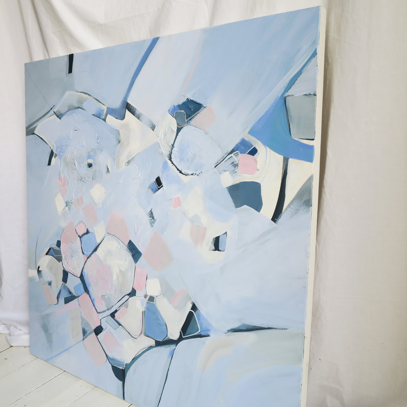
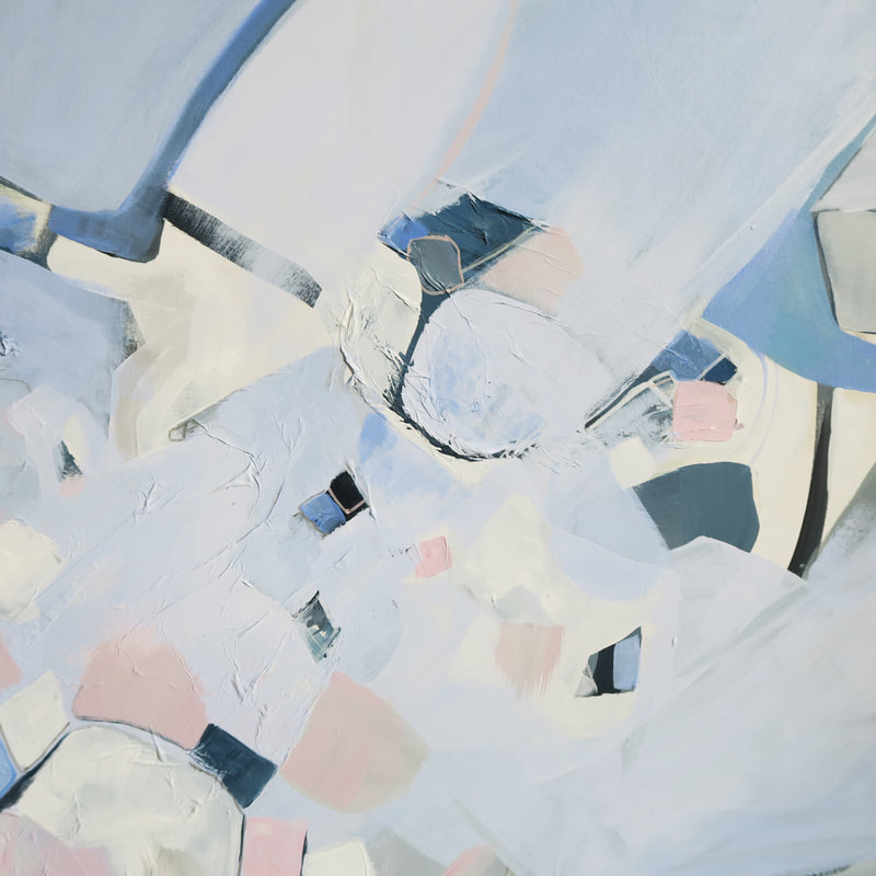
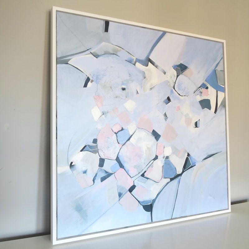
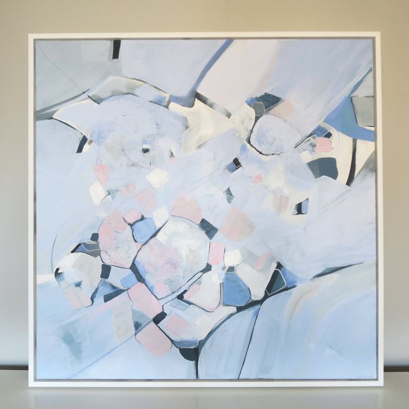
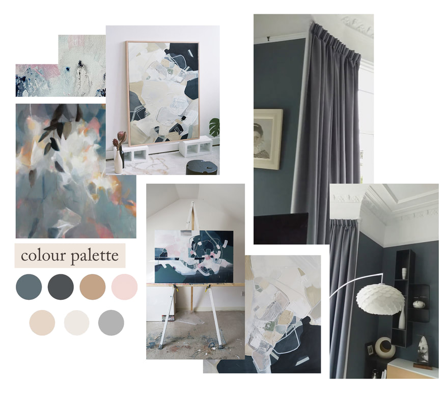
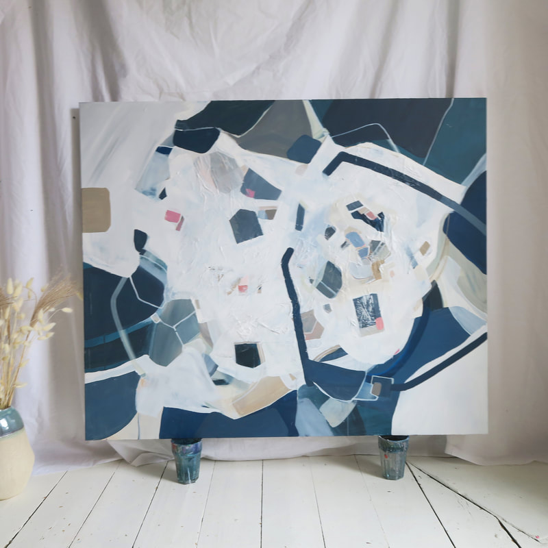
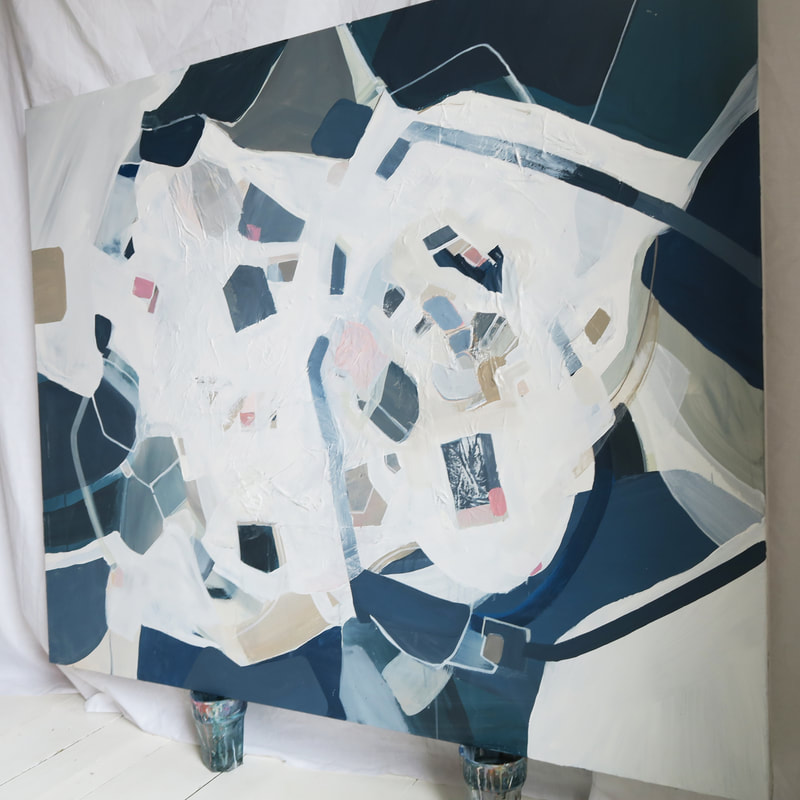
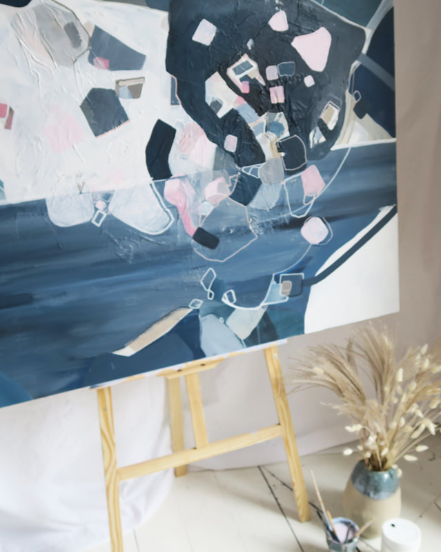
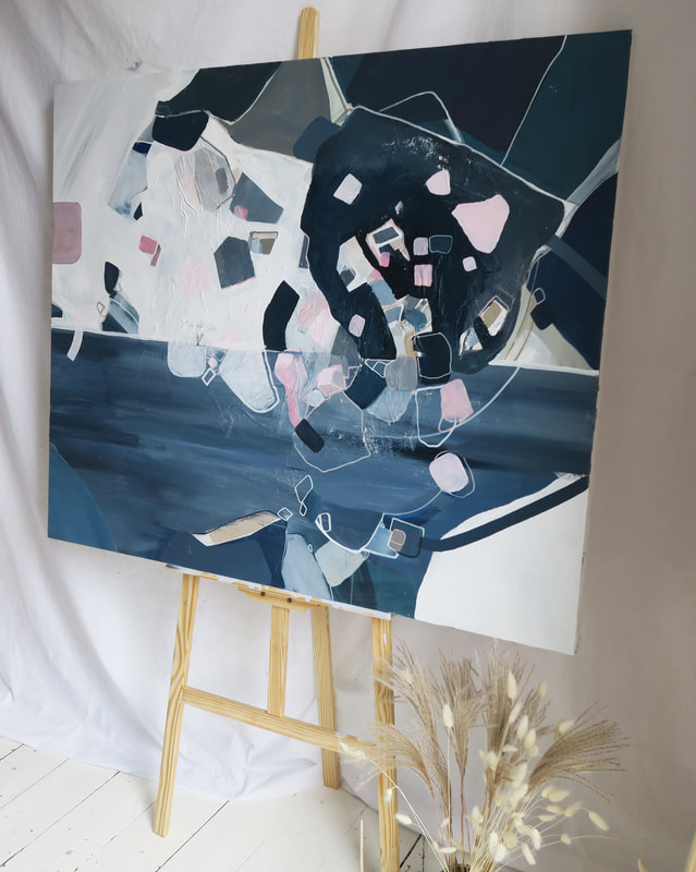
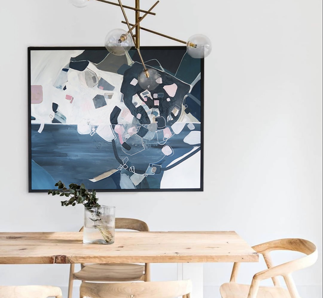
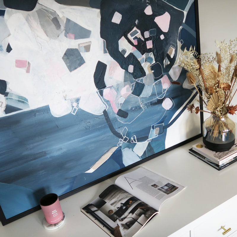
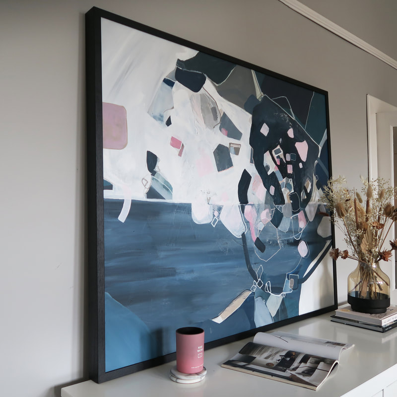
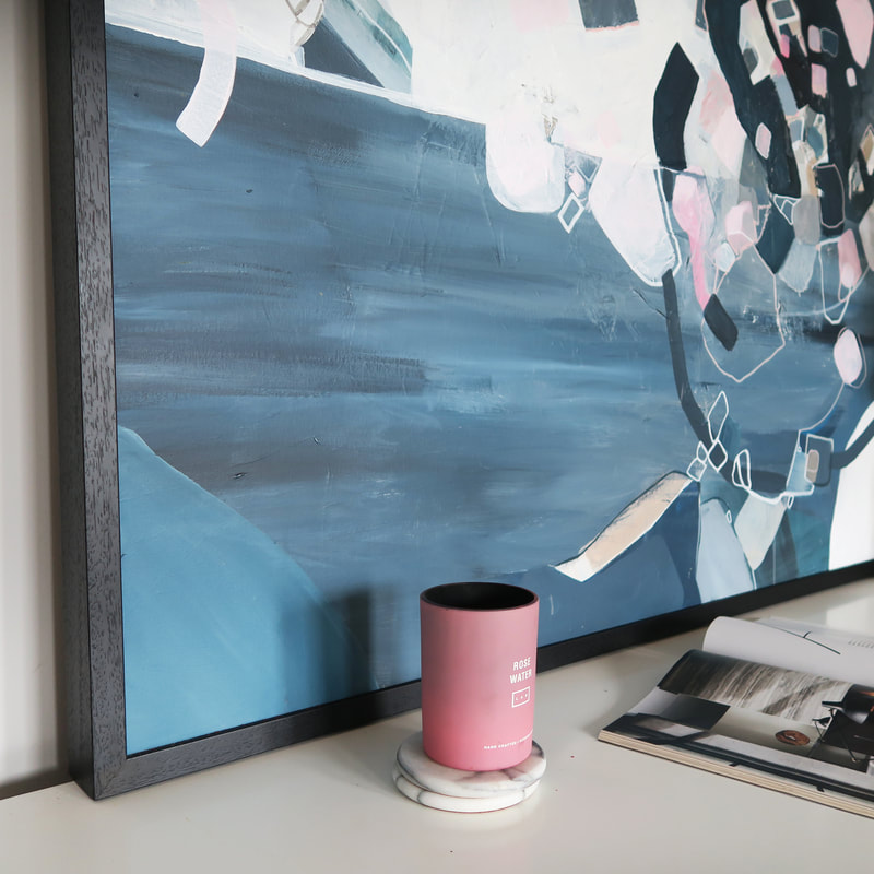
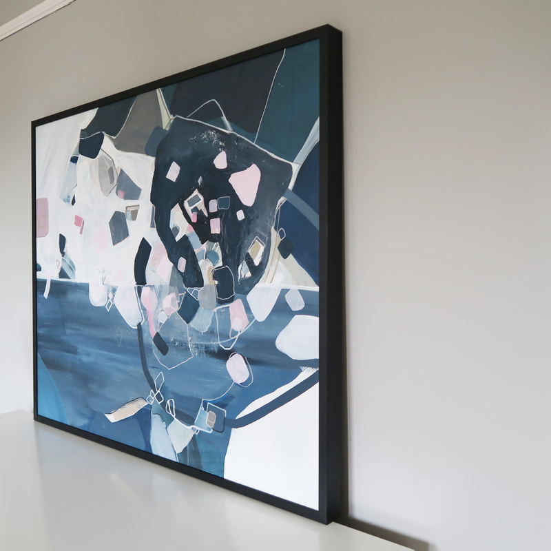
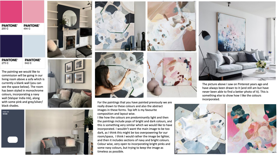
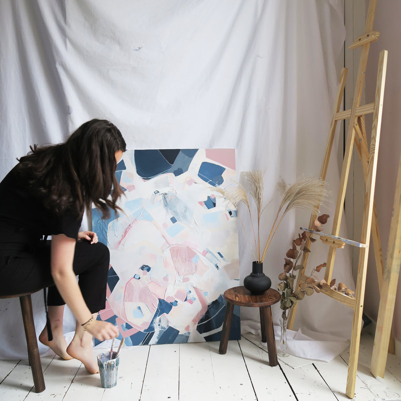
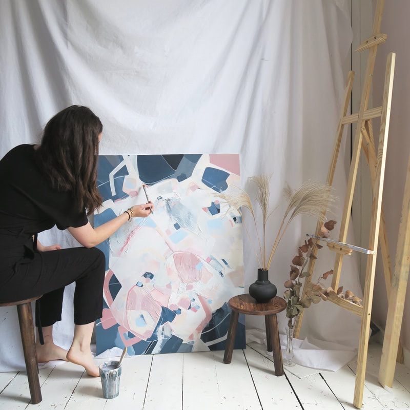
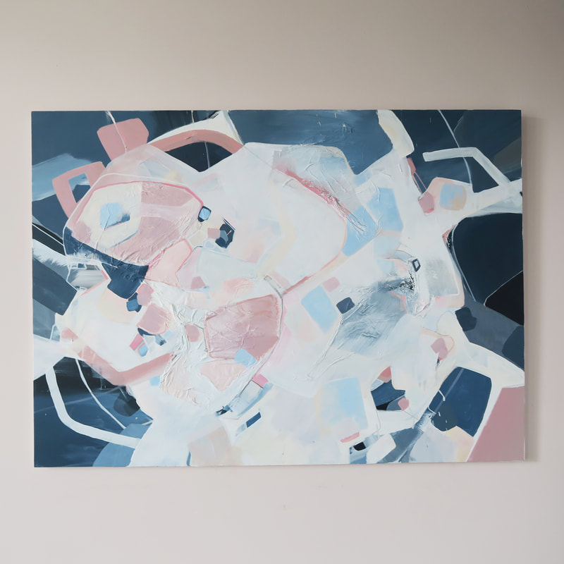
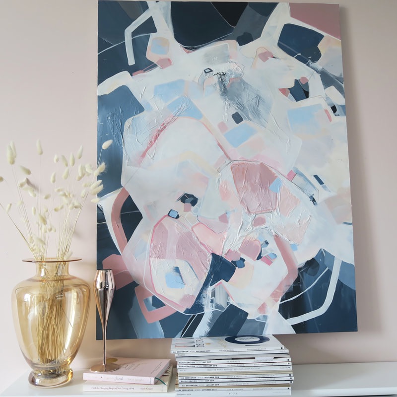
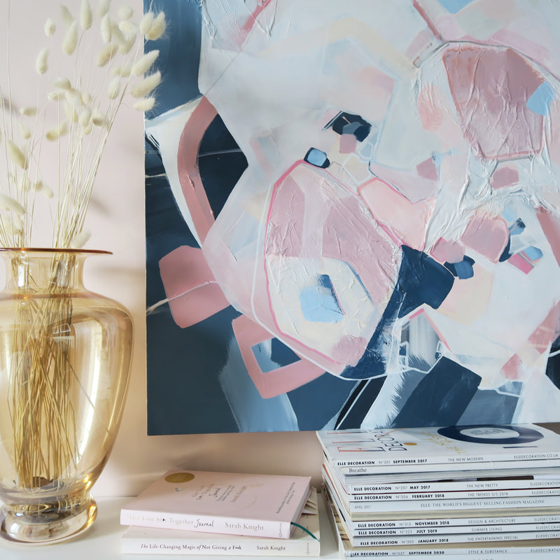
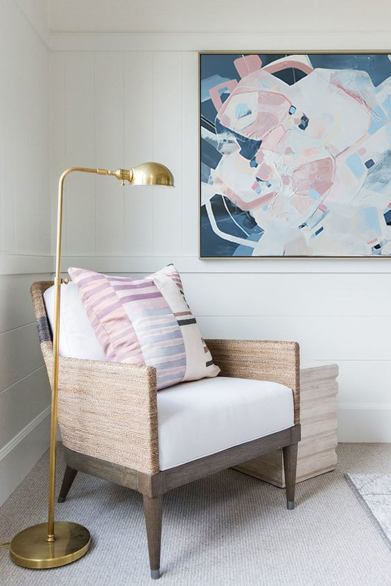
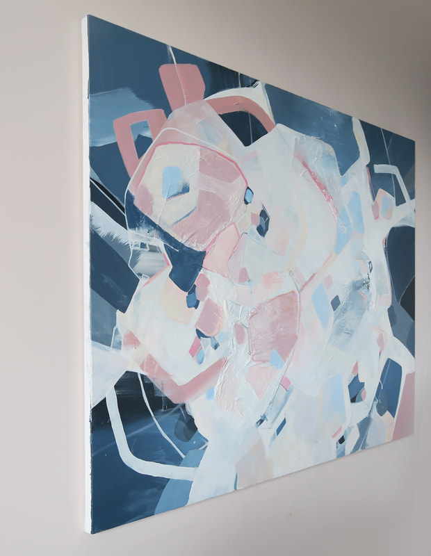
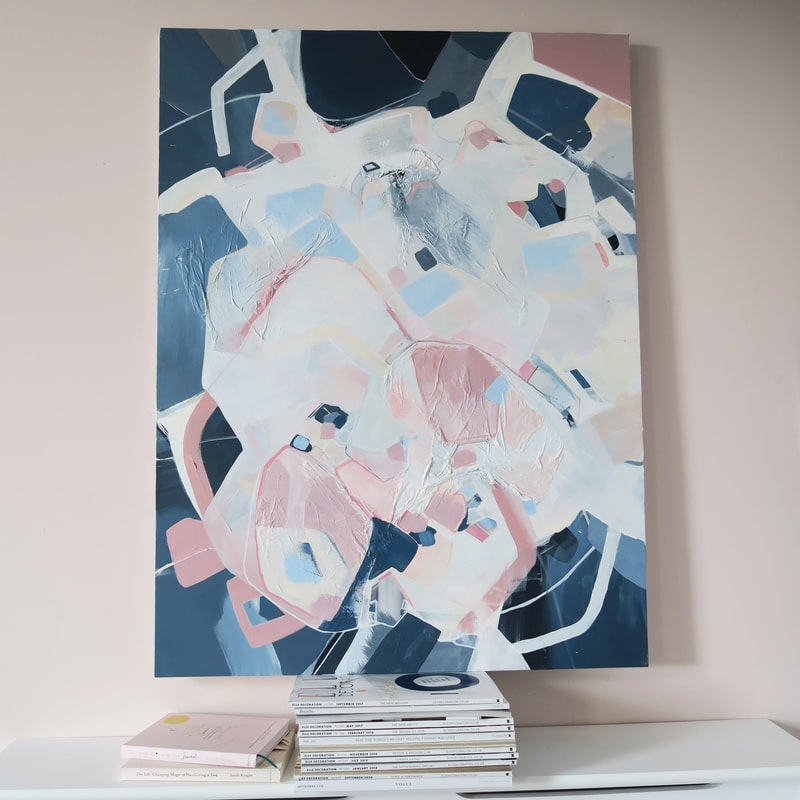
The BriefI was commissioned to create a painting to fit perfectly into my clients lovely kitchen and dining area. Their friends call it the “beach kitchen” (even though they live in London) as it has a relaxing vibe which includes pastel hues which might remind you of a beach scape. They had envisioned a piece to contrast with the light pink walls and light grey kitchen cupboards, but keeping with a beach theme - think of stormy greys and textures, play of reflections and shapes resembling shells and sandy textures. My client was really drawn to my “nights by the bay” piece which capture the colour palette they wanted. Think a base of dark blues, greens and greys, then adding in whites and light greys with pops of pink to compliment the walls and bring some light and contrast to the dark. This piece was all about contrasting linear elements with strong organic flowing shapes. My client then sent through some interior photographs which included a close up of their granite worktops which are white with swirls of grey, and asked if I could include an element inspired by that stormy look that they capture. The InteriorThe MoodboardFor every commission I do I create a moodboard based on the brief, and send this to the client to see so we are both along the right lines of colour and influence. I then always refer to this when I am beginning the painting & throughout the process. The Final PaintingThe final painting I've named 'fragments of the tide' - and you can probably see why. I think it captures a stormy sea scape well, but also looks contemporary and abstract enough. Really enjoyed doing this piece and my clients were lovely! Onto the next one now... 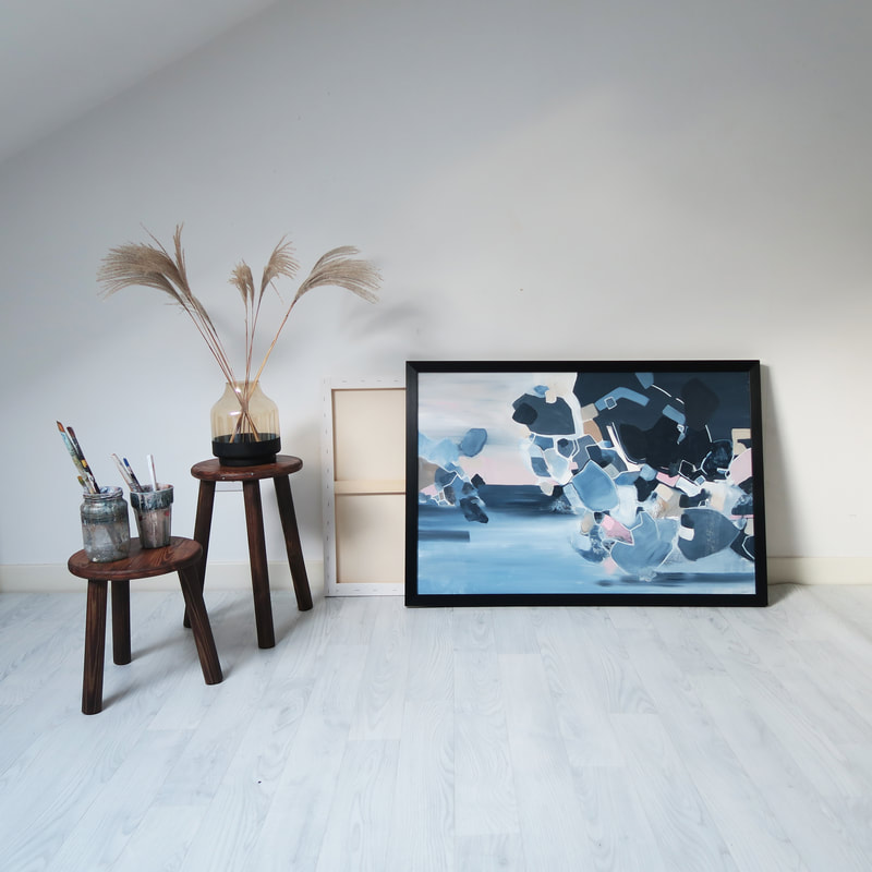 I was so excited to be commissioned to create two paintings for an interior project run by Kibre Studio in London. The space they were commissioned for was a lounge/ games room for a Build to Rent scheme in Sutton. Kibre Studio specialise in Build to rent schemes and have worked with some of the UK's largest landlords. Kibre sent me through the branding document, as they ideally wanted them to tie into both the furniture / finishes and the new branding. Below are the furnishings, interior finishes and moodboard which should help paint a bit of a picture of the brief they gave me to help create the paintings to tie in with the overall project. The brief was incorporating mainly the Dark green RAL 6003/ grey tones from the branding, with some hints of the dark blue that’s in the furniture. Then I planned to add accents of the copper/rust tie it in with the accents in the furniture and lighting. From this brief I put together a moodboard which is below. Below are some of the proposed furnishings and palette which influenced the piece. Part of the brief involved creating a 'water' effect which linked to the projects branding. I tried to incorporate this by using some watered down acrylic neutrals and green, layering these and letting them contrast again some harsher lines. Studio ShotThose copper accents & finer details..The Finished PiecesBecause there was such a clear brief from the team at Kibre, the paintings were completed within a 4 week lead time from the initial commission and in 4 weeks sent down to site ready to be hung! I can't wait to see them in the space next to the furnishings, fittings and decor the team at Kibre have chosen. It was great to explore some of the other projects Kibre have completed, involving some gorgeous artwork from other artist and furnishings - I'll link there website here and include some images of their previous projects below. This was such a pleasure to do for them, I loved working to such a beautiful design brief and can't wait to see the project come together. Who else loves those emerald greens?! Kibre Design StudioI was delighted this month to be asked to work up a commission to sit in a beautiful apartment in Monaco, France. My client had a vision of pale blues, whites, and pinks. She wanted the overall feel to be light, airy and peaceful. I worked up the below mood board for her which consisted of some of my previous pieces she liked, a colour palette, and references to other pieces I thought worked well and fitted her brief. The Mood BoardThe ApartmentIn the StudioI really enjoyed using the colours in the palette as I've never used them before - this pale blue was a bit of a challenge just to get the balance right. I started working the painting up in dark blues and lots of texture, and then painted on top of this to work up a base of this pale baby blue colour. I started shaping forms and colours and creating an almost 'terrazzo' effect out of shapes. At the size this piece was which was 1m x 1m, it had a really statement effect despite being such soft colours. The Final PieceUpon completion of the painting, we decided to go for a shadow gap white frame which just brought the piece together - it instantly gives it a contemporary edge!  I'm pretty happy with how this piece turned out - so much so that once it was sitting in my living room I didn't want to give it up!
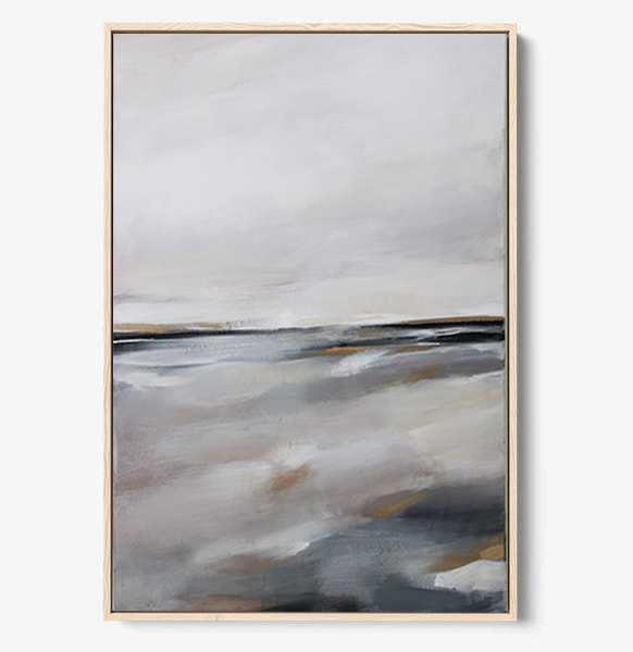
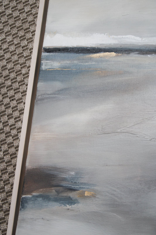
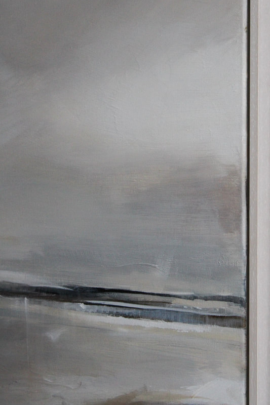
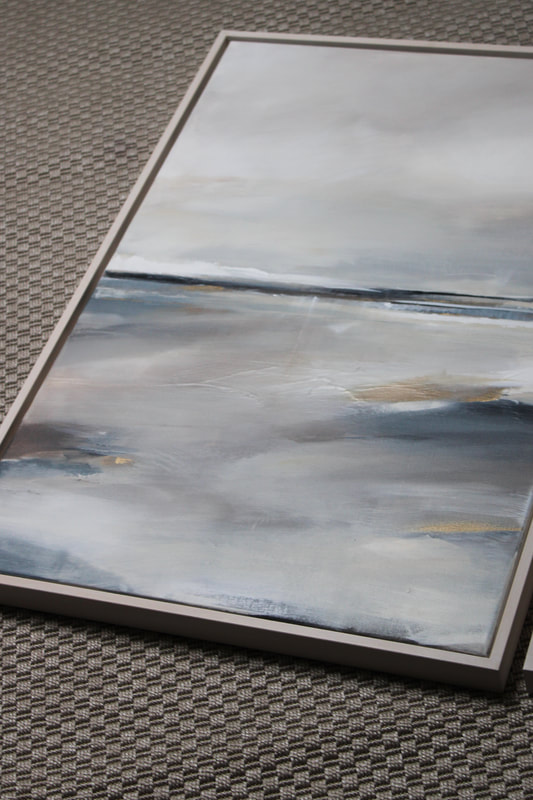
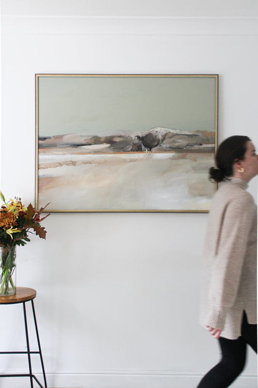
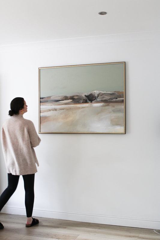
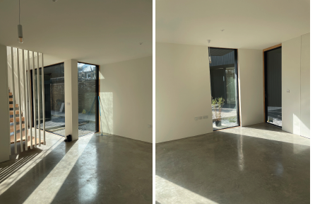
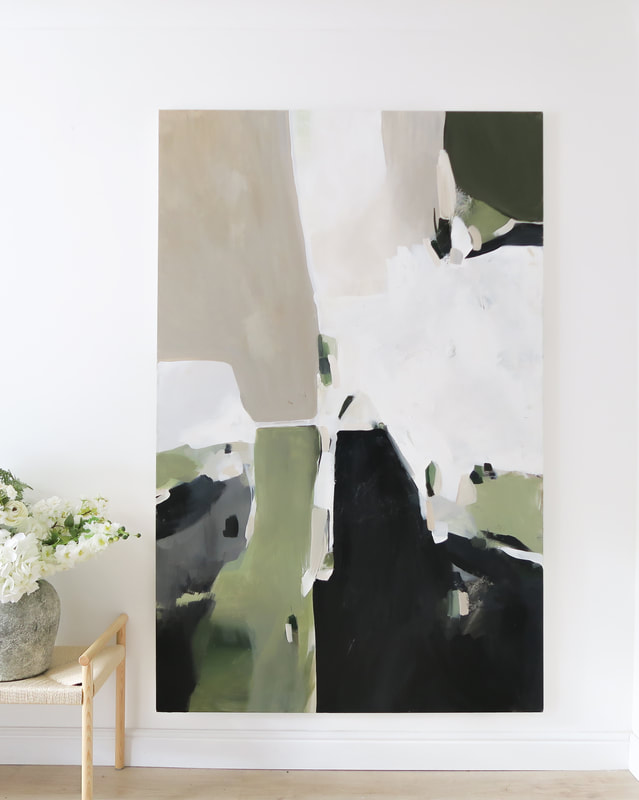
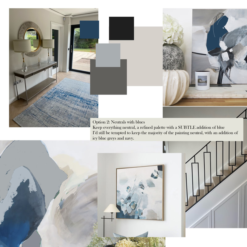
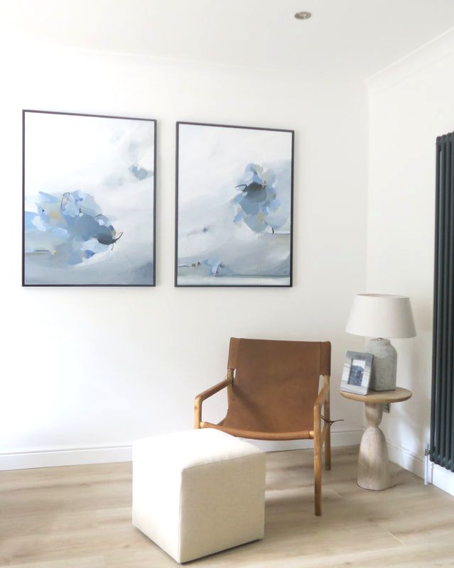
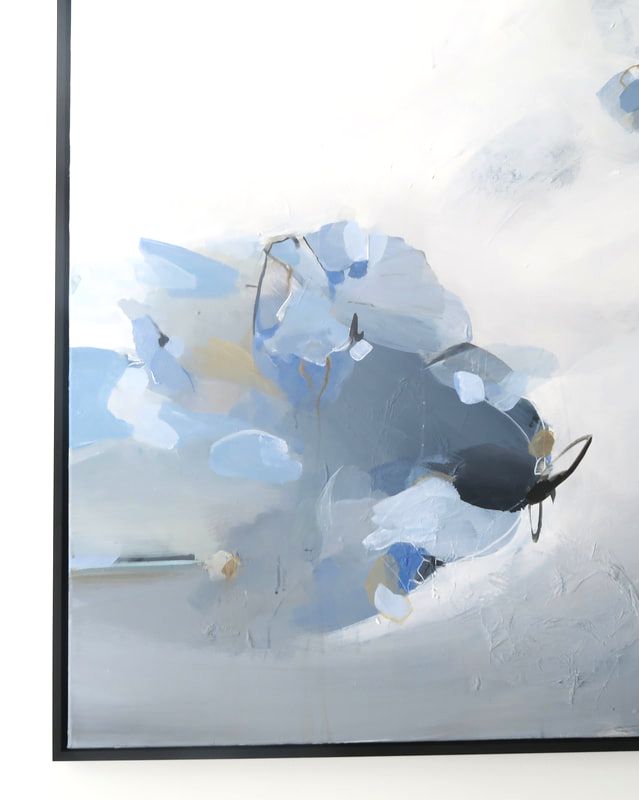
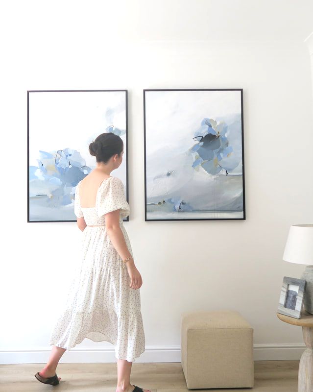
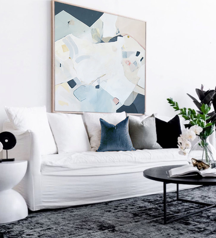
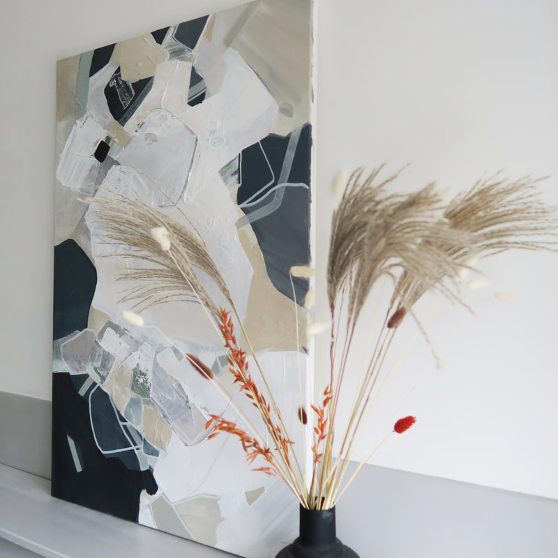
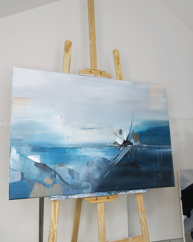
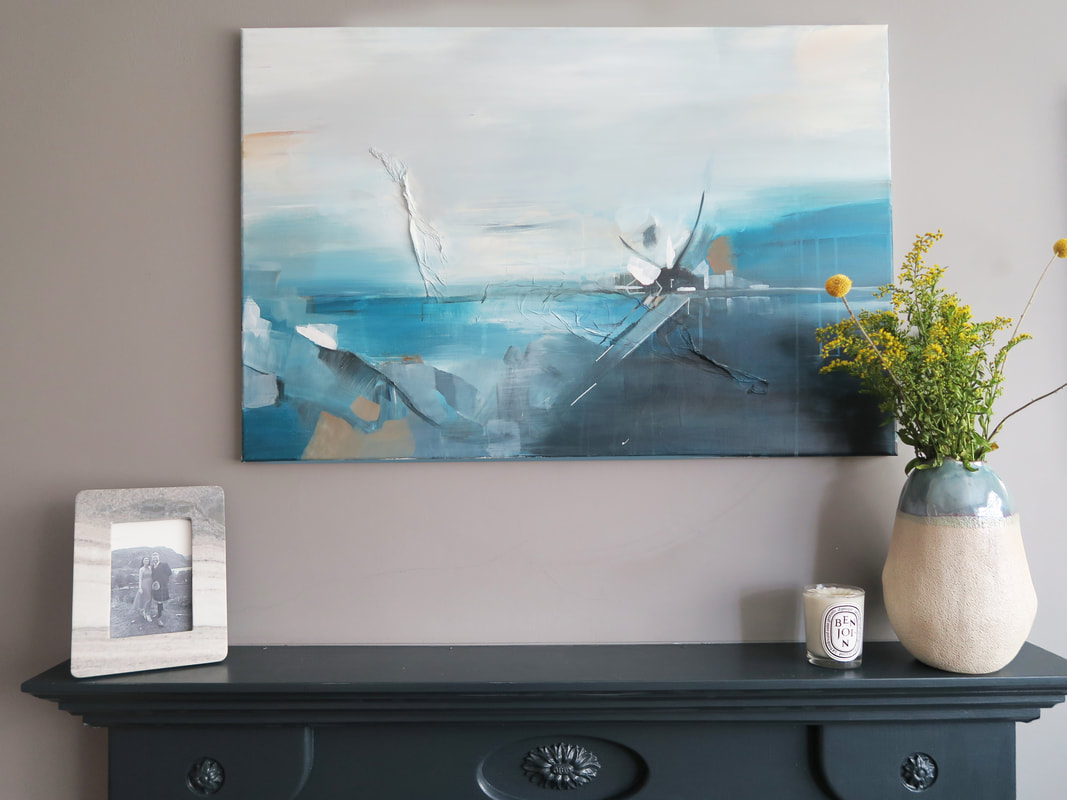
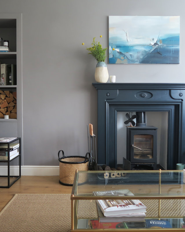
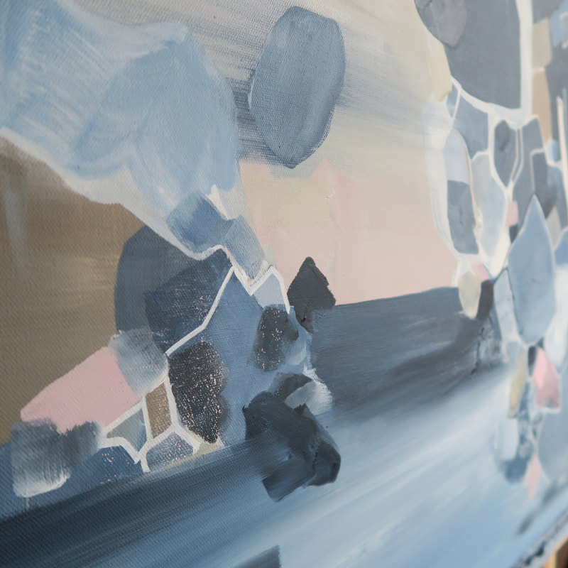
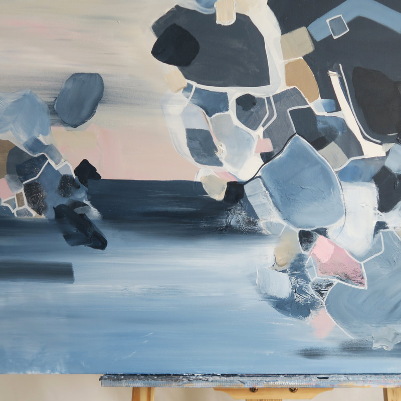
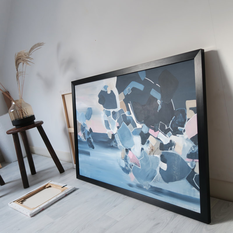
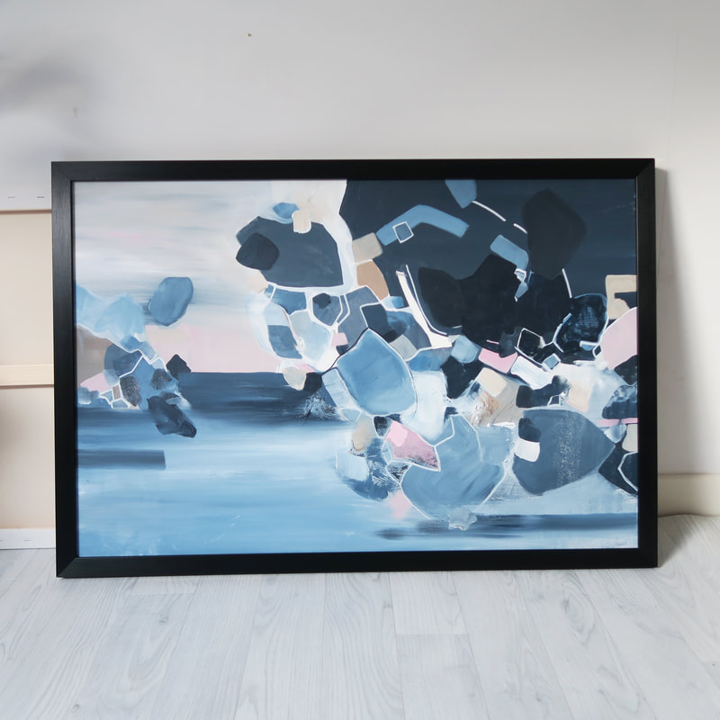
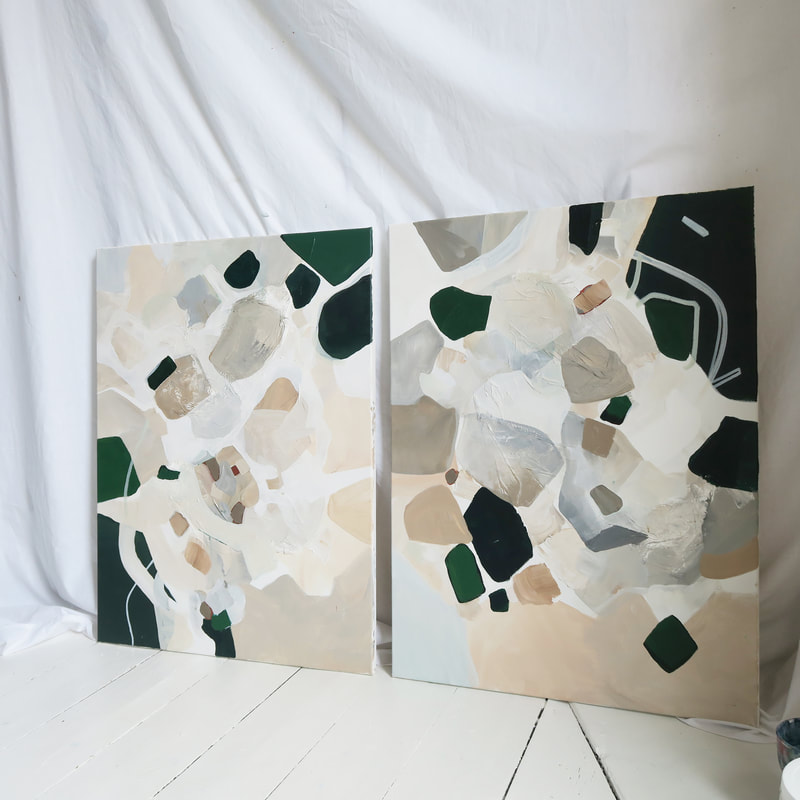
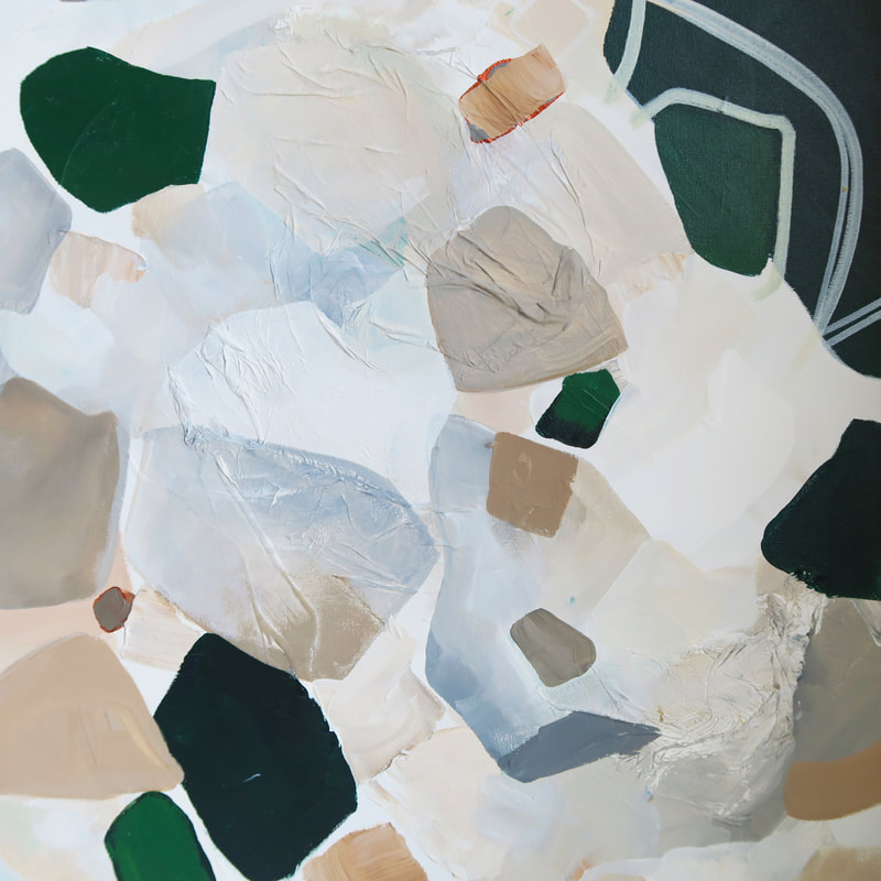
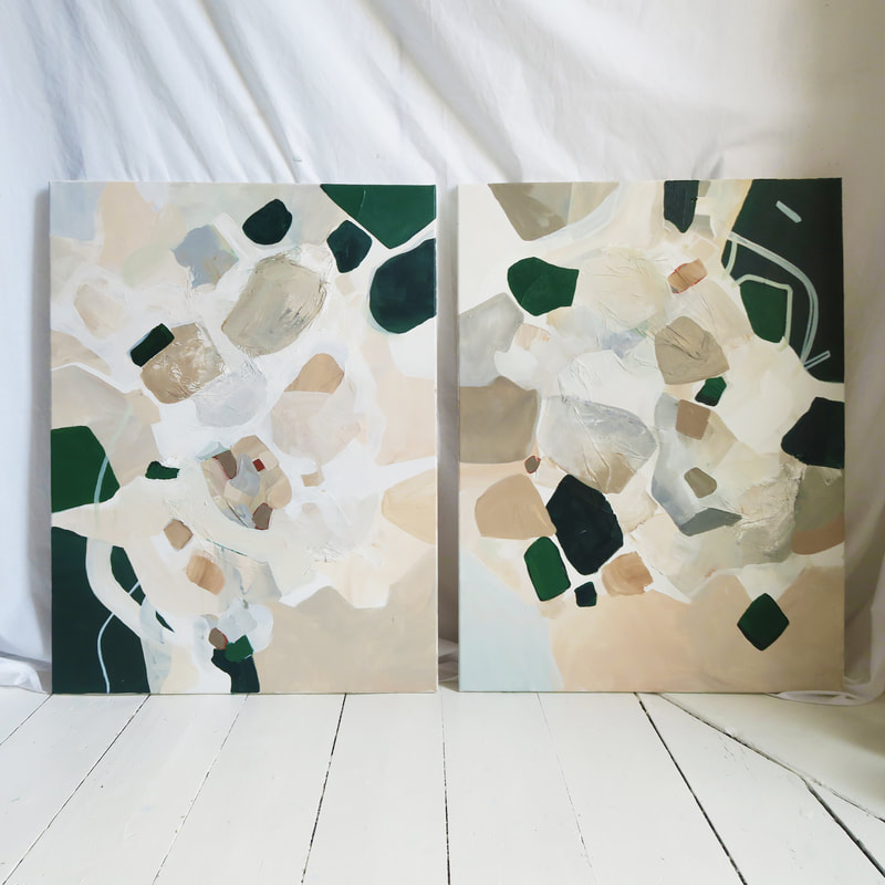
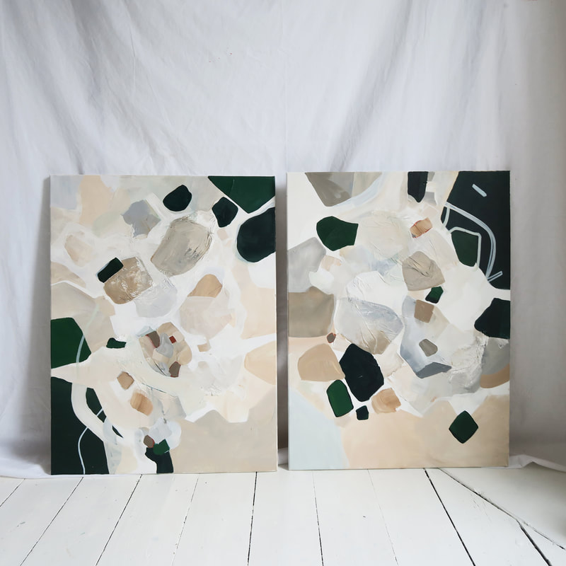
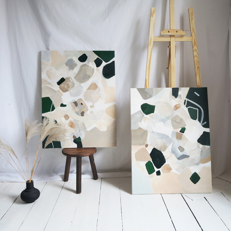
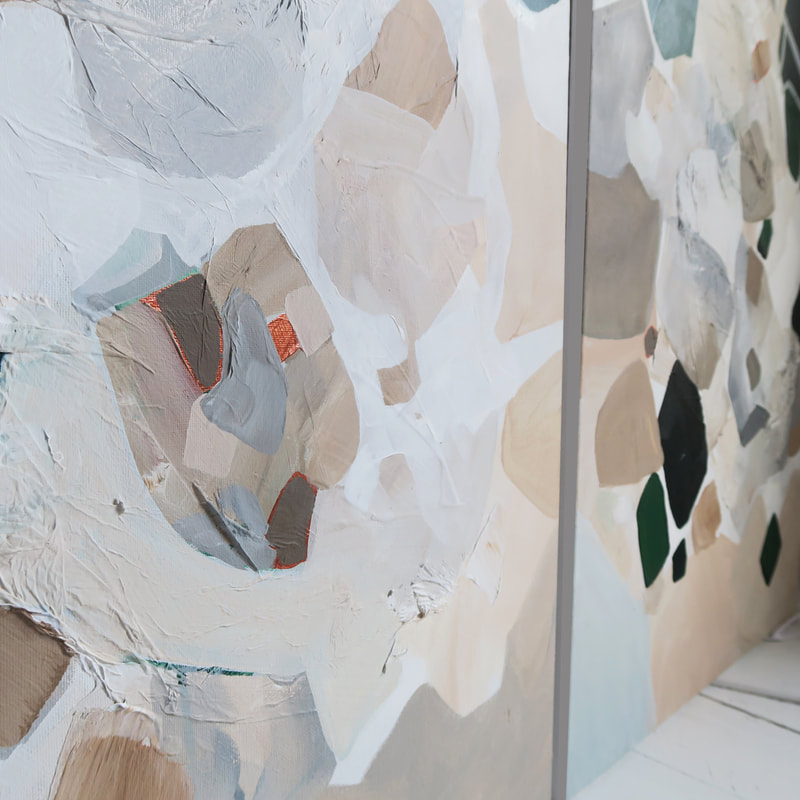
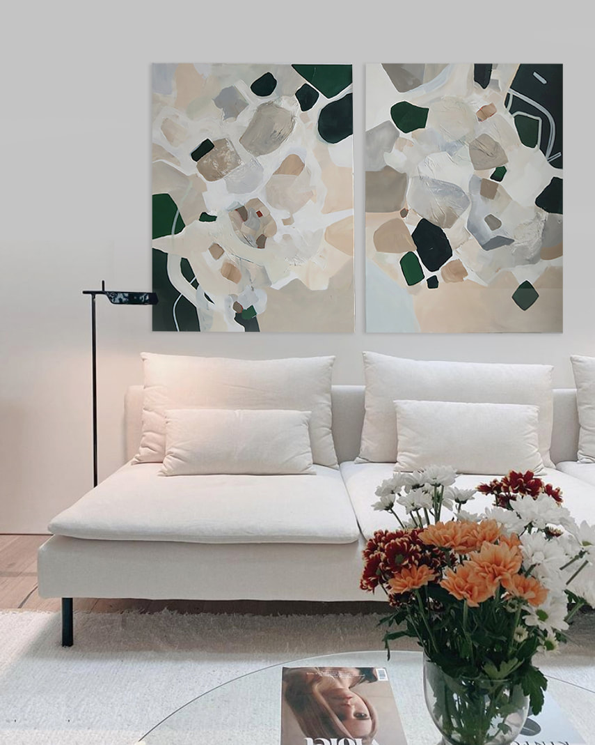
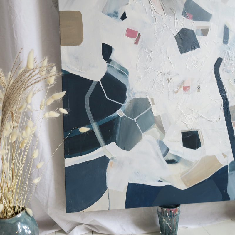
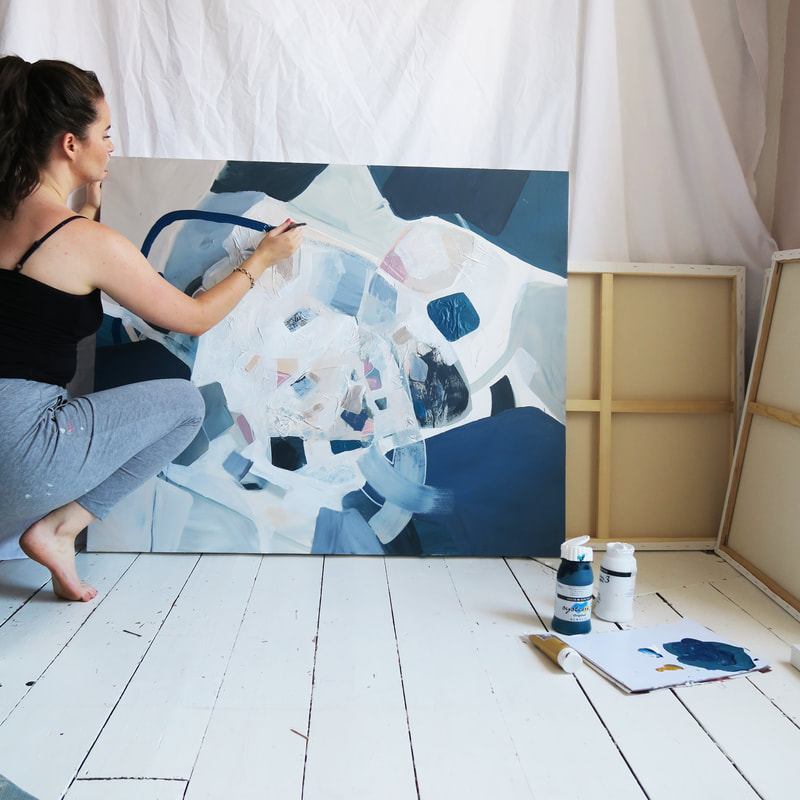
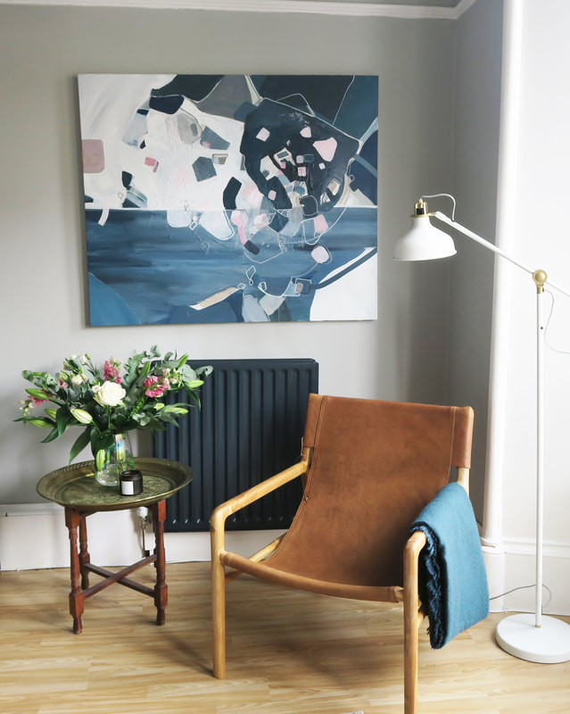
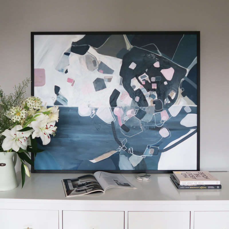
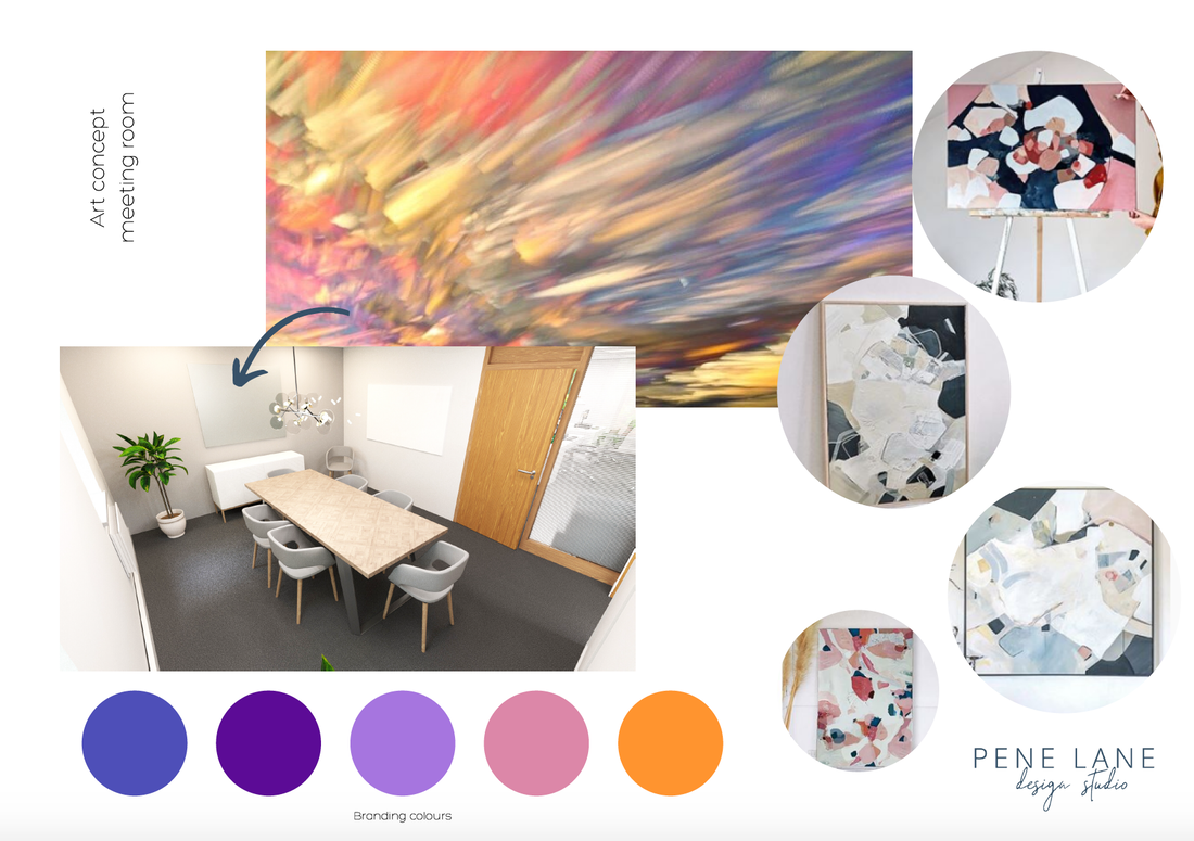
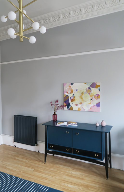
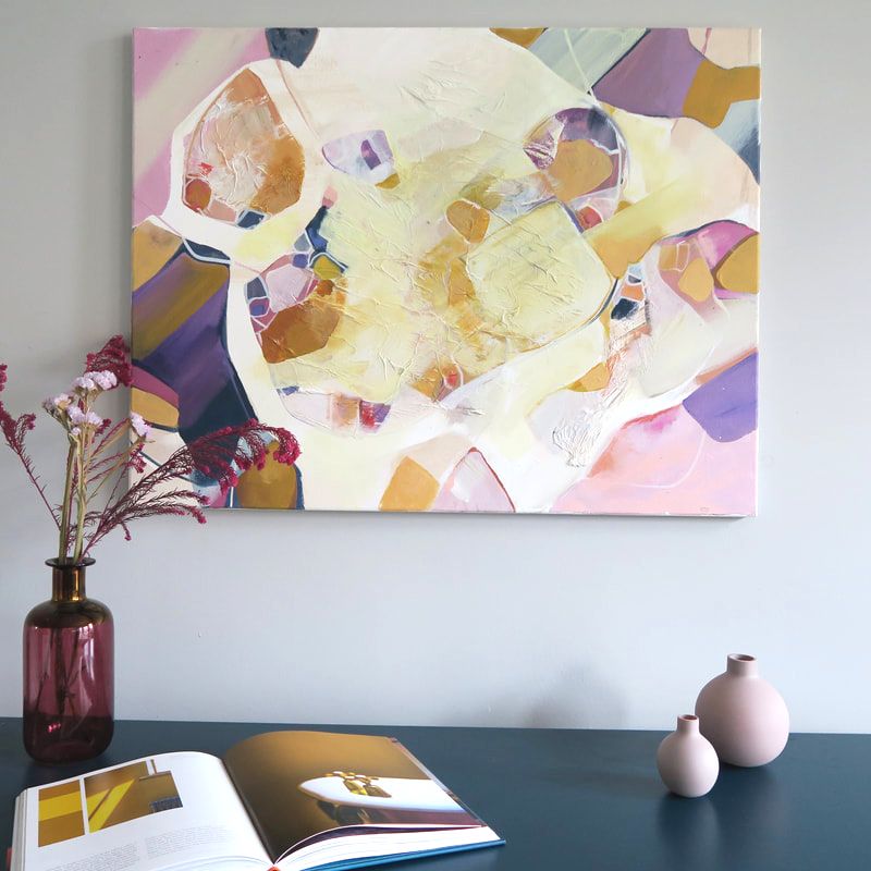
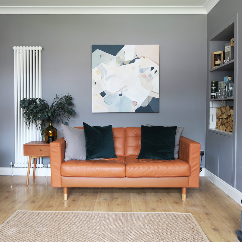
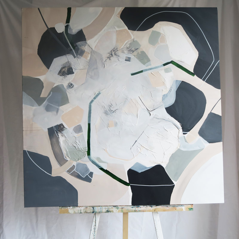
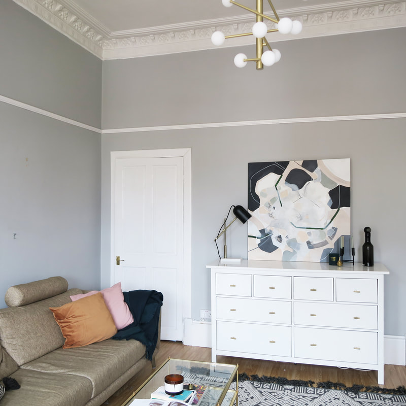
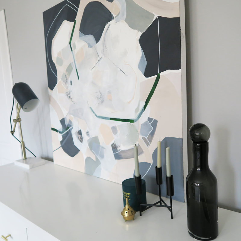
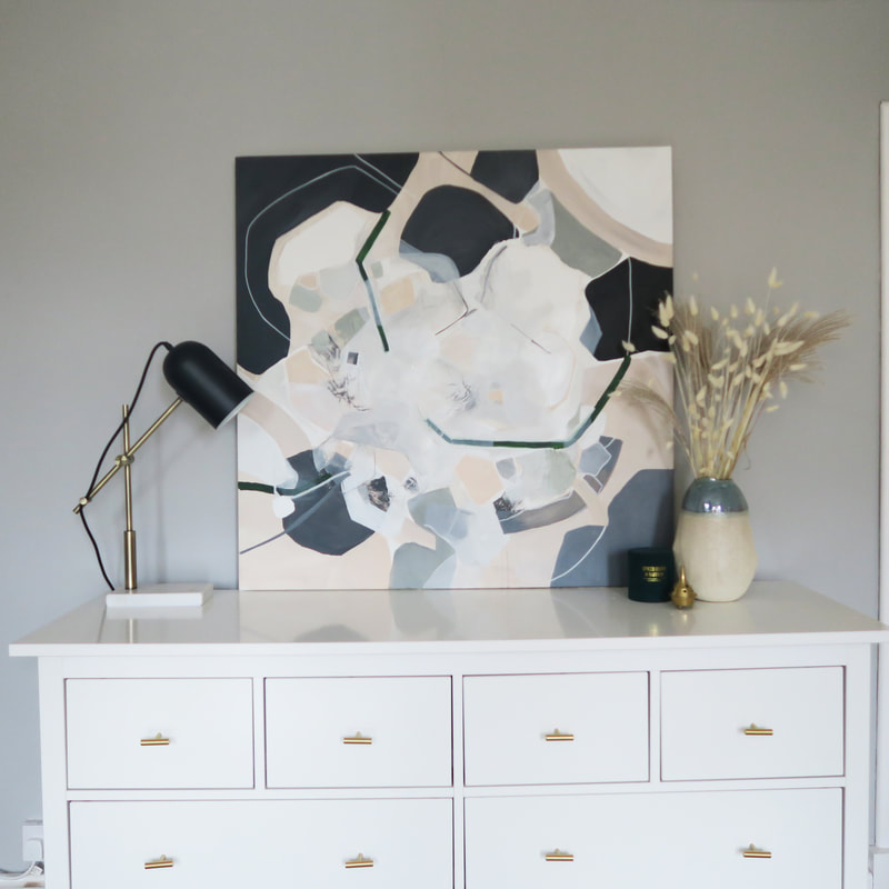
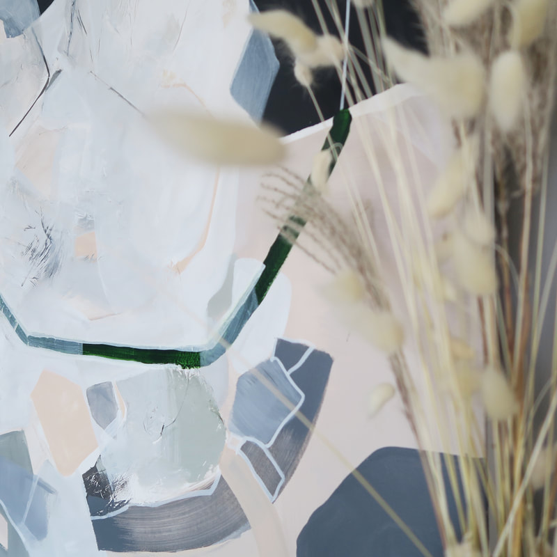
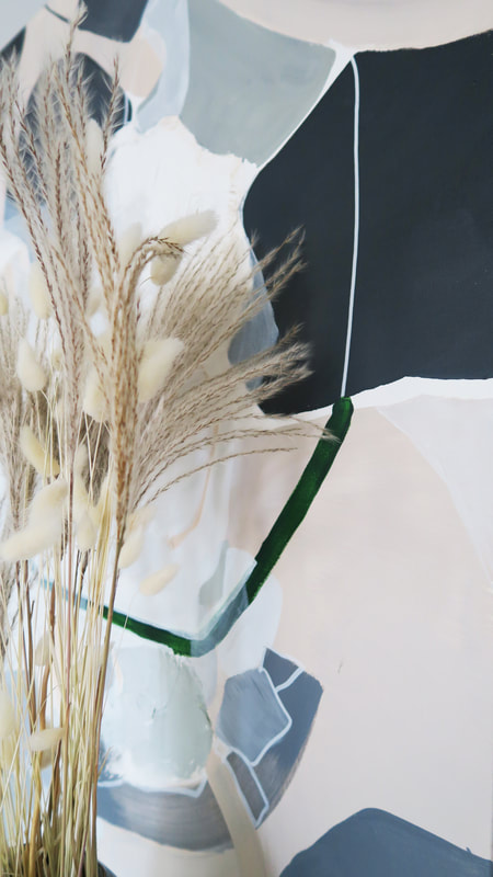
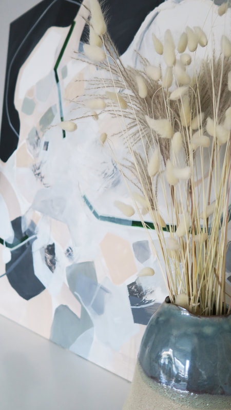
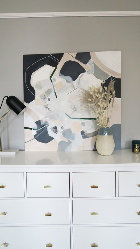
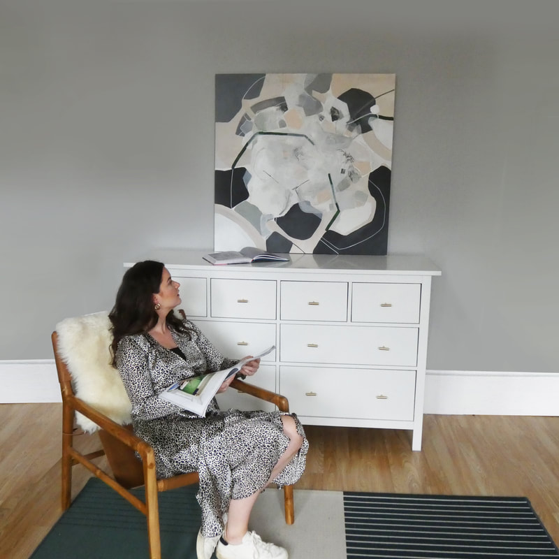
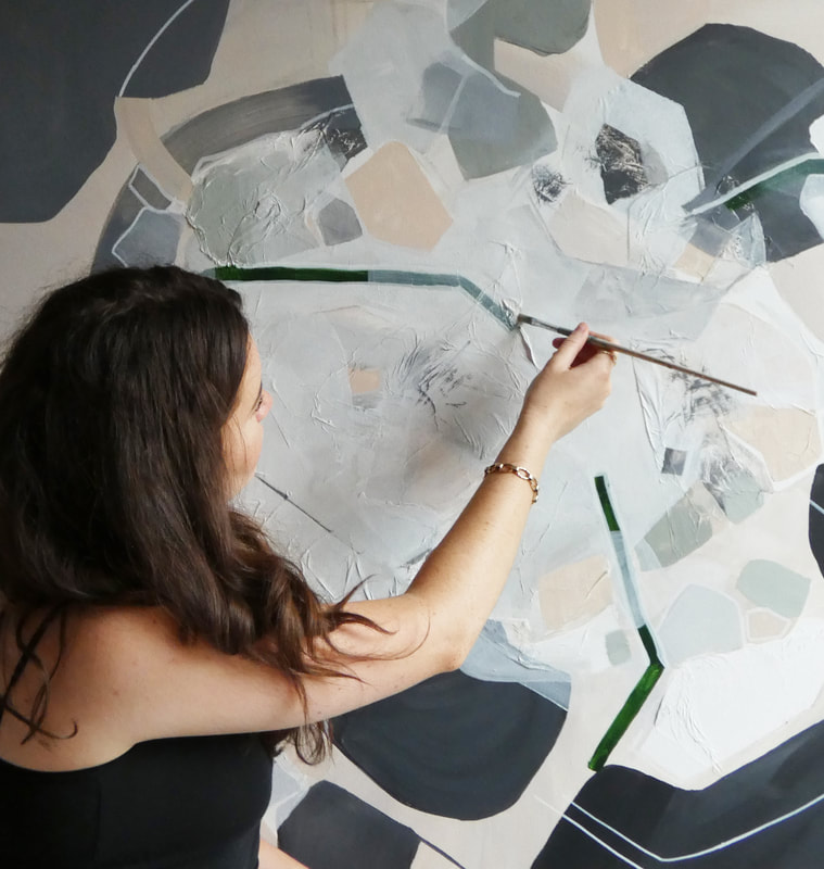
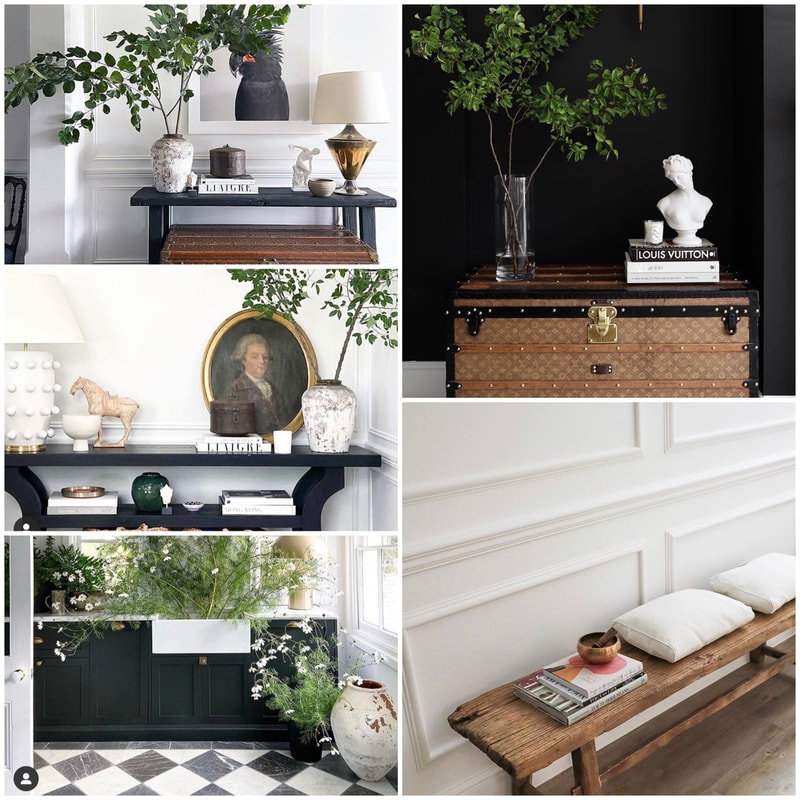
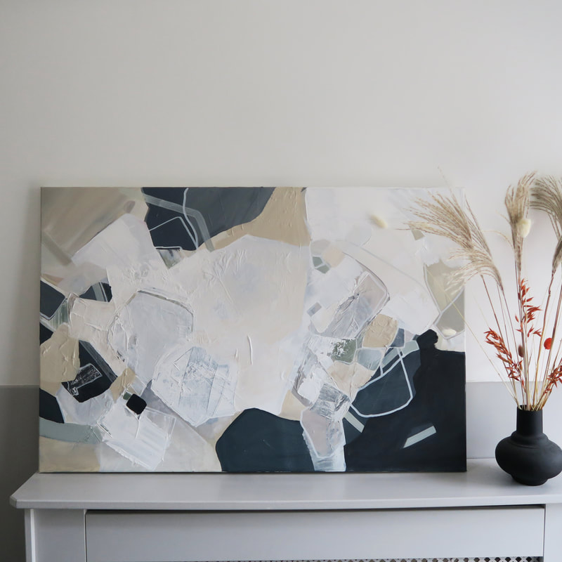
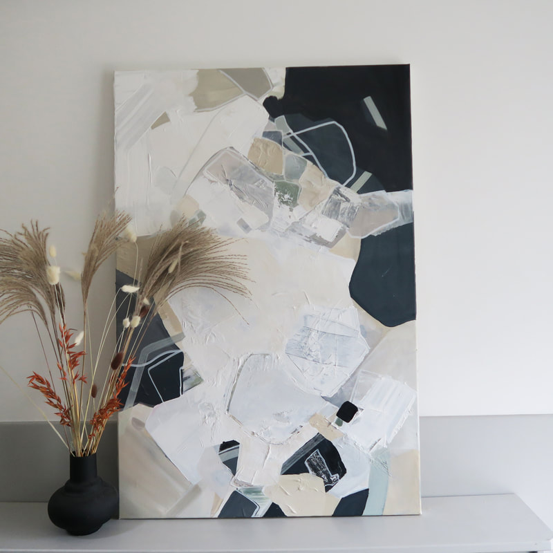
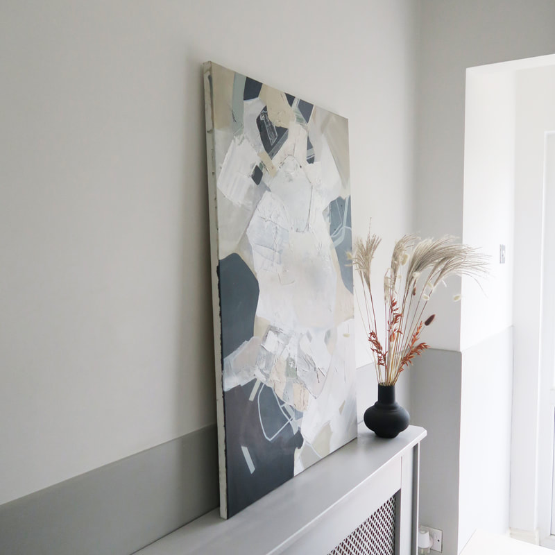
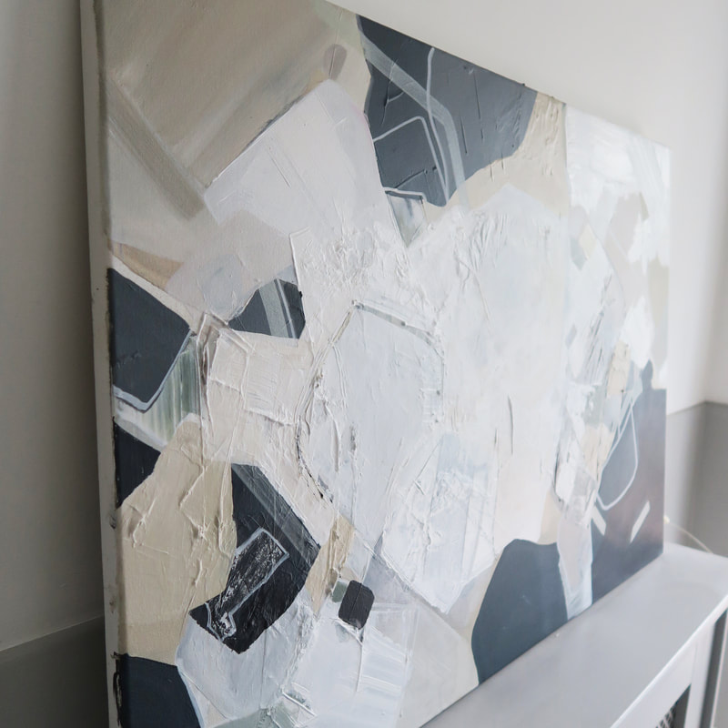
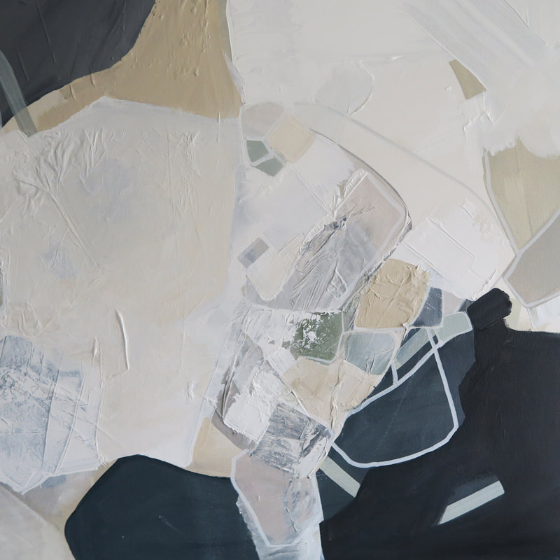
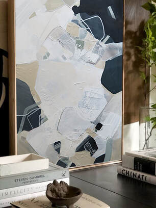
I've decided to call this piece 'pearl blue' because of its light, fresh (and obviously blue) palette. Its now arrived safely in Monaco and I can't wait to see it up in the apartment. Since launching my business I have met many interesting people. The client who commissioned this painting was one of them. Helen owns her own jewellery brand (I'll link below), and makes the most gorgeous abstract intricate pieces. Working with someone who has their own creative vision is really exciting; and I'd say it was more like a collaboration between us rather than just me painting the piece on my own, which I loved. She asked me to work up a commission for her gorgeous townhouse in the west end of Glasgow. The main objective of this piece was to create something which would compliment the interior wall colour and the other artworks in the space, so everything in Helens living room would sit together in harmony. She wanted something moody, with deep blues, greys and dusty pinks. I wanted to also include some warm neutral colours as this would be used to tie in some of her furniture and accessories she owned. The mood board below shows shots of her room, and inspiration images and colour palette I used to create the painting from. The mood boardI wanted to use Helens jewellery as inspiration; which would add a lovely bit of personalisation into the painting for her. I focused on capturing some of the shapes Helen often uses in her pieces. Some are quite graphic, others are more organic. I had fun playing with pops of colour and contrasting linear shapes and lines. I tried to create almost 'jewel'-like shapes. Helens JewelleryStudio Shot & Works in ProgressIt took a while to get the balance working of the dark blue and contrasting white, you can see some of the top images are quite different to the final painting - again, its all a process and it was great being able to run things past Helen. The final painting; ready for its new home!I dropped the painting off to Helen in person which was lovely, and she sent some photos of the painting hung above her sofa. It looks perfect for the space and her grey walls and decor. I've decided to call this piece 'nights by the bay'. I asked for name suggestions on instagram and almost everyone suggested something sea themed - I can see why and it definitely reminds me of a peaceful water scene. Doing this piece was a pleasure and I'm really happy with the way it has turned out. Please give Helen a follow on her instagram below, and I'll link her website. I'm all about supporting small, Scottish creative businesses and her work is so beautiful! This month I had the pleasure of working up a 76 x 101cm canvas for a beautiful house in London which has just been renovated. The clients knew exactly what they wanted, so I let them take the lead and they put together an amazing mood board for me to work with - I've attached this below as it pretty much speaks for itself! They have the most gorgeous house and their renovation is documented on instagram (I'll link below). The piece was made for the space above their sofa and we focused on incorporating a lot of the living room colours into the piece, as well as some elements from my previous pieces which they liked. The wanted the piece to be darker towards the edges, with a light, airy feel towards the centre. The room the painting was designed for...Studio work in progressThe final piece.I've named this piece 'Cosmos' - there's something about it that reminds me of planets, stars and the sky. I'm looking forward to seeing how this piece will tie the room together; complimenting their style. Follow their lovely reno below! I was approached by the lovely Carima from Pene Lane. Pene Lane is a interior design studio based in Leeds and specialises in rental property design and corporate interiors. As I have a background in interiors, I was super excited to get started and work with another designer to help create their vision and satisfy the project brief. Camira and myself had a skype call to chat the project through. She sent me a moodboard she had put together and some information about what the client requirements were and why the colours were so important to get right. As always I referenced the colours, moodboard and brand image and made a start in my studio. I knew this would be a tricky commission because the colours are so bold, to get the balance right it would take a lot of layering and manipulation of colours. I imagine a lot of people viewing my work for the first time probably don't realise the process behind it - and this is what I remind many of my clients during the working up of a painting, it is very much a process and requires some back and fourth before I'll work something up that works for both me and my client. I always working closely with the client for feedback and keep them up to date on my progress, and this was essential for this piece. This piece took several attempts to get right with the help of Carima and her vision, but I'd like to think the final piece captures the brand image of the clouds very well. Here it is, styled up in my living room before it gets sent down to its new corporate office! I really enjoyed working this piece up because it had a very small, set brief and was a challenge - in a good way! I normally wouldn't ever work with such bright colours but I think that 1) it'll look fabulous in its neutral meeting room, and many modern offices incorporate bright colours so it'll look contemporary and fitting with its space. 2) its proven to me that I can work with colours out-with my comfort zone and thats a nice feeling! I also loved this because working with a designer means they have their own vision. Carima was lovely and it was an absolute pleasure to work with her. I've linked her website and instagram below and will definitely be keeping up with her future projects - she's always busy working on something new! This month I did something a little different than my usual and asked one of my favourite interior influencers if they would like to collaborate with me - I was over the moon when she said yes. Yasmin had popped up on my feed complimenting my art work a few times, and I’ve followed her progress as an interior influencer for the past few years so I was super excited to create a painting for her gorgeous home. I've shared her grid and link to her insta below. The main thing I loved about Yasmins style is how unafraid she is of colour, she makes some bold decisions and still manages to make every one look classy and sophisticated. You can tell she is constantly experimenting with her style and she has the confidence to make different decisions and not necessarily just follow trends - which I love. I also knew she would have her unique vision I could tailor her painting to. As soon as Yasmin agreed to work with me she sent me over mood boards and had so many exciting ideas. She decided what room she wanted the painting to go into. She specified her dining room - I was so excited!! The painting would be tailored to her colour scheme, finer decor details and be used to compliment the room and tie all of her interior furnishings together. The space is pretty neutral, incorporating bold blacks and hints of strong emerald green. She wanted her painting to be quite similar: kept neutral but with green accents and a green linear aspect to it. It was amazing working with somebody who had a clear view on what they wanted - she was almost directing me on the creative approach to this painting which was really exciting. She also mentioned that this room links in with her kitchen which will be getting painted a beautiful dark moss green colour. She gathered some mood images and sent them to me, and as always I referred to them during painting - some of the images I've featured below. Some pics of her dining room and colour of her proposed kitchen: A small flash of bright green would compliment the space and bring out the other green tones she has in her dining room - even her rug had a linear green accent through it so I really wanted to incorporate that into the piece! She wanted the painting to sit above her fireplace and make quite a statement. Because the wall above her fireplace is so light, I wanted to introduce black charcoal greys around the corners of the painting to give that statement contrast she was after. The Painting ProcessThe piece was 100cm x 100cm on cotton canvas, and I used various different techniques and materials, the majority of these being acrylic paint and collage. I originally worked up the painting to reflect the neutrals in her space and then placed the linear green shape into the piece as I spoke about before. I always think that when working with clients, doing less and then giving them the option to add more is always a better way of working rather than going too wild! I also added some very light peachy tones which would compliment her floor finish and warm white wall colour she has on her walls. I then sent her photos of how the piece was looking, and agreed it could take more green. She loved the piece how it was so I made sure I didn't do anything too drastic - just added a tiny bit more of that bottle green to the shapes. View the updated painting below sitting in her gorgeous dining room! This is still to be framed and I can't wait to see it when its properly hung up. I loved doing this for Yasmin and really appreciate how supportive she has been of my art since collaborating with me - I'm sure influencers get gifted SO many wonderful things all the time but she was so lovely and I could tell she was genuinely excited by my art. I whole heartedly appreciated it - she even sent my a gorgeous bunch of flowers. I've linked Yasmins Instagram below, please follow her for all things colour and interior inspo - she posts regularly, is super friendly and is one talented lady! This painting was named 'shifting sand' because it reminds me of the rocks and sand left by the tide at the beach. I feel like this piece was super special because the palette is very minimal, and this is something I'd like to continue to explore in my work. My client for this commission has very specific taste and style in her home and wanted to capture her style in this painting. Her home interior features lots of whites, creams and neutrals with hints of sage greens and dusty mint colours. She put together an amazing mood board, and I got started. 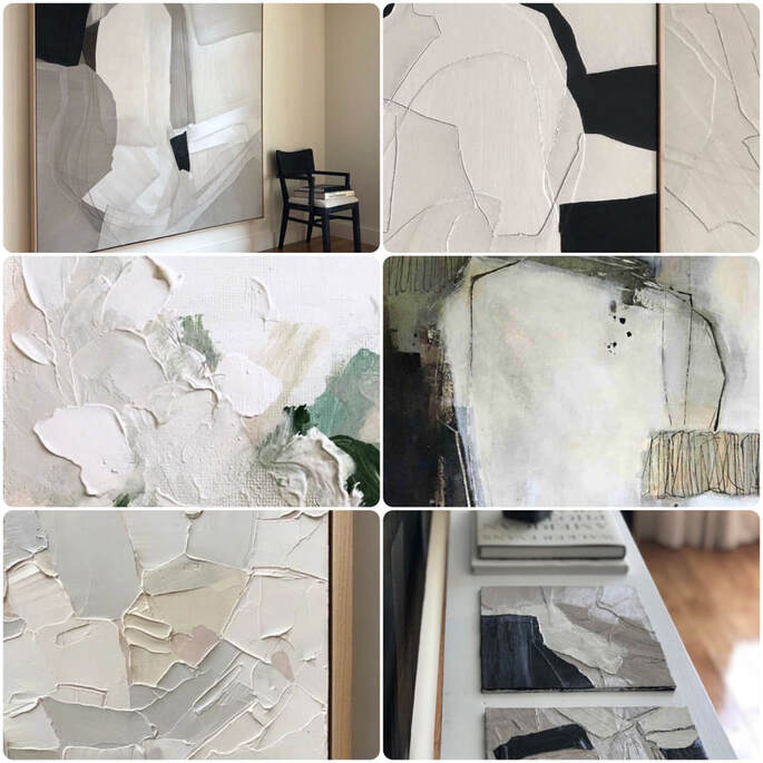 Her taste was super refined so I wanted to capture this in the painting. She liked these images of thick paint creating texture and then combining this with minimal colour, so I used my palette knife and layers of gesso to create the final textural piece. I also added pops of very subtle sage colours in to create a tiny bit of contrast - but the initial change in colour is so subtle that its almost unnoticeable! Once I had the texture and colours finalised, I then went in with finer details and small brushes to create linear mark making which added some more detail to the piece.
|















 RSS Feed


